| Image |
Comment |
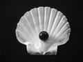
| 06/05/2002 04:38:00 PM |
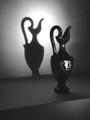
Ying Yangby YoodioComment: I really like the simplicity and contrast of this picture. |
| 06/05/2002 04:37:00 PM |
Breakfastby VodkamanComment: If it had been possible to get just the child's face so that it filled up the frame, that would have been hilarious. |
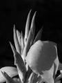
| 06/04/2002 04:17:00 PM |
Spiked Beautyby shortredneckComment: I really like the way you can see the texture of the petal, and the way the shadows are used. parts of it seem out of focus, but it doesn't take away from the picture. |
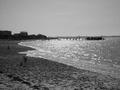
| 06/04/2002 05:19:00 PM |
The Beachby wolfjackComment: This picture is almost too sharp, and a little too bright in the water.. I do like the way you have gotten the curved motion of the water, and how it contrasts with the straightness of the pier. |
| 06/03/2002 10:53:00 PM |
Take that photo & I`ll punch your lights outby doogbullComment: And I thought my son was the only one who felt this way! :-) If the face had shown some of the same emotion, it would have been awesome; however, I fully understand that babies don't always cooperate. |
| 06/04/2002 04:39:00 PM |
Smileby jhcrossComment: I lvoe the expression. The little corner of whatever it is attracts my attention more than I want it to. If it was unavoidable to miss, so be it. The lighting and focus if very well done. |
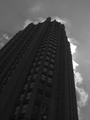
| 06/05/2002 04:36:00 PM |
Dark Towerby eddyComment: Either a touch more exposed to show the details of the building more OR a touch less exposed to make it more of a sihouette would have made it more effective for me. |
| 06/04/2002 04:43:00 PM |
|
| 06/03/2002 09:01:00 PM |
back in the dayby connieComment: A neat idea. It seems a bit overexposed to me, though you may have wanted it like that. I think it would have been nice to see the pattern on her all of her dress and not just at the hem |
| 06/04/2002 04:38:00 PM |
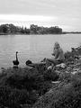
Girl and Black Swanby lisaeComment: Did you try a horizontal layout and cropping it just above the trees across the river so that the girl and swans were more of the picture, and not the sky? I don't know if it was intentional or not, but the picture is very grainy. Normally, that is not real appealing to me, but in this picture, it makes it feel like we are back in teh 70's, and for some reason, that is effective. Also, for some reason, I like that you got the back of her head, and not her face. |
Home -
Challenges -
Community -
League -
Photos -
Cameras -
Lenses -
Learn -
Help -
Terms of Use -
Privacy -
Top ^
DPChallenge, and website content and design, Copyright © 2001-2026 Challenging Technologies, LLC.
All digital photo copyrights belong to the photographers and may not be used without permission.
Current Server Time: 06/20/2026 03:17:35 AM EDT.