|
|
|
Showing 8501 - 8510 of ~9205 |
| Image |
Comment |
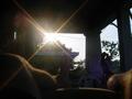
| 07/17/2002 01:57:00 PM | Relaxingby g04tComment: I like the starburst from the sun. The feet definitely give it a relaxed feeling. |
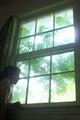
| 07/17/2002 01:52:00 PM | Looking Outsideby rondajewelComment: I like the colors and framing on this picture. At first, i thought it was washed out, but upon second look, I like the way it makes it look bright and cheerful outside, and dark and forlorn inside. A little more light on the face, just to see her expression would have made it interesting. karmat |
| 07/20/2002 10:14:00 PM | Silentby chuckComment: To be honest -- voting on thumbnail. hate snakes. don't want to see full-size. two extra points just 'cause I won't look at it. (would've gotten a 10 from me in the fear challenge.) I think I'm going to pass out now, it downloaded before i could finish commenting. *shudder* karmat |
| 07/20/2002 11:04:00 PM | Heavenly beautyby Palli747Comment: My only suggestion would be to back away a little, and frame it so that you don't cut her feet out of the picture. (That is a personal thing, it just bothers me.) Otherwise, I like how she is illuminated, and the rest is darker. |
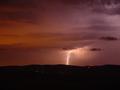
| 07/21/2002 07:45:00 PM | Dancing Forksby gray4093Comment: Great job! The only suggestion I would have is to crop it closer to the lightening, so that the viewer doesn't wander around in the picture looking that the red lights, and other such stuff. Nice colors! |
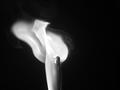
| 07/21/2002 07:21:00 PM | \by Denise CataniaComment: A very nice shot. The only way I think it MIGHT be improved is if the match were over to the left so that the flame and smoke were going into the picture, and it didn't have an open space. |
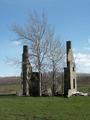
| 07/21/2002 07:34:00 PM | If These Walls Could Talk...by BigSmilesComment: they would say, "There are trees growing between us." Sorry, couldn't resist. A nice picture, and very interesting subject matter. I think saturating the colors and adding a little contrast, if you can, would really make a big difference in this picture. |
| 07/21/2002 07:09:00 PM | Sunrise Lightby sweetk1685Comment: I think the light pole adds a neat touch. It gives a focal point the picture so that it is not "just" a sunrise/set. |
| 07/08/2002 10:06:00 PM | Evil Dollyby evmariedogsComment: I'm really sorry, but this doll looks, well, innocent and almost regal. Am I missing something totally obvious? It is an excellent picture, good focus and lighting, etc. Maybe if you could have put it in a setting to show the "evilness" of it, or something like that. karmat |
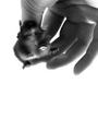
| 07/08/2002 11:04:00 PM | Feeding Time in the Reptile Houseby PatellaComment: Hehehehe. Poor little guy. Wonder who is more afraid, him or the ones viewing the picture that are afraid of mice/rodents? :-) For me personally, I would have liked a little sharper focus, just so you could see his face better. I like the space at the bottom. It gives a feeling of falling. karmat |  Photographer found comment helpful. Photographer found comment helpful. |
|
Showing 8501 - 8510 of ~9205 |
Home -
Challenges -
Community -
League -
Photos -
Cameras -
Lenses -
Learn -
Help -
Terms of Use -
Privacy -
Top ^
DPChallenge, and website content and design, Copyright © 2001-2026 Challenging Technologies, LLC.
All digital photo copyrights belong to the photographers and may not be used without permission.
Current Server Time: 06/21/2026 04:47:11 PM EDT.
|