| Image |
Comment |
| 07/24/2002 02:35:00 PM |
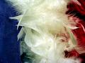
Angel's Wardrobeby albright1Comment: Good contrasting colors and textures. I dont know if this will make sense, but I'll try. Did you try framing it so that the colors ran diagonally instead of vertically. I don't know what the effect would have been, but it may have added a little interest. karmat |
| 07/24/2002 02:23:00 PM |
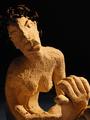
Refractory girlby manoloComment: I like the way you have framed this, and the focus you have used. I think somehow showing the head more, simply because it is so intriguing. karmat |
| 07/24/2002 02:33:00 PM |
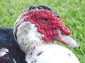
Ugly Ducklingby rdesaiComment: That is one mean looking son of a gun. Great focus, and I like the colors. karmat |
| 07/23/2002 05:36:00 PM |
chippedby ibewillComment: I like the composition and framing of this shot. It is simple, and could almost tell a story. karmat |
| 07/26/2002 03:57:00 PM |
Gritty Determinationby GeneralEComment: I understand why you showed the printed part, but I think it would have been better if you had shown more sandpaper and less print. karmat |
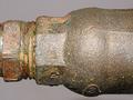
| 07/24/2002 02:28:00 PM |
Pipeby john22132Comment: For me, I think tilting the pipe one way or the other would have made it more dynamic. The way it is, it seems kinda static. karmat |
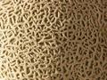
| 07/23/2002 05:24:00 PM |
Cantaloupeby jmattysComment: Good focus on the texture. Almost looks like I could feel it. A couple of minor suggestions. First there is a touch too much light on the right, and not enough on the left. A flashlight might work well for this. Also, if the cantoloupe hadn't been quite so ripe, you would have had some nice green spots to. ;-) karmat |
| 07/24/2002 02:51:00 PM |
|
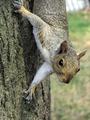
| 07/26/2002 03:42:00 PM |
Close enough to touchby Brazen AngelComment: the squirrel is looking at me. Well framed adn composed,and I like that hte background is blurry. It causes attention to go to the squirrel. Also, leaving room at the bottom and not feeling the need to have the whole animal in the picture were good decisions. karmat |
| 07/25/2002 06:27:00 PM |
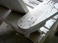
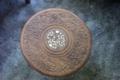
Yard Sale Item # 13by leviadidasComment: It comes across being a little flat. I like the contrast/complimentary colors of the blues and tans. I think to really make this picture stand out, I would get down more on level with the surface, and let the shadows create depth. That way the viewer would feel the surface more, instead of just seeing it. karmat |
Home -
Challenges -
Community -
League -
Photos -
Cameras -
Lenses -
Learn -
Help -
Terms of Use -
Privacy -
Top ^
DPChallenge, and website content and design, Copyright © 2001-2026 Challenging Technologies, LLC.
All digital photo copyrights belong to the photographers and may not be used without permission.
Current Server Time: 06/22/2026 04:41:38 PM EDT.