| Image |
Comment |
| 08/02/2002 10:48:00 PM |
|
| 08/02/2002 05:07:00 PM |
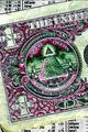
"Dirty money"by awmk1981Comment: Good shot. Would like to see a little more detail on the coins -- maybe increase the contrast. karmat |
| 08/03/2002 11:56:00 AM |
Running-On-Emptyby amonteforteComment: Good symmetry. the only suggestion i would make would be to make sure the monitors were showing the same thing. Not sure what caused one to be bright and one dark, but it causes a noticeable glare on the left side of the picture. Still, a great job. karmat |
| 08/02/2002 11:06:00 PM |
Customer Dissatisfactionby mciComment: I like the how this picture seems to project despair. I like the high contrast and negative space on the right. For my personal taste, I wish the subject was just a touch sharper. karmat |
| 08/03/2002 12:15:00 PM |
For Leaseby ScottEmmonsComment: I really like how you've used the lines in this composition. Everything is so angular, and the shadows jsut emphasize and strengthen that. The black and white also makes it powerful. karmat |
| 08/02/2002 10:44:00 PM |
unknownby KathycComment: I like the abstractness and the colors in this one. I also think you have done well in keeping reflections to a minimum. karmat |
| 08/02/2002 11:05:00 PM |
Reflecting On Faith Lostby jmattysComment: Excellent job of getting the reflection in focus. This is a great capture. I think it needs to be cropped just a touch on the left, and if it had been possible to shoot at another time of the day, maybe the NASDAQ wouldn't have a glare (of course, you probably wouldn't have as good a reflection, either.) karmat |
| 07/30/2002 04:13:00 PM |
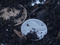
A Heap of nothingby anitraComment: i like the composition of this site, and the color contrast that you have. It seems out of focus to me, though, and kinda static. Not sure how to fix that, sorry. karmat |
| 07/30/2002 04:26:00 PM |
signby john22132Comment: The contrast between the sign and the greenery is interesting. It is kinda static, though; it looks flat to me. Maybe a different angle, or different time of day to catch some shadows. karmat |
| 08/02/2002 11:13:00 PM |
Makes the world go aroundby GordonComment: I like the composition of this picture -- it really holds my attention. It is a little bright in the lower part, but nothing major to me. karmat |
Home -
Challenges -
Community -
League -
Photos -
Cameras -
Lenses -
Learn -
Help -
Terms of Use -
Privacy -
Top ^
DPChallenge, and website content and design, Copyright © 2001-2026 Challenging Technologies, LLC.
All digital photo copyrights belong to the photographers and may not be used without permission.
Current Server Time: 06/22/2026 11:43:05 PM EDT.