| Image |
Comment |
| 08/09/2002 09:18:00 PM |
Another Year Olderby CoreyComment: A couple of suggestions that I think would help this picture (though its focus and lighting are right on, I believe): Focus only on the cake or only on the one guy (maybe by moving to the left a little). I think the major distraction is the guy on the far left, though I do think his facial expression is humorous. karmat |
| 08/06/2002 03:49:00 PM |
|
| 08/07/2002 11:13:00 PM |
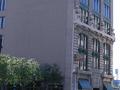
Seventh Street Grilleby mcrochipComment: I think the sign, since that seems to be what you are focusing on, should be more important in the picture. Also, I think cropping the right side windows would help. I like the way the bushes/tress lead the eyes to the building. karmat |
| 08/08/2002 12:13:00 PM |
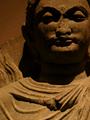
2nd/3rd century ADby stephanComment: I think this picture needs more light to truly emphasize the features. I like the general composition. karmat |
 Photographer found comment helpful. Photographer found comment helpful. |
| 08/06/2002 03:27:00 PM |
|
| 08/07/2002 10:26:00 PM |
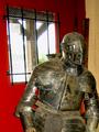
EncRustby willsy66Comment: Shallow depth of field works well here, I think, though it may be more effective if it were possible to view the "context" of this picture. karmat |
| 08/08/2002 12:01:00 PM |
KEEPER OF DREAMSby karolComment: I think cropping it a touch tighter at the bottom to eliminate the red/pink stripe would have improved this picture. It's got great focus, and I like the water drops. I also like the contrast between the background colors. karmat |
| 08/07/2002 11:15:00 PM |
crumbling beautyby awmk1981Comment: I think backing up and getting more context would help give this picture more depth and meaning, especially at the top. I like the colors. karmat |
| 08/08/2002 04:20:00 PM |
I'm a little rustyby arippsComment: That is a bright red, there. I think if you had moved jsut a touch to the left, then the yellowish color could play in the picture a little more. It kinda looks like he just walked in the door. karmat |
| 08/06/2002 11:04:00 PM |
|
Home -
Challenges -
Community -
League -
Photos -
Cameras -
Lenses -
Learn -
Help -
Terms of Use -
Privacy -
Top ^
DPChallenge, and website content and design, Copyright © 2001-2026 Challenging Technologies, LLC.
All digital photo copyrights belong to the photographers and may not be used without permission.
Current Server Time: 06/23/2026 10:08:08 AM EDT.