| Image |
Comment |
| 10/14/2002 02:33:00 PM |
My Seven...by amonteforteComment: I like the composition, but I am curious. Would it have been possible to have them spread further up so that there wasn't so much space at the top. Not sure that I would like that better, but would be interested in knowing if it would have made a difference. I like the contrast of the dark vs. light colors. karmat |
| 10/14/2002 03:04:00 PM |
7 deadly casino sinsby nikonerComment: I like the framing and symmetry of this. The colors are really muted though, making it look flat. Did you try saturation, or boosting contrast any? karmat |
| 10/16/2002 02:27:00 PM |
Meet Miss Ohioby LanSnakeComment: Hehe. The girl in the background is obviously not impressed! good shot, just wish you could have used a faster shutter speed so that ms ohio wasn't blurry. i am assuming you were either too far away to use flash, or didn't want to (not that i would recommend the flash). karmat |
 Photographer found comment helpful. Photographer found comment helpful. |
| 10/14/2002 03:02:00 PM |
This Just Isn't Enough....by nards656Comment: I really like this and how it looks like the bill disappears into darkness. What i really like, though, is the supper it bought me Saturday night!!!!! karmat |
| 10/14/2002 02:26:00 PM |
|
| 10/16/2002 12:07:00 AM |
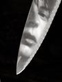
Pistolby IvanComment: Great use of negative space. karmat |
| 10/18/2002 02:21:00 PM |
Battered Reflection by hokieComment: Nice shot. Would've been cool in the reflections challenge as well. I like the negative space and the way you have used it. karmat |
| 10/16/2002 03:07:00 PM |
|
| 10/18/2002 01:39:00 PM |
Fist of Furyby ManicComment: Good use of motion, I think. I assume you took the picture while the hand was thrusting forward and then stopped. Sometimes, it works better to place your hand (or other moving object) in the final position, hold it for a few seconds, then move backwards. That way, the "end" position is really clear, but you still have the motion blur! karmat |
| 10/14/2002 02:54:00 PM |
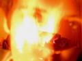
Wrath - The Fiery Rage Withinby KonadorComment: Nice effect. Don't know how you did it, so I don't know if my suggestion is a possiblitly, but if the fire would have been secondary to the face, instead of the other way around, it would have bene more obvious, to me. Reminds me of a depiction of hell. karmat |
| Photographer found comment helpful. |
Home -
Challenges -
Community -
League -
Photos -
Cameras -
Lenses -
Learn -
Help -
Terms of Use -
Privacy -
Top ^
DPChallenge, and website content and design, Copyright © 2001-2026 Challenging Technologies, LLC.
All digital photo copyrights belong to the photographers and may not be used without permission.
Current Server Time: 06/25/2026 06:55:40 PM EDT.