|
|
|
Showing 7201 - 7210 of ~9205 |
| Image |
Comment |
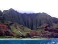
| 01/16/2003 06:17:03 PM | Kauaiby WarpComment: It seems that you were trying to capture the mist/clouds coming in over the ridge, but the water is so awesome, I wish you had gotten more of that, and less of the top stuff. Makes me want to go there. |
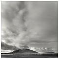
| 01/16/2003 06:10:59 PM | Tranquilityby greenem2Comment: Oddly enough, I like what I consider negative space at the top of the picture. It makes the landscape look isolated and barren. Good use of bw, I think. |  Photographer found comment helpful. Photographer found comment helpful. |
| 01/16/2003 06:07:25 PM | Casey Jones Ranchby boyte1Comment: The fences do a nice job of forming "converging lines. I think if there junction was more readily viewable, it would be even more effective. | | Photographer found comment helpful. |
| 01/16/2003 06:05:33 PM | A Lunar Landscapeby Fibre OptixComment: Awesome detail. The only suggestion I would make is to consider the composition so that the "lit" part of the moon is in the bottom of the frame, then it would have the negative space to really emphasize the subject. | | Photographer found comment helpful. |
| 01/16/2003 06:02:44 PM | Not Another Storm!by basia03Comment: It seems pixelated in the weeds in front (over sharpened, maybe?) and there is noise in the sky. NeatImage (you can get a free download) is dpc legal and awesome at removing noise. | | Photographer found comment helpful. |
| 01/16/2003 06:01:16 PM | McAlpineby jbolingComment: I realize it is the curve of the lake, but hte left side being lower than the right makes it feel lopsided, even though the picture is probably even. Maybe include more of the shore on the left, or crop it before it further on the right so that the section that feels curved would be eliminated. Bet this is gorgeous in summer! | | Photographer found comment helpful. |
| 01/16/2003 05:54:55 PM | Pathby ramoneComment: Just my opinion, but I think the path needs to be more "in" the picture. Maybe a little further to the left, then it would have a clearer entry. It is a good method of drawing the eyes up and into the picture. Very well taken. Your snow is white and not bluish or blownout! |
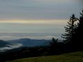
| 01/15/2003 11:56:02 PM | The Fog Rolls in at Duskby sjgleahComment: Great composition, I think, but the picture is a bit dark in the foreground for my. I either like complete silhouettes (like the tree on teh right), or being able to distinguish the details. I love how you have captured the fog/mist on teh lower left, just wish I could see more of it. Overall, an excellent shot, and it reminds me of home! |
| 01/15/2003 11:52:37 PM | Winter sunsetby dazzlerComment: The colors on this are awesome. having the sun on the vertical middle, and the horizon on the horizontal middle make the picture a little static for me. Did moving it up/down, left or right change it any? The plus to this composition, though, is that it is very soothing and stable. |
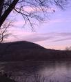
| 01/15/2003 11:46:02 PM | Take Me to the Riverby kandyjComment: CRITIQUE CLUB CRITIQUE
by karmat
Composition -- I think the main thing I would change in the composition is to make it a horizontal framing instead of vertical. I understand that that might not have been possible, because I don't know what was to the left or right of the frame, but you may have been able to get the same effect by cropping some of the sky out. The sky is beautiful, but it is most interesting, I think, just above the hills. I like how the tree on the left frames the shot, adn it is also effective how you have used three elements in "layering" the shot (river, hill, sky), though, again less sky would have made the elements fill the frame more equally.
Technique -- I really like how you have captured the colors in the sky, adn I understand how difficult that is to do, and maintain proper exposure. The hillside and the river do appear to be a bit dark, as a result, and the picture, overall, may have been stronger if you could have captured more of the detail in some way. It is well focused, which is an accomplishment in itself when photographing a tree!
Overall Effect -- You met the challenge well, and I found myself hearing "Billy Bob Bass" singing this over and over and over!! (If you do not know who Billy Bob is, you gotta see one to truly appreciate this song!). The colors are very soothing and it is a very nice shot. With a little tweaking, I think it would make a nice shot to hang on a wall somewhere. | | Photographer found comment helpful. |
|
Showing 7201 - 7210 of ~9205 |
Home -
Challenges -
Community -
League -
Photos -
Cameras -
Lenses -
Learn -
Help -
Terms of Use -
Privacy -
Top ^
DPChallenge, and website content and design, Copyright © 2001-2026 Challenging Technologies, LLC.
All digital photo copyrights belong to the photographers and may not be used without permission.
Current Server Time: 07/17/2026 03:53:45 AM EDT.
|