|
|
|
Showing 7191 - 7200 of ~9205 |
| Image |
Comment |
| 01/20/2003 12:43:56 AM | Got Cookiesby daysezComment: Excellent clarity and detail within the focus. the leaves on the table cloth/background are kind of distracting to me, but that may just be me. |  Photographer found comment helpful. Photographer found comment helpful. |
| 01/20/2003 12:41:34 AM | Applejacksby rll07Comment: Great detail on the cereal, and the slight blur of the milk drop shows motion. I think a different color background would have helped show the milk drop even more. |
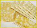
| 01/20/2003 12:19:18 AM | Cheese and Crackersby HBunchComment: I really like the composition of this shot, and I think it is effective. I do think that a differently colored background would have helped give the picture a little more contrast, and grab the viewer more. | | Photographer found comment helpful. |
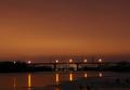
| 01/19/2003 06:27:13 PM | Smoke on the Waterby inspzilComment: CRITIQUE CLUB CRITIQUE
by karmat
COMPOSITION
You have chosen a good subject, I think, though if the smoke could have a more prominent view in the picture, I think the viewer's would have responded more positively towards it. Maybe if you had chosen a song about a bridge or something . . .. I like that the bridge is in the lower third of the picture. It gives enough foreground to have an "entry" point, and doesn't cut the picture in half. If I were to change anything, I think I might have made the picture more narrower by cropping some of the sky out, because though I like the warm orange color, there is nothing there to add interest or add to the context of the picture. I also like the angle you have shot this with. The river's edge at the bottom right forms a nice contrast with teh horizontal bridge.
TECHNIQUE
This is exposed beautifully as the bridge adn other things in the mid to background are silhouetted, but you can still see some detail at the front. The lights have a nice flare, without being blownout, but you were close, I think. I also like the warmth of the orange, as it lends itself to the "smoky" feeling. I think blue would have been much too cool feeling. The focus is clear and crisp, and I do not notice any "noise" in the sky.
OVERALL EFFECT
I found this picture rather pleasant, though I, like some of the other viewers, would have liked to have seen the smoke play a more prominent role in the picture. It is very warm feeling, as mentioned above, and though I would consider the sky negative space, I do not think it helps to draw attention to the subject. The silhouetted bridge does that. But that is jsut my opinion. Again, I enjoyed this work, as I have many of your others. | | Photographer found comment helpful. |
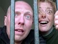
| 01/18/2003 12:19:33 AM | Pink Floyd- Is there anybody out there?by Clou9Comment: CRITIQUE CLUB CRITIQUE
by karmat
COMPOSITION
I like the tight framing of this shot. I think that it adds to that "left behind/alone" feeling. I almost think it could have been tighter on the left side and still been effective, or maybe a little bit wider on the right. The bars give an interesting captive feeling to it. I think they could have been used to really frame the shot if you had included one on the far left. Otherwise, I think the one on the right could be cropped out because it makes the shot feel rather off-balanced to me.
The choice of subject works well here. From what I know about Pink Floyd, this shot is probably fairly well representative of the song. :-) You're models have done well at looking surprised/shocked.
TECHNIQUE
The focus and lighting is right on in this shot. I like the low perspective, but I think a high perspective, with the camera pointing down to the subjects, would have given it an even more "behind bars" feeling, as it would have made the viewer feel "above" the scene.
I have found that if I can't get skin tones to look like i want, black and white works well. I am not sure if this picture would be more effective, or less, but it would even the colors out, and you wouldn't have to worry about the "pinkness."
OVERALL EFFECT
I find the expression on the faces humorous. I am not sure if this is what you wanted or not, but if so, great work. If not, ummm, maybe they could have been looking more reflective or something. I also think that just having one of the people in the shot would have worked as well. Though this shot is not one that I would hang on my wall, I do think it works very well in this challenge, and I could see it being cover art for an album of this nature. Best of luck in future challenges. |
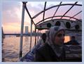
| 01/17/2003 05:57:18 PM | "The Nile Song" by Pink Floydby albright1Comment: CRITIQUE CLUB CRITIQUE
by karmat
COMPOSITION
At first, I did not really like the composition of this shot. I felt that it included too much "stuff" and could have been framed differently. After looking at it though, I decided that it did have some fairly strong points. The "rails" on the boat give a strong outline to the picture. As a result, the viewer tends to focus on face, more than the sunset, which may or may not have been what you intended. The subject is placed well in the frame, but I find myself wishing she was looking the other way, but I don't know if that was possible. Overall, I think the composition still feels slightly off balance.
TECHNIQUE
It seems a touch dark on my screen, but when I look closely, I can make out the details of her clothing, the seat cushions, etc. so it does not seem to be badly underexposed. I think a bit of brightness on her face would have helped a little bit. It is well focused, and I really like how you have captured the colors and the textures of the water.
OVERALL EFFECT
After getting over the shock of having the subject seem to be looking straight at you, it is a fairly effective shot. I am not familiar with the song you have chosen, and I have never been to Egypt, so I will take your "word" on it there. :-) The colors give it a very soothing feeling, and the water looks calm so that is also relaxing. Good work. |
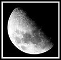
| 01/17/2003 01:42:51 PM | Lunar Landscapeby marboComment: I think the square framing works well with this shot. Excellent capture of the detail, and I like that the moon is in the bottom of the frame with the "shadow" at the top. I think that makes for a strong composition. | | Photographer found comment helpful. |
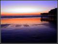
| 01/17/2003 01:15:41 AM | Sands of Timeby RoninComment: My only suggestion would be to crop some of the bottom of it so that it was more narrow. This would eliminate some of the foreground. I think this picture would be effective if the structure on the right were in the middle horizontally, and water between the sky and reflection cut the picture in half -- "breaking" the thirds rule.
Still, an awesome shot!!!! |
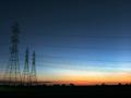
| 01/17/2003 12:31:38 AM | Sunset on the horizonby xertionComment: One of the very few photographs that I have seen where power lines actually ADD to the shot. The towers anchor it on the right, and the lines lead the eyes to the right. Nicely done, and great colors, too. | | Photographer found comment helpful. |
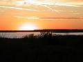
| 01/16/2003 11:52:09 PM | Sunset Lakeby LauraLeeComment: Beautiful colors and composition. I really cannot think of anything I would suggest to make it better. I would have liked to seen it bigger, though. :-) | | Photographer found comment helpful. |
|
Showing 7191 - 7200 of ~9205 |
Home -
Challenges -
Community -
League -
Photos -
Cameras -
Lenses -
Learn -
Help -
Terms of Use -
Privacy -
Top ^
DPChallenge, and website content and design, Copyright © 2001-2026 Challenging Technologies, LLC.
All digital photo copyrights belong to the photographers and may not be used without permission.
Current Server Time: 07/16/2026 09:48:03 PM EDT.
|