| Image |
Comment |
| 01/30/2003 12:28:20 PM |
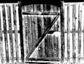
Church Doorsby inspzilComment: Interesting effect. I think it needs to be cropped closer on the left to make it symmetrical, though. |
 Photographer found comment helpful. Photographer found comment helpful. |
| 01/30/2003 12:27:41 PM |
|
| Photographer found comment helpful. |
| 01/30/2003 12:26:25 PM |
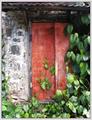
All Closed Upby JeanComment: I think cropping it so that the overhang at the top and the ivy at the right didn't show would make if feel more balanced to me. As it is, I feel like it is a little tight. The contrast of the red and green is nice. |
| 01/30/2003 12:17:23 PM |
My left footby av8orboyComment: I think it is cropped a little too close on the right. Did you try it from different perspectives, and not just "straight" on? |
| 01/30/2003 12:15:25 PM |
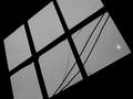
Windows & Doorby bcncrazyComment: I really like the perspective of this, but I feel like the "fuzziness" of it takes away from the total effectiveness. |
| 01/30/2003 12:10:35 PM |
City Windowsby nathaliedooComment: How would this look with a vertical frame, instead of horizontal? The grainy/contrasty look reminds me of a "retro" look, like during hte 70's or something. |
| Photographer found comment helpful. |
| 01/30/2003 12:07:36 PM |
Window & Lightby KathycComment: I like the stark contrast between the black and gray, however, I think the composition itself comes up a little flat. Maybe if the light was a little more pronounced or definite, it would help. |
| 01/30/2003 12:04:08 PM |
Window to heavenby amonteforteComment: I like the colors in this, and it is a great idea. Something about the crop/framin makes it feel off-balanced to me, though. Maybe if you could have gotten more to the right, to make it more symmetrical, or more under it and to the left so that it was from a really skewed perspective. I'm just not sure. |
| 01/29/2003 03:06:02 PM |
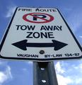
Can't park here.by Fibre OptixComment: CRITIQUE CLUB CRITIQUE
by karmat
COMPOSITION
You have chosen a good angle from which to photograph this sign. It adds interest and makes it more dynamic. It would appear that you are going for a symmetrical look, in which case I might suggest croppping out the post, as it seems to be a bit off-center. I don't want to sound picky, but it seems that shots do better if they are exactly symmetrical, or way off.
TECHNIQUE
The focus is a little soft. It appears to be a bright, sunny day, so could you use a higher aperture number to improve the focus all the way up the sign. That would also prevent the slight blowing out of the clouds in the lower right hand corner. The sky and clouds add a nice "contextual" feeling to it. I think the black really stands out because of the sky. the crop may be a tad close, but I think that cutting the very corners off adds to the symmetrical feeling of it.
OVERALL EFFECT
My first impression was that this sign is 10 feet tall. Don't know if it really is or not, obviously, but your perspective makes it seems big. That is effective. Nicely done. Your score was probably effective by the soft focus, as that is the first thing people seem to notice, and many do not have time to study the pictures in depth. |
| 01/29/2003 03:01:53 PM |
|
| Photographer found comment helpful. |
Home -
Challenges -
Community -
League -
Photos -
Cameras -
Lenses -
Learn -
Help -
Terms of Use -
Privacy -
Top ^
DPChallenge, and website content and design, Copyright © 2001-2026 Challenging Technologies, LLC.
All digital photo copyrights belong to the photographers and may not be used without permission.
Current Server Time: 07/17/2026 02:58:43 AM EDT.