|
|
|
Showing 7021 - 7030 of ~9205 |
| Image |
Comment |
| 02/24/2003 01:14:28 PM | Modem plugby kiwinessComment: The dof on this shot makes it look like a sea monster or something (which is what they seem like sometimes). Great work, and the yellow background is especially interesting. |  Photographer found comment helpful. Photographer found comment helpful. |
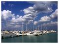
| 02/24/2003 01:12:32 PM | Storm Brewingby GraciousComment: Wonderul composition. I really like this shot. The contrast of the boats against the water, adn the clouds against the sky are particularly effective. Kinda makes me want to sing the theme from "Gilligan's Island" :-P . 10 | | Photographer found comment helpful. |
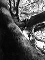
| 02/23/2003 11:30:14 PM | Judamohrby bgheenComment: CRITIQUE CLUB CRITIQUE
by karmat
COMPOSITION
I think the composition of this shot is very strong. The trunk is a stabilizing factor in the left of the frame, but there is enough fo the tree in the rest of the frame to provide balance. You have chosen a good subject here, the only suggestion I would make would be try to find some way to have the leg going up and out like the rest of the branches. Then it would really look like a "limb."
TECHNIQUE
Your focus is good, and you have done a nice job of controlling the light in the leaves -- it is bright, but doesn't appear to be blown out. The darkness in the lower left bothers me some, but not a lot, maybe some fill flash, if it were available would help. Also, I think the bw really adds to the picture. Though color would have been nice, it may have caused too any elements to compete with each other, adn would have made the leg very obvious.
OVERALL EFFECT
Good work, and you have met the challenge well. I just have one question for you? Was it not cold up there???? February in Michigan, and you (or your model) doesn't have pants on. Hope you didn't get sick!!! :-) |
| 02/23/2003 09:30:02 PM | Liberty and Justice for All - 2by kevinswopeComment: CRITIQUE CLUB CRITIQUE
by karmat
(I apologize for this being so late; my internet connection has been bonkers the past few days, and I am just now able to connect long enough to do it! :/ )
COMPOSITION
You have used the rule of thirds very well. The flag is positioned on teh left third in such a way to anchor the shot, and the angle of the flag pole is very effective at drawing the eyes up and through the picture. I almost think you could have cropped the moon out, though it is a nice touch, because it is so close to the bottom of the frame, it looks kinda like an accident, and leaves me feeling a bit unbalanced, as the flag is so much bigger than it.
TECHNIQUE
Wonderful use of lighting here. The colors are so "pure" and rich; very nicely done. Taking pictures of flags is difficult, as they don't want to stand still, but you have nailed the technique, I believe. I can think of nothing to do to improve it.
OVERALL EFFECT
You have done very well here, and have captured the majesty of the flag well. It is bold and strong, and a shot to be proud of. Nicely done! |
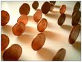
| 02/23/2003 12:04:35 AM | Untitled Iby bil99Comment: CRITIQUE CLUB CRITIQUE
by karmat
COMPOSITION
I feel that the composition of this is very strong. You have chosen a good subject, and have concealed your "Waldo" well. Though it is visible, it does take the viewer a moment to "see" it. I also think the tight crop, having the coins "spill" out is also very effective, and adds to the interest of the picture. I think George needs to be lower in the frame though. Right now, his center position (even though he is on the left third) makes it appear a bit static. Lowering, or raising may help that. Also, did you try it with all "heads" up or all "tails" up instead of heads and tails? That may have helped to tie your entire composition together better
TECHNIQUE
Great focus and lighting, the detail of the coins is very crisp and clear, and they are shiny without having distracting glare spots all over the place. The coloring of this is very warm, and it is interesting how all of the coins ended up being the same color. It took a second for me to realize they weren't all dimes!
OVERALL EFFECT
Very nice, indeed. You have met the challenge, and met it well, I think. Overall, a good picture. | | Photographer found comment helpful. |
| 02/21/2003 04:17:24 PM | Focus on Knowledgeby calailleComment: CRITIQUE CLUB CRITIQUE
by karmat
COMPOSITION
Potentially, I think the composition of this shot is very strong, but there are a couple of minor things you could do to help it. One is to move the horizontal bookshelf down a bit. This would allow the vertical shape of the books to be a little more continuous, yet broken by horizontal lines. Also, I would place the "window" in the upper right or left hand corners. Ideally, I think the lower left or right would be more effective, but that may be a logistical nightmare depending on how tall your model is and how high the shelves were! By changing the location of the window, it may also force the viewer to look more for the "waldo."
TECHNIQUE
The focus is awesome. The books are in focus, as is the model's eye. The colors of the books also make a nice picture, though I am wondering what it may have looked like in black and white!
OVERALL EFFECT
You have met the challenge, though the "waldo" may be a bit obvious, but sometimes obvious is better to many of the voters at dpc. Nice work, and good luck in future challenges. | | Photographer found comment helpful. |
| 02/21/2003 04:10:31 PM | Frozen As Stoneby anggComment: CRITIQUE CLUB CRITIQUE
by karmat
COMPOSITION
Though your shot is a nice one of plants, I have a hard time finding a point of focus. Perhaps if you were even closer, and focused on just one of the leaves or changed the perspective somewhat.
TECHNIQUE
Your picture looks a bit grainy to me, and I see that your ISO is at 400. If that is adjustable, I would get that down lower, and use a slower shutter to allow in more light. The red and green make an nice contrast though, and overall, I think this is a pleasant picture. A crisper, clearer focus would have really made this image *pop* I think.
OVERALL EFFECT
Like some of the others, I have a difficult time seeing how this met the "waldo" challenge. Maybe I am totally crazy, but on dpc, obvious is better. Is the gray spot on the leaf significant?? If so, maybe it should be larger in the picture. My sincerest apologies if I am missing something obvious here. |
| 02/21/2003 04:03:14 PM | Standing in the Sunlightby ZiggyComment: CRITIQUE CLUB CRITIQUE
by karmat
COMPOSITION
The composition of this is strengthened by the pattern created by the coins, and the diagonals they form. I think the number of coins is okay, you just need a few more up in the upper left corner where it is open. maybe cropping it tighter on teh left would prevent you from having to stand any more coins up!
TECHNIQUE
I think the depth of field is okay, personally, but historically, dpc voters like a lot of focus! The shadows of the coins also has a nice effect. That said, I will try to give some suggestions that would make it score higher (not necessarily what I think is better, understand). I think it may be a touch dark. Since you were using natural light, it is difficult to change that, I understand. Maybe a slower shutter speed or smaller aperture number (though your aperture seems to be pretty small), but I don't know if your camera will allow you to adjust that. I also think you need a "purer" background. The color is okay, but I can see lines that make me think this is a piece of paper or something.
OVERALL EFFECT
A neat thing about this picture is if you stare at it long enough, the coins seem to be suspended. Your "Waldo" is hidden, I think, and I think it is effective that the depth of field is small.
Good work, and good luck in future challenges. | | Photographer found comment helpful. |
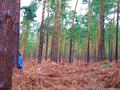
| 02/21/2003 03:52:24 PM | Woodland Clearingby RoseytoneComment: CRITIQUE CLUB CRITIQUE
by karmat
COMPOSITION
The composition of this is helped by having three distinct "bands" of color (undergrowth, trunks, greenery), and having an anchor on the left side of the shot. I think you may have been able to crop the sky out, since it is colorless and bland, and helped the overall effectiveness of the picture.
TECHNIQUE
Good focus and use of lighting. The colors in this are very nice as well. The blue of the jacket really jumps out and grabs the viewer's attention. It seems a little pixelated/grainy to me, but that could very well be my monitor (I'm at work), and not your picture.
OVERALL EFFECT
I believe you have met the challenge well. The person is not an obvious part of the picture, but is visible since the blue is so noticeable. Perhaps if they had been wearing a tan or green jacket, they would have been better hidden (but maybe too much so!) Also, it might have been a neat idea (just a different one, not necessarily a better on) if they had been peeking out around a tree instead of standing by it.
Good work, and good luck in the future. | | Photographer found comment helpful. |
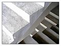
| 02/20/2003 11:42:43 PM | Steps in the right directionby JeanComment: CRITIQUE CLUB CRITIQUE
by karmat
COMPOSITION
Great choice of subject matter. I really like the flow of the diagonal lines, and how they set up contrasts by going in different directions. The brightness of the top steps really grabs the viewer's eyes, so it may have been more effective to have less of them and more of the bottom steps, then the eyes would travel through the picture more easily.
TECHNIQUE
The focus is good, and the lighting overall establishes some nice tonal contrast. I think the upper part is a bit bright, but it would be difficult to tone that down without losing some in the lower sections. You have captured the textures of the steps very well.
OVERALL EFFECT
I love the optical illusion of this one. It is confounding enough to make you look at it for a few seconds more, then it just pops out at you. It looks so 2-dimensional, and 3-dimensional, at the same time. Overall, very nicely done. | | Photographer found comment helpful. |
|
Showing 7021 - 7030 of ~9205 |
Home -
Challenges -
Community -
League -
Photos -
Cameras -
Lenses -
Learn -
Help -
Terms of Use -
Privacy -
Top ^
DPChallenge, and website content and design, Copyright © 2001-2026 Challenging Technologies, LLC.
All digital photo copyrights belong to the photographers and may not be used without permission.
Current Server Time: 07/17/2026 10:05:03 PM EDT.
|