|
|
|
Showing 6931 - 6940 of ~9205 |
| Image |
Comment |
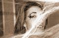
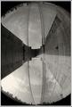
| 03/19/2003 02:38:56 PM | Along Came A Spiderby raybanComment: CRITIQUE CLUB CRITIQUE
by karmat
COMPOSITION
The webbing, helps to draw the eyes from left to right to the spider and the face. I think, however, it would have been more effective to crop the right side, so that the face was on teh edge, and the spider was on the right vertical third line.
TECHNIQUE
Great focus, and the sepia tones really add to this picture, I think. Straight black and white with a lot of contrast might have been interesting as well.
OVERALL EFFECT
Overall, it is a good picture. I know when I was voting, I wondered if the spider's web was supposed to be the bridge. I am suspecting, from comments below, that most people wondered teh same thing. With that thought in mind, it is a good photograph that makes people stop and think. For some reason, I kept thinking of Halloween or a haunted house when looking at it -- it just has that mood.
Best to you in future challenges.
karmat |
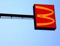
| 03/19/2003 01:37:03 PM | 3 in the skyby kosmikkreeperComment: CRITIQUE CLUB CRITIQUE
by karmat
COMPOSITION
Overall, I think the composition of this shot feels a little static. Though the eye is drawn towards the "3" by the pole, and it is in a natural position to draw from left to right, the even horizontal leaves the eyes no where else to go. I assume you probably used the straight horizontal to even up the three, but did you try it with a tilt or angle to the sign? Also, being on the top third also makes it top heavey to me. Maybe lower in the frame would help?
TECHNIQUE
The focus is fine, though it seems to have a bit of noisy in it. Judging by the colors, it seems that this was taken either at dawn or dusk; it just has that "almost dark" look to it. Did you use a polarizer? That may have made your blues even deeper, allowing more contrast with the sign.
OVERALL EFFECT
According to half of the voter's interpretation, you met the challenge. :-) Aside from that, the picture, though technically sound, comes up a little flat to me. You have some wonderful colors, and I think really using those in contrast to each other would have added some interest.
Best to you in future challenges.
karmat |  Photographer found comment helpful. Photographer found comment helpful. |
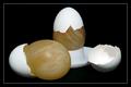
| 03/16/2003 05:42:33 PM | Naked eggs (raw eggs disolved in vinegar)by kiwinessComment: CRITIQUE CLUB CRITIQUE
by karmat
COMPOSITION
I think the composition of this is very strong in part to your arrangement of the shells and "remains." You have managed to build a triangle which fills the frame nicely, but doesn't leave it looking overly crowded. Also, the eyes are drawn to the center of the composition, but it is not overly busy, and not static, either.
TECHNIQUE
Great focus and lighting. My only teeny-weeny nitpick is the shadow in the egg shell on the right. Since there are no noticeable shadows elsewhere, this one stands out ot me. Great clarity.
OVERALL EFFECT
Hmmm, I will have to store this idea away for future science projects. Is the resulting membrane delicate? It looks kinda like wood or something. Good work, and it is well done. I'm surprised that it didn't score higher (but only partially because I know how unpredictable the voters are sometimes! :P)
Best wishes in future challenges.
karmat | | Photographer found comment helpful. |
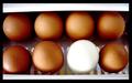
| 03/15/2003 10:37:21 PM | odd one outby quicksand84Comment: CRITIQUE CLUB CRITIQUE
by karmat
COMPOSITION
Though the horizontal placement of eggs gives the picture a solid, stable feeling, it also makes it kinda static. There is nothing to lead the eyes through the picture; they just go to the white egg and stop. I think a tighter crop to remove the white at the top and bottom, or to even it up would have been effective, or arranging the eggs differently, maybe in a cluster instead of rows.
TECHNIQUE
It seems slightly overblown on the white. Maybe a diffuser, or something like a tissue or paper towel (make sure it doesn't ignite!) over your primary light source would help.
OVERALL EFFECT
I think this is a potentially awesome shot. The white adn brown provides a neat contrast, and it does meet the challenge.
Best wishes in the future.
karmat
|
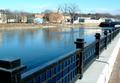
| 03/15/2003 12:41:28 AM | Riverwalkby pitsamanComment: CRITIQUE CLUB CRITIQUE
by karmat
(we meet again -- I just did your "egg" entry, I believe")
COMPOSITION
Unlike some others, I didn't think the leading lines had to lead to any one subject, per se, but they did need to lead the eyes through the picture. Having said that, I do think you met the challenge well, as there are explicit and implicit leading lines here. The obvious ones are the rails and the concrete between the rails and roadway. The less obvious ones are the water adn the shore on the other side. I think the houses and stuff detract from the overall effectiveness of the the lines though. Perhaps if you had framed it a little more to the right, with more of the road showing, then cropped it so that the water, rails, concrete thing and road all met a point in the upper right with none of the other shore showing, it would have had more punch to it.
TECHNIQUE
The focus is good, and the exposure works well. The colors have a nice hue to them, and nothing seems blown out, etc. Good work.
OVERALL EFFECT
Again, the lines do serve to move the eyes through the picture. As stated earlier, I think framing it a little more to the right would have given the eyes somewhere to rest before they were "led" out of the frame.
Best wishes in future challenges.
karmat
| | Photographer found comment helpful. |
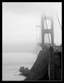
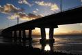
| 03/14/2003 05:48:36 PM | Golden Gate Bridge by byetkoComment: I think it needs to be just a touch tighter on the left, with maybe more of the bridge showing on the right. I really like the bw -- it gives it a mysterious feeling. | | Photographer found comment helpful. |
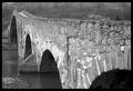
| 03/14/2003 05:47:47 PM | Centuries Oldby jimmyn4Comment: I think it needs a little more room in the top left of the picture (where the "swell" is). I feel like I am going to bump my head. :-) Great capture of the detail in the bridge, though, and bw works very well here, I think. | | Photographer found comment helpful. |
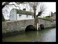
| 03/14/2003 05:46:14 PM | Eynsford Bridge & Fordby Geo_GriffinComment: I like the quietness and "quaintness" of this shot. Very peaceful looking. I wish you had a blue sky this week, this would have been really nice contrasted with the green grass and greenish tints of the roofs. | | Photographer found comment helpful. |
| 03/14/2003 05:45:04 PM | | | Photographer found comment helpful. |
| 03/14/2003 05:44:41 PM | | | Photographer found comment helpful. |
|
Showing 6931 - 6940 of ~9205 |
Home -
Challenges -
Community -
League -
Photos -
Cameras -
Lenses -
Learn -
Help -
Terms of Use -
Privacy -
Top ^
DPChallenge, and website content and design, Copyright © 2001-2026 Challenging Technologies, LLC.
All digital photo copyrights belong to the photographers and may not be used without permission.
Current Server Time: 07/18/2026 05:48:42 AM EDT.
|