|
|
|
Showing 6891 - 6900 of ~9205 |
| Image |
Comment |
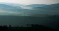
| 03/30/2003 04:59:03 PM | NEW DAYby Pep VentosaComment: CRITIQUE CLUB CRITIQUE
by karmat
(I apologize for being so long to write this -- crazy week.)
COMPOSITION
I really like the "layers" of colors in this shot. This reminds me so much of the Southern Appalachians where I live. It is more difficult to shot effectively than some realize, adn you have done well I think. I also like that the "bottom" layer is very dark, it serves as an anchor for the shot. Also, though normally I think power lines and such detract from shots, this one kinda adds interest for me. It also helps to tie the middle of the picture and the bottom of hte picture together, I think. Perhaps if it had been a little more to the left, it could have become the actual subject of the photo.
TECHNIQUE
Though it has nice colors, and I like the different layers, it does seem a bit bland. I don't know what settings you were using, but maybe a slower shutter could have captured some more??? Or, using a haze filter (or nd filter sometimes helps) would have helped eliminate some of the haze that is just hanging around and not contributing significantly to the picture (mid left). Not sure, so that probably doesn't help alot.
OVERALL EFFECT
This is one of those shots that makes me want ot sit adn stare because it is so peaceful adn serene. Great work
Best to you in future challenges.
|
| 03/30/2003 01:11:22 AM | |  Photographer found comment helpful. Photographer found comment helpful. |
| 03/26/2003 10:40:34 PM | From A Tree Aboveby MonaComment: CRITIQUE CLUB CRITIQUE
by karmat
COMPOSITION
I really like how you have framed this with the trees in the foreground. Not only do they providea natural frame, they also help to establish depth/distance in the picture, and add interest. I assume you have a valid reason for having this vertical, but I find myself wanting to see more on the left and right, in a horizontal fashion.
TECHNIQUE
The focus and color on this are nice. This would be an awesome shot with a nice blue sky, but I understand that you can't control the weather. I would, however, remember this scene and try to re-photograph it if you could, with a nice sky, or even a sunset/rise. The trees on the far side of the valley are a little dull. I live in the Southern Appalachian Mountains, and this is a problem we also have frequently. I have found that a polarizer can sometimes help, as can a neutral density filter because they allow me a longer exposure time in brighter conditions. Someone below mentioned a haze filter, which would probably also be extremely helpful, though I've never used one myself.
Overall effect
A great shot of a location that I would very much like to visit!
| | Photographer found comment helpful. |
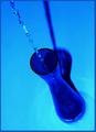
| 03/26/2003 10:26:12 PM | Filling a Flower Vaseby nathaliedooComment: CRITIQUE CLUB CRITIQUE
by karmat
COMPOSITION
I think the composition of this works well in part because the eye "enters" the frame in the top left and is able to follow the water down into the vase. The shadow behind it also sets up some nice converging lines.
TECHNIQUE
The focus here is great, adn you have captured the falling water nicely. I like the overall blue tone, but in the bottom, around the base of the vase, it looks a little odd to me. The blue looks almost blown out and causes it to seem an unnatural teal or aqua color.
OVERALL EFFECT
This is a very interesting shot, adn the blue (with the water) makes it feel peaceful and relaxing to me. It may have been interesting, though not better to crop the bottom of the vase off, then turn the picture upside down. Also, if the blue hues were not acquired in post-processing, a bright yellow or red flower may have added some color contrast. Again, not necessarily making it better, just making it different. | | Photographer found comment helpful. |
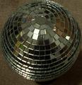
| 03/26/2003 12:08:24 AM | Party On!by NicNic101Comment: CRITIQUE CLUB CRITIQUE
by karmat
COMPOSITION
I think the overall composition of this could have been strengthened by getting closer adn not trying to include the whole thing. Perhaps sitting it on a solid background and getting an edge of it in one corner (lower right, for example). Then, the negative space would help focus the viewer's attention on the subject.
TECHNIQUE
The focus looks off to me, especially as you get to the bottom of the ball. I found myself looking at the individual mirrors, and thought that it would have been neat if you could have arranged/manipulated it so that it ended up being a mosaic of some kind. Sort of a picture within a picture type thing.
It is a good idea, I just think some of the distracting elements (focus, background) kept it from being as effective as it could be.
Best to you in future challenges.
karmat | | Photographer found comment helpful. |
| 03/25/2003 11:48:07 PM | Catching diamondsby sdarComment: CRITIQUE CLUB CRITIQUE
by karmat
COMPOSITION
You have done well at cropping this so that the subject fills the frame diagonally. I think it works well that the eyes start in the lower left and go up and right. Then, on the right side, they are brought back down following the water droplets.
TECHNIQUE
The skin tones look okay, but the bath tub and water have a pinkish cast to me, and that gives it an unnatural feeling. You have captured the falling water very well. The focus on her face seems a bit soft, though. Since that is naturally where the viewer is going to look, I think it probably should be very clear. As a result, it gives the feeling of being a touch off, focus-wise, even though the water clearly shows that is not the case. Some of the water is a bit blown out, but I don't know if that detracts from it, or adds to the feeling of "brightness" in this shot. Just out of curiousity, did you try this in black and white?
OVERALL EFFECT
This shot immediately makes the viewers (well, most of them)smile because they remember their fun times in the tub, or their childrens' fun times. It is definitely a shot that you will want to save.
Best to you in future challenges. |
| 03/25/2003 11:20:30 PM | Kitchen Sponge Artby RefocusedComment: CRITIQUE CLUB CRITIUE
by karmat
COMPOSITION
I think the composition in this shot is "scattered" but has a lot of potential. The randomness of the colors is great for keeping the eyes moving, but then they just settle on the faucet. I imagine that is because the faucet looks a little out of place to me. I would recommend cropping it so that just the sponges, no faucet, filled the frame.
TECHNIQUE
The colors here are awesome. So many times the darker colors all look black, but here they are distinguishable. It looks like the sponges have been "stabbed" and have dribbled all of the soap! My only suggestion would be to get a lot closer. Get right down near the sponges so that the texture of them and the bubbles are nice and visible. I think doing that would have given your shot a lot more visual, and immediate, impact.
OVERALL EFFECT
This looks like a fun shot to set up. It's colorful and thus "happy." Nice work. The faucet really doesn't fit in it though, for the reasons mentioned above.
Good work and best to you in future challenges. | | Photographer found comment helpful. |
| 03/25/2003 11:11:22 PM | Steps and Pillarby jjbeguinComment: CRITIQUE CLUB CRITIQUE
jjbeguin -- I am honored to have the opportunity to "study" your picture and offer my evaluation of it. As I feel you have much more knowledge and skill in photography than I do, I am abandoning my normal form of critique (composition, technique, overall effect), as I honestly don't think I could tell you anything that you don't already know! :-) Instead, I am going to offer to you my impressions of your picture. I did not get to vote in the "From Above" challenge, so my introduction to your shot was when it was selected from the queue for me to do this critique.
My first impression, honestly, was what am I looking at??? When I saw that it was for the "From Above" challenge, I looked closer and still could not figure it out completely. At this point, while I like the colors and textures, it had a "flat" look to me, and wasn't distinguishable. Then, when I saw that you were the photographer, I knew that there had to be something there, so I looked some more. Upon this third, carefully scrutinizing look, I began to make out the steps. Until then, I had just noticed the strength of downward "thrust" that the lighter areas provided, with a sharp contrast to the upwards diagonal. I was also impressed by the "conflict" of the light vs. dark areas.
This picture to me was kind of like one of those illusions that you study and study, then when you figure out what it is, it is so obvious you want to hit yourself in the head. I suspect in trying to vote on around 200 pictures, people don't have time to study every shot for the 20 or so minutes that I had for this one! As a result, your score is lower than you usually receive. I think those that "got it" voted you high, and those that didn't just didn't get it.
| | Photographer found comment helpful. |
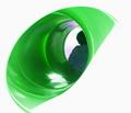
| 03/25/2003 05:26:29 PM | In the Eye of the Slideby OneSweetSinComment: CRITIQUE CLUB CRITIQUE
by karmat
COMPOSITION
I think it is interesting how this has been done to look like a giant green eye. It "flows" diagonally through the shot, and that gives the shot a lot of motion. I think it needs to be cropped closer on the top though as it feels crowded at the bottom because it is "running" out of the frame.
TECHNIQUE
The color in this is very eye catching. I am assuming this is a child going down a slide, though it looks more horizontal than vertical. The slide seems to be in focus, but I think it may have been more effective if the child wasn't quite so grainy.
OVERALL EFFECT
This is an interesting abstract, but I think the high level of contrast almost makes it difficult to look at. I found myself staring at the lower side of the "eye" where it is almost a straight line. Then I found that my eyes were drawn to the white areas, where there was nothing.
Best to you in future challenges. | | Photographer found comment helpful. |
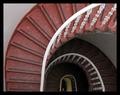
| 03/25/2003 05:17:25 PM | Round and Roundby agwrightComment: CRITIQUE CLUB CRITIQUE
by karmat
COMPOSITION
I really like how you have composed/cropped this shot. You didn't try to include too much which would have taken away the wonderful detail, but you left enough for the eyes to have something to follow "downwards."
TECHNIQUE
The focus on this is great, and you have used the available lighting to your advantage. It would have made this shot more immediately appealing if there was light on the lower levels, but if it were coming from above it would blow out the upper level, and I think it works okay the way it is. The darkness, getting "thicker" as you go down helps to anchor the shot and really sets up nice contrast with the upper levels. I like the colors, and I think this shot works well in color, but out of curiousity, I was wondering if you tried it in black and white with a lot of contrast. I don't think it would make it better, but it would be interesting, I think.
OVERALL EFFECT
This is a shot that literally draws you into it. Very well done, and I enjoyed it. Sorry I could not offer more in the way of improving it, because I think it is already very nicely done.
Good work and best to you in future challenges.
karmat | | Photographer found comment helpful. |
|
Showing 6891 - 6900 of ~9205 |
Home -
Challenges -
Community -
League -
Photos -
Cameras -
Lenses -
Learn -
Help -
Terms of Use -
Privacy -
Top ^
DPChallenge, and website content and design, Copyright © 2001-2026 Challenging Technologies, LLC.
All digital photo copyrights belong to the photographers and may not be used without permission.
Current Server Time: 07/19/2026 11:02:06 AM EDT.
|