|
|
|
Showing 6881 - 6890 of ~9205 |
| Image |
Comment |
| 03/30/2003 11:28:50 PM | Jenineby rj324Comment: What a beautiful girl. This is a great shot. I almost think cropping the top some, maybe down on her head a little would really focus attention on her eyes. Nice work! |  Photographer found comment helpful. Photographer found comment helpful. |
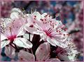
| 03/30/2003 11:27:52 PM | Joyby falveyComment: I like the bright colors and the dof you used! |
| 03/30/2003 11:27:34 PM | | | Photographer found comment helpful. |
| 03/30/2003 11:27:20 PM | |
| 03/30/2003 11:26:43 PM | I Hate Showersby nathaliedooComment: I can appreciate this so much. I wanted to get a good picture of one of my 14 months old's tantrums, but he didn't have a good one while I had my camera ready!!
I really like the crop you used here! | | Photographer found comment helpful. |
| 03/30/2003 11:25:47 PM | Almost Holy by KonadorComment: Great use of negative space, and the lighting is awesome! 10 | | Photographer found comment helpful. |
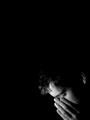
| 03/30/2003 11:25:24 PM | Melancholyby clues56Comment: Awesome shot. At first, I thought perhaps you needed more light on the right, but after looking at it, I think the darkness contrasting with the light really adds to the effect. 10 | | Photographer found comment helpful. |
| 03/30/2003 11:21:07 PM | Still Life with Orangesby boyte1Comment: CRITIQUE CLUB CRITIQUE
by karmat
COMPOSITION
I really like the composition fo this. The vertical-ness of the background baskets are offset nicely with the round one containing the oranges. Also, like I said during the voting, I think that the color, as well as the placement, of the oranges gives a nice resting point for the eyes.
TECHNIQUE
The focus here is awesome. I can see the details in the baskets and on the oranges. I noticed a couple of comments about being too dark. On my monitor it looks right on, there are details in the shadowy parts, adn nothing is too blown out.
OVERALL EFFECT
This is a great still life. I am sorry I can not make more suggestions for improvements, but I simply do not see what could be improved greatly. I suspect that the voters simply weren't "grabbed" by oranges in a basket, perhaps. If this had been apples, it would have looked great in my kitchen, maybe between two of the baskets I have in there! :-)
Best to you if future challenges
| | Photographer found comment helpful. |
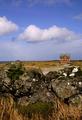
| 03/30/2003 05:22:46 PM | Tranquillityby TarbiniComment: CRITIQUE CLUB CRITIQUE
by karmat
COMPOSITION
Your composition is really effective the way the walk (?) draws the eyes from the upper right to the left, then the water takes them back to the right. Also, the three "bands" of color really break the photo up and add interest to the shot.
TECHNIQUE
The focus and lighting is really good in this. For my personal taste, the greens may be a touch over saturated, but with 9 inches of unexpected snow on the ground outside, I think I like it anyway! :-)
OVERALL EFFECT
This shot has some really neat elements in it. The longer I look at it the better I like it. Very peaceful, and pleasant. Nice work.
karmat | | Photographer found comment helpful. |
| 03/30/2003 05:11:18 PM | What's your favorite dish?by vjozComment: CRITIQUE CLUB CRITIQUE
by karmat
Rough when you can't think of anything, isn't it? I've been there. When that happens, sometimes I take my camera out and just start shooting pictures and let whatever may happen. Othertimes, I will find a nice online gallery adn surf through it for a while.
About this picture:
COMPOSITION
I like the strong vertical "movement" of the dishes. You ahve a nice pattern set up here, and I think that it could potentially make this an awesome shot. Perhaps if the front dishes were evenly spaces, adn set a stringent "rhythm" then the back dish set like it is, almost as if it were "marching to a different drummer" it would have more immediate impact. They look a little too random, right now, I think.
TECHNIQUE
I like the hint of colors showing, and the front dishes being out of focus doesn't bother me too much. I do think that if perhaps there were some behind the focused one, and they were out of focus as well, it would make for a stronger visual image. Also, there is a strange shadow on the focused plate that looks like you may have adjusted either contrast or saturation a bit too much, and it looks a little like noise.
OVERALL EFFECT
I think this is a potentially good shot, it just lacks some of the "organization" things that would give it "grabbing" power. I do not mean to say that all shots must look straight or organized, but sometiems it helps to "control" the chaos.
Best to you in future challenges.
karmat | | Photographer found comment helpful. |
|
Showing 6881 - 6890 of ~9205 |
Home -
Challenges -
Community -
League -
Photos -
Cameras -
Lenses -
Learn -
Help -
Terms of Use -
Privacy -
Top ^
DPChallenge, and website content and design, Copyright © 2001-2026 Challenging Technologies, LLC.
All digital photo copyrights belong to the photographers and may not be used without permission.
Current Server Time: 07/18/2026 02:20:32 PM EDT.
|