|
|
|
Showing 6861 - 6870 of ~9205 |
| Image |
Comment |
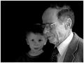
| 04/04/2003 10:47:40 PM | Mother and son by jjbeguinComment: CRITIQUE CLUB CRITIQUE
by karmat
Once again, I have the pleasure of studying one of your creations, adn getting to try and actually tell you something you need to do about it! Once again, I am hard pressed to find fault with this picture, but I can tell you what my opinions are on it, humble though they may be.
I love the pride and "dignity" that the man is showing. He seems pleased to be posing for you, and is a great capture of emotion. I assume Chantal is his mother, and though she looks more like, "okay, take the picture already," you can tell she is doing it because he enjoys it, adn that in itself gives her pleasure. Her stance is almost one of protection of him, and I wonder if the mood of the shot would be changed if their positions were reversed?
I am trained as a teacher for students with various "disabilities" (I prefer the term differences) so this shot really struck a nerve with me. So many times, society wants to cast those who are different away, or at least hide them. Vincent looks like to me he is ready to charge hell with a water pistol, and does not try to hide it. Judging from this shot, he has tried, and succeeded, and mom is very proud of him. Great emotional capture.
Technically, the background gives it a relaxed portrait mood (again contrasted with Vincent's pose), and the sepia tones are awesome. The only nitpicky critical thing I would say is that I wish he were further to the left of the frame. It feels like Chantal is crowded to me. |  Photographer found comment helpful. Photographer found comment helpful. |
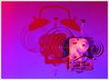
| 04/04/2003 10:38:08 PM | Time Lives A Life Of Its Ownby moonoComment: CRITIQUE CLUB CRITIQUE
by karmat
Normally, I follow a set guideline for critiquing pictures, but it doesn't seem to work for this one. As a result, I am simply going to give you my impressions of the picture, and maybe something will be helpful.
The colors were the first thing I notices. I like the contrast of the warmer face of the clock, and the cooler greens/blues, etc. It kinda looks like a watercolor painting to me in a way. I also found it interesting that the face of the clock is barely discernable, yet the word "quartz" is very plain. As a result, that is where my eyes tended to rest. Unfortunately, it is at the very bottom of the frame, and then they tend to go right out of the picture.
I am not a huge fan of abstracts, though this one was interesting to me because the colors reminded me of the sky and the sun. I do think though, that many may have interpreted your extreme post processing as more of a cover for some inherent flaw in the picture, rather than just an attempt to be creative and avant garde.
Best wishes to you in future challenges.
karmat | | Photographer found comment helpful. |
| 04/04/2003 12:02:46 AM | Reflections in Timeby jaygComment: CRITIQUE CLUB CRITIQUE
by karmat
COMPOSITION
This shot reminds me of a picture in a picture. The position of the clock works well. It is not in the center, so it doesn't give the shot a static look, and allows for the warm color of the wall to be prominent.
TECHNIQUE
The lighting of this shot is very interesting. The blinds (I presume) cast a neat shadow on the shot, and the clock itself is a good reflector. The focus is also good, and I like the warm hue of the colors -- it gives it a "late day, late summer" feel to it.
OVERALL EFFECT
I like the reflection in the clock, and the symbolism that could infer. I think though that if the reflection itself had been clearer, the picture would be more effective. It is tricky to do though, because in order to get the numbers AND the reflection in focus, the camera actually has to focus on two different planes.
Overall a pleasant picture.
Best to you in future challenges. |
| 04/03/2003 05:38:47 PM | Old Friendby greenem2Comment: CRITIQUE CLUB CRITIQUE
by karmat
COMPOSITION
The composition of this is simple, but effective, I think. It is composed tight enough that there is not a lot of wasted background space, adn it is clear what the subject of the photograph is.
TECHNIQUE
The focus here is very good. Great detail in the texture, especially on the side of the face. The lighting is a bit harsh, I think, causing some of it to almost blow out. the black adn white works well to give it a feeling of notalgia, but did you try sepia tones. That may have warmed it up a little bit.
OVERALL EFFECT
Though I saw the connection to time clearly, I suspect some voters may not have. This is a very good picture technically, and I like how you have shown the effect of time more than just a watch or numers. Good work and best to you in future challenges.
karmat
| | Photographer found comment helpful. |
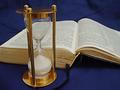
| 03/30/2003 11:48:06 PM | Time Draweth Nighby briphotoComment: I love the idea, and the blue background really gives this an almost elegant feeling to it. I would suggest propping the Bible up, so that the words were more visible, adn getting into a slightly lower position with the camera so that it is more straight on rather than having a "down" look to it. Also, that would capture the sand in the hourglass more, and if you had just a few remaining, they would be more noticeable. |
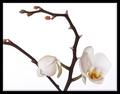
| 03/30/2003 11:46:40 PM | Time & Patienceby rafterComment: A beautiful shot. It seems a little unbalanced to me because you have cropped what seems to be a very small part off of the left, and left some room on the right. Maybe a little tighter on the right? |
| 03/30/2003 11:45:53 PM | | | Photographer found comment helpful. |
| 03/30/2003 11:45:38 PM | Time Fliesby SwashbucklerComment: A much tighter crop of this would make it even more effective I think. The chain on the pocket watch looks out of place almost with that sharp angle. | | Photographer found comment helpful. |
| 03/30/2003 11:44:56 PM | Spring Timeby Dr NickComment: Great colors, adn an astounding execution of a wild idea. I hope people look at this long enough to get teh full impact of it! |
| 03/30/2003 11:44:26 PM | Life Spanby dsidwellComment: Wonderful capture. I think the empty space is a bit too much though. It is not enough to be effective negative space, but too much to be a "margin" of sorts, especially since the right is cropped much tighter. I really like this in black and white! | | Photographer found comment helpful. |
|
Showing 6861 - 6870 of ~9205 |
Home -
Challenges -
Community -
League -
Photos -
Cameras -
Lenses -
Learn -
Help -
Terms of Use -
Privacy -
Top ^
DPChallenge, and website content and design, Copyright © 2001-2026 Challenging Technologies, LLC.
All digital photo copyrights belong to the photographers and may not be used without permission.
Current Server Time: 07/18/2026 11:11:04 PM EDT.
|