CRITIQUE CLUB CRITIQUE
by karmat
Normally, I follow a set guideline for critiquing pictures, but it doesn't seem to work for this one. As a result, I am simply going to give you my impressions of the picture, and maybe something will be helpful.
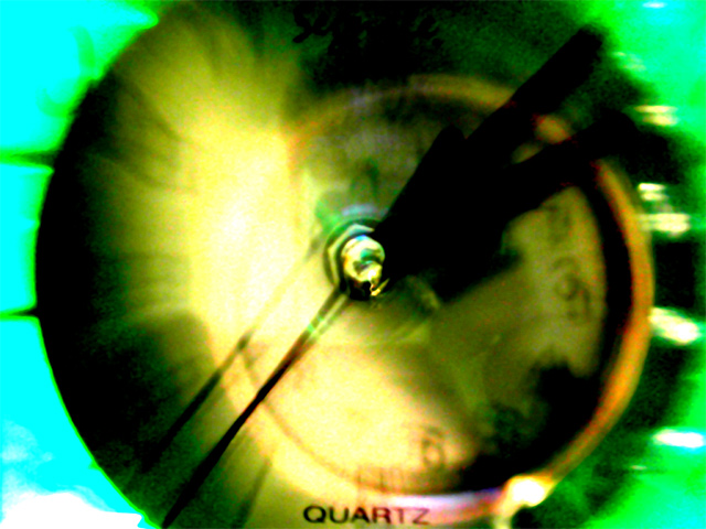
The colors were the first thing I notices. I like the contrast of the warmer face of the clock, and the cooler greens/blues, etc. It kinda looks like a watercolor painting to me in a way. I also found it interesting that the face of the clock is barely discernable, yet the word "quartz" is very plain. As a result, that is where my eyes tended to rest. Unfortunately, it is at the very bottom of the frame, and then they tend to go right out of the picture.
I am not a huge fan of abstracts, though this one was interesting to me because the colors reminded me of the sky and the sun. I do think though, that many may have interpreted your extreme post processing as more of a cover for some inherent flaw in the picture, rather than just an attempt to be creative and avant garde.
Best wishes to you in future challenges.
karmat |