| Image |
Comment |
| 04/07/2003 12:39:59 PM |
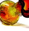
Crackle Glassby WILDBLUEComment: CRITIQUE CLUB CRITIQUE
by karmat
COMPOSITION
You have filled the frame with the subject nicely. Also, I like the diagonal movement provided -- it is much more effective than a simple horizontal or vertical framing. Maybe just a touch more space at the top, or a tighter crop at the bottom would give it a more balanced feeling.
TECHNIQUE
Great focus and colors. I like that the cracks are so visible. Also the colored shadow is a great touch. I think that if there was even more of that, it would particularly effective.
OVERALL EFFECT
This is a great abstract. It is "out there" enough to gain the viewers interest and keep it, but not so wild that it totally confounds. The colors are very warm and inviting. I think this would look good on the wall of a modern apartment or townhouse, etc.
best to you in future challenges. karmat |
 Photographer found comment helpful. Photographer found comment helpful. |
| 04/06/2003 11:52:59 PM |
Old Habana Edificio (Building)by azzemotoComment: CRITIQUE CLUB CRITIQUE
by karmat
COMPOSITION
I really like the "streetcorner" look of this shot. I think it fills the frame up nicely for the most part, though there doesn't seem to be any one thing to focus on. Instead, the focus for many would probably be wondering how you got it to look so "faded." Perhaps a slightly tighter crop on the sides and top would help to define the picture more.
TECHNIQUE
I found the faded look very interesting, and even more so after seeing that it was a "natural" effect and not achieved in photoshop (or equivalent). Unfortunatly, it does leave the impression of being out of focus, which historically, doesn't do well here. I think the suggestions of sepia may be right on. It would give a more "authentic" look to your shot.
OVERALL EFFECT
I think the "time" element is there, it is just obscure. The picture does look like you are looking backwards in time, but that is probably a further stretch than some viewers wanted to go. Overall, a nice picture, and best to you in future challenges. |
| 04/05/2003 11:57:29 AM |
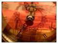
Reflections on Timeby BudweezerComment: CRITIQUE CLUB CRITIQUE
by karmat
COMPOSITION
The composition of this is really strong. You have filled the frame with the main object, and your subject is easily identifiable.
TECHNIQUE
The colors here are wonderful. The orange of the desert scene really complements the brassy/gold of the clock hands. Also, I like that the hands of the clock are so well focused. It gives the eyes something distinguishable to "rest" on. Choosing a desert scene, such as you have, works well because the reflection does not have to be in focus to be identifiable. Being slightly "soft" adds to the overall warmth, I think. My only suggestion would be to reposition the hands. I think the "short" hand needs to be more around the 11 or 12 (a normal 3 o'clock position, but I see your clock is on its side), and the "long" hand around the 6.
OVERALL EFFECT
I did notice the tiled in the background in voting, but it wasn't too distracting. If you wanted to eliminate it, possible laying a similarly colored towel or cloth down may have helped to "disguise" it. Otherwise, it adds some "surrealness" to the shot, and makes the viewer stop and look a little more.
Good work and best wishes in future challenges.
karmat |
| Photographer found comment helpful. |
| 04/05/2003 12:09:59 AM |
|
| Photographer found comment helpful. |
| 04/05/2003 12:00:44 AM |
|
| Photographer found comment helpful. |
| 04/05/2003 12:00:32 AM |
Spookyby joebarComment: Great work, and wonderful in black and white. |
| Photographer found comment helpful. |
| 04/05/2003 12:00:00 AM |
|
| Photographer found comment helpful. |
| 04/04/2003 11:45:58 PM |
Flame On! by joebarComment: I would not change a thing. Great capture. Wonderful shot! |
| Photographer found comment helpful. |
| 04/04/2003 11:45:31 PM |
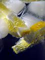
Gin and Tonicby pinbackComment: Awesome colors and focus. Did you try flipping it so the lemons were on top and the ice on the bottom? |
| Photographer found comment helpful. |
| 04/04/2003 11:44:55 PM |
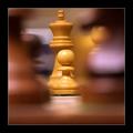
Behind Enemy Linesby arnitComment: The blurred foreground really makes the center o the picture "pop." Very well done. |
Home -
Challenges -
Community -
League -
Photos -
Cameras -
Lenses -
Learn -
Help -
Terms of Use -
Privacy -
Top ^
DPChallenge, and website content and design, Copyright © 2001-2026 Challenging Technologies, LLC.
All digital photo copyrights belong to the photographers and may not be used without permission.
Current Server Time: 07/19/2026 05:44:23 AM EDT.