| Image |
Comment |
| 04/26/2003 03:14:16 PM |
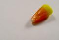
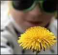
Candy Cornby AnnidaComment: CRITIQUE CLUB CRITIQUE
by karmat
COMPOSITION
I like the use of negative space here. It really accentuates the candy, and forces the viewers' eyes to it. I think though, that a lower left placement may have made it feel more balanced, at least to me. Right now, it just kinda feels like it is hanging there. Of course, if that is what you were trying for, then you succeeded!
TECHNIQUE
The first two things I noticed was that the background was gray and the candy seemed to be a touch out of focus. maybe the gray could be fixed (if you wanted it more white) with white balance adjustment or by boosting contrast, or by using more light. It may not be so much the background being dark as the site's gray really emphasizing it and making it noticeable.
I do thing a sharper focus on the candy would have made a big difference. The details of it are showing, but it seems a little soft around the edges.
OVERALL EFFECT
I really like your use of negative space. I do think a brighter background and clearer focus would have really made this image *pop.*
|
 Photographer found comment helpful. Photographer found comment helpful. |
| 04/26/2003 12:33:40 AM |
Springby GeocideComment: I love the contrast/compliments of the colors in this one, and though it seems rather soft, I find it effective! |
| Photographer found comment helpful. |
| 04/26/2003 12:33:02 AM |
|
| Photographer found comment helpful. |
| 04/26/2003 12:32:33 AM |
|
| Photographer found comment helpful. |
| 04/26/2003 12:32:02 AM |
Disappearby jimmythefishComment: The leading of the bridge through the picture is effective, I think. And you definitely have "flora." Nice work. |
| Photographer found comment helpful. |
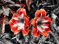
| 04/26/2003 12:31:25 AM |
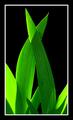
Floraby STEINRComment: Normally, I don't like pictures that look more graphic than photographic, but this one is particularly effective. The grays make the color of the flower even more bold. I only think the flowers could be a little less centered. |
| Photographer found comment helpful. |
| 04/26/2003 12:30:17 AM |
Azaleaby ChrisW123Comment: Wonderful light, and good use of a shallow depth of field. |
| Photographer found comment helpful. |
| 04/26/2003 12:29:07 AM |
|
| Photographer found comment helpful. |
| 04/26/2003 12:28:56 AM |
crossedby falveyComment: Very simple and very effective. I like the dramatic lighting you have used. Great work |
| 04/26/2003 12:28:03 AM |
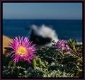
Beach Floraby MiekaComment: I love this shot. Great use of shallow depth of field, and I like the color of the flowers. |
| Photographer found comment helpful. |
Home -
Challenges -
Community -
League -
Photos -
Cameras -
Lenses -
Learn -
Help -
Terms of Use -
Privacy -
Top ^
DPChallenge, and website content and design, Copyright © 2001-2026 Challenging Technologies, LLC.
All digital photo copyrights belong to the photographers and may not be used without permission.
Current Server Time: 07/19/2026 04:43:54 PM EDT.