|
|
|
Showing 6751 - 6760 of ~9205 |
| Image |
Comment |
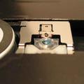
| 05/13/2003 01:04:55 PM | Sparkling Tracesby eloiseComment: I think this would have made a much more interesting macro. However, I understand that sometimes the risk involved would just be too great. Maybe if the pieces of glass were a little more distinguishable. Right now, the crack in the pavement is what grabs and holds my attention. |  Photographer found comment helpful. Photographer found comment helpful. |
| 05/13/2003 01:01:12 PM | Clever Sliverby knightdComment: I like the dramatic angle of this, and the shallow depth of field could be more effective, I think, if the glass part was more in focus. The colors are a little drab, too, to me. Maybe convert to a pure bw or sepia and use a lot of contrast? | | Photographer found comment helpful. |
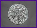
| 05/13/2003 12:54:18 PM | The Weight of a Snowflakeby JeileenComment: I think a different background color would add some interest to this, as well as a different camera angle. As a picture, it doesn't seem to have any "depth" to it, and it seems kinda static with the centered composition.
On a side note, why a purple border? It does pull attention to the shot, but I don't think it adds to it. Maybe a black or gray border would have worked better. | | Photographer found comment helpful. |
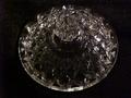
| 05/13/2003 12:52:07 PM | glassby BeckyComment: There seems to be a lot of noise in this. Was this a slow shutter speed? I like the designs in the glass. You may have done well to get closer to it, and not have it quite so centered. |
| 05/13/2003 12:51:17 PM | The Glowing Lightby PHOTOCHlXComment: This is a nice idea, and I like the composition of it. I think though, sharper focus would help tremendously. I would suggest slowing down the shutter speed, but that may blow the candlelight out (no pun intended). Perhaps you could have the room well lit, and shoot it with a fast shutter or something. Not sure. |
| 05/13/2003 12:49:20 PM | Close up of a windowby morterinComment: I like the colors and the balance between the dark and light and how they transpose themselves. I think, though, to have more interest and photographic merit (totally my opinion, you understand) it needs to have something to a source of focus, or maybe have a little more context to it. | | Photographer found comment helpful. |
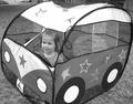
| 05/12/2003 12:02:35 AM | I Can't Drive 55!by sabal5Comment: CRITIQUE CLUB CRITIQUE
by karmat
The quality of this shot is very good. The details are visible, and it is well lit/exposed. The black and white is okay, but I can't help but wonder what the color version would look like.
I think a couple of things could be done to really make this an awesome shot. First of all, a lower camera angle would have "emphasized" the child more. Right now, it has a "snapshot" feeling to it instead of a "portrait" feeling because the viewer is looking down on her. However, this will really bring up some stuff in the background that you may not want to see, so a tighter crop, even allowing some of the car to "exit' the frame might have to be done.
If you want to leave it like it is, though, I would strongly recommend cropping the top so that the car and house is not showing. Also, by cropping it as closely to the "car" as you have, it feels very tight and cramped. Maybe "loosening" it a little on either side, or cropping it so that some of it is not shown, might work.
I think you have chosen an excellent subject. I, for one, appreciated the humor you portrayed, and the take on the challenge. This is a shot that you, or the parents of the child if it is not you, will enjoy for years. Best to you in future challenges.
| | Photographer found comment helpful. |
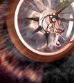
| 05/11/2003 11:50:44 PM | Take Off!by adineComment: CRITIQUE CLUB CRITIQUE
by karmat
Very cool shot!! I like the "motion" of it. This picture has a lot of energy to it. This is one time that the lens flare really added to the picture, I believe, both by adding interest and an almost "mystical" feel to it. I really like the background you have used. By not being solid black, it almost looks to me as if the bike is flying through space or something.
The light on the cogs is a bit bright, and this makes it look ever so slightly out of focus. Also, I think it wouldn't feel quite so like it was flying out of the frame if it was a little lower and to the left more. Of course, if you want that "flying out of the frame" feeling, then pat yourself on the back, because you obviously succeeded!!
A great shot, and best to you in future challenges. | | Photographer found comment helpful. |
| 05/11/2003 11:44:24 PM | Oh Lord, won't you buy me, a...........by robconComment: CRITIQUE CLUB CRITIQUE
by karmat
I like the dramatic angle you have chosen to present this with. It really adds interest to the shot, and makes it different. I also like that it is place in the lower left and in a sense, leads the viewer's eyes up and into the frame. I think the positioning of it gives a stable feeling to the picture, and a solid place to "rest the eyes."
To make it stronger, I think it may have been beneficial to either present it in color, or use more contrast in the bw. Right now, it is a muddled look to me, no distinct black or white, or even dark/light gray -- all of the grays are sort of in the middle of the spectrum. I think a crisply focused shot in color would have also had a nice effect.
Finally, the shot looks a little grainy to me. I understand this may be intentional sometimes, but I'm not sure it is truly effective here. Maybe a lower ISO would have eliminated some of that.
If you have questions or comments, please let me know. Best to you in future challenges! |
| 05/08/2003 05:05:09 PM | Flying V Guitar. Going... Going.... Gone!by GordonComment: CRITIQUE CLUB CRITIQUE
by karmat
I think the quality of this picture (focus, lighting, etc) is great. The details of it are visible and clear, and you have left no doubt what the outcome was! I also like how the sequence is even with a "before/during/after" feeling to it. At one point the "pilot's" head being cut off bothered me, but since the guitar is the object of focus, it really doesn't seem to matter. I think what is missing from this "story" (and it does a good job of telling one), is emotion. Technically it is very well done, but emotionally it comes up a bit short.
To be perfectly honest, I was surprised that this was yours. After seeing some of your other triptyches, this just doesn't seem to compare. Again, this one is good, but it lacked that certain element, the "wow" factor if you will, that made it shine above the others.
I truly enjoy your work, and hope that this doesn't sound too harsh.
karmat
|
|
Showing 6751 - 6760 of ~9205 |
Home -
Challenges -
Community -
League -
Photos -
Cameras -
Lenses -
Learn -
Help -
Terms of Use -
Privacy -
Top ^
DPChallenge, and website content and design, Copyright © 2001-2026 Challenging Technologies, LLC.
All digital photo copyrights belong to the photographers and may not be used without permission.
Current Server Time: 07/20/2026 01:43:57 PM EDT.
|