|
|
|
Showing 5801 - 5810 of ~9205 |
| Image |
Comment |
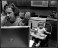
| 01/06/2006 01:14:20 AM | Unbreakable Bondby twm122Comment: There's something about the colors of their shirts that is not working for me. Individually, they work okay (adn orange looks really good on her!), but I think the orange sweater may be dominating the scene and taking away from their faces. |  Photographer found comment helpful. Photographer found comment helpful. |
| 01/06/2006 01:10:19 AM | | | Photographer found comment helpful. |
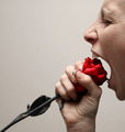
| 01/05/2006 09:13:12 PM | Rose6899by angela_packardComment: CRITIQUE CLUB CRITIQUE
by karmat
Okay, if I can stop laughing long enough, I'll tell you what I think of this picture.
Compositionally, this is an excellent set up. The stem of the rose leads the viewer's eyes up and into the frame, where they are met with the face. The crop of the head is very effective, I think, for adding to the "tension" in the shot and driving the focus to the mouth and rose.
Technically, the focus and lighting is good, and the exposure is good as well. The red of the rose is very nice, but the gray stem kind of bothers me. I didn't notice it at first, but the more I look at it, the more I notice it. Also, and this is just a nitpick, the pattern on your nails distracts me from the subject. Not enough that if I were voting, I would vote it down, but I find myself looking at them. Probably because they are in close proximation to the rose.
Someone mentioned a different color background. I had not thought of it, but it would be interesting to see what it would look like with a white white backgroun (now, it is a grayish color) or a black one. It might have even been interesting to do it with a "wild" color. If you don't have gels for your lighting (and most of us don't), I have found that the plastic report covers that you can find in school supplies work okay. Of course, it would have cast a different color on the face and rose, so you would have had to had a separate light (with the color) shining on the wall.
It meets the challenge, and I think it is quite funny.
Good work and best wishes in future challenges.
karmat | | Photographer found comment helpful. |
| 01/03/2006 05:05:21 PM | Color chart gone nativeby BoltiComment: CRITIQUE CLUB CRITIQUE
by karmat
Technically, you have done well with your shallow dof. I like the blurred/focus/blurred way you have set it up. Also, the colors are awesome.
Compositionally, it feels a little \"open\" to me. I think a tighter crop would help to focus the attention on the crayons better. Also, I find myself leaning to the right trying to see the points more. Maybe a sharper angle of incident between you and teh tips, so that the frame is filled more.
Overall, this is a well executed shot and fits the challenge.
Good work, and best to you in future challenges. Hang in there and I look forward to seeing your future submissions.
karmat | | Photographer found comment helpful. |
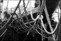
| 01/03/2006 04:24:25 PM | Tying it Togetherby alienhelixComment: CRITIQUE CLUB CRITIQUE
by karmat
Compositionally, I really like this shot. The white rope is an attention getter that draws the eye to the center cord and then through the rest of the shot. It is balanced with the main focus being on the right third and the shallow dof being more in the left of the frame. At first I disagreed with the suggestion of a tighter crop/frame, but the more I look at it, the more I think it may make the composition stronger.
Technically, it has good dof and focus where the focus needs to be. My only thought is that it is a bit "gray." I believe a bit more black would give it some more depth and *pop*.
Overall, it is a nice nautical scene, and frankly, I'm surprised it didn't score higher.
Best wishes and Good work.
karmat | | Photographer found comment helpful. |
| 01/03/2006 03:58:11 PM | Birthday roseby MajankaComment: CRITIQUE CLUB CRITIQUE
by karmat
Technically, this shot is superb. The lighting is great, and the exposure shows the details throughout the flower. Also, the contrast between the green and red is nice.
Compositionally, I think this shot could have had a bit more *oomph.* As it is, it feels slightly unbalanced and static. By having the focused rose rising so far above the rest, the composition "feels" top heavy. Also, because of the tight crop and almost-centered composition of the main flower, the viewer looks at the flower, then proceeds on. There is nothing to keep the viewer looking, or nothing to help the viewer move about the frame.
Suggestions -- If you had 34 other roses (happy birthday!) you had the potential to really have a nice full composition. If you wanted to have the one isolated like you have, I think having a wider crop on the top and right would have helped. The nice clean white background would have created negative space and forced the focus onto the one rose.
Good work and best wishes in future challenges.
karmat | | Photographer found comment helpful. |
| 12/29/2005 05:35:58 PM | | | Photographer found comment helpful. |
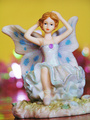
| 12/28/2005 02:14:01 PM | Fairy Thinkingby MushComment: Overall, I think you met the challenge well -- it does have shallow depth of field. You also have some nice bokeh patterns in the back.
From my experience, pictures of figurines do not do as well on dpc. That said, I think you could have made this more interesting by chosing a unique angle, or including just part of the fairy in the picture (not the whole thing). As one photographer told me. Frame your shot, then get closer. Repeat. ;) Don't be afraid to fill the frame with your subject. | | Photographer found comment helpful. |
| 12/11/2005 04:31:01 PM | Spare Changeby runin2dsonComment: CRITIQUE CLUB CRITIQUE
by karmat
Compositionally, I love how this shot is set up. The stacks snake up and curve almost like they are actually growing. By doing it that way, the shot has "movement" (the eyes are drawn upwards through the stacks) but it is still stable because you have located them primarily on the right third (Though cropping just a bit of the far righ side may have made it a more even third, if that is what you wanted). The apparent randomness also adds appeal to me for this shot.
Technically, the orange background is awesome. I also like how it "fades" from yellow to orange. I do think if the focus was a bit sharper on the pennies throughout it would have had more punch. While I certainly understand that not all of the subject *needs* to be in focus, I think what happens in this shot is that the eyes are pulled towards the fuzzier ones.
Overall, I find this shot very appealing. I would have expected a higher score for it. Crawling inside the head of a typical dpc voter (yes, it is scary sometimes), pocket change is everyday, and while presented in a unique way, it still lacks something that many people can identify with. What you have done compositionally is awesome, but it takes a second or third glance to realize the beauty of it.
Great work, and best to you in future challenges.
karmat |
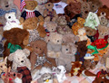
| 12/10/2005 04:24:37 PM | My Stuffed Stuffby dphillipsComment: CRITIQUE CLUB CRITIQUE
by karmat
Compositionally, I believe your set up is a bit too random to generate a lot of interest. I think if you had arranged the toys in a particular fashion, (smallest in front/largest behind, grouped by animals like ranks in an army) it would have addes more interest and given the eyes somewhere to rest and look. One idea I can think of is to sit one animal in the front, then use the aperture that you did to make the focus of the animals behind softer and blurry. Also, use a low enough angle that it gives the impression of legions and legions of animals behind.
Technically, the focus is good, and the colors are good. It would seem that you used a flash (though I'm not certain) because one of the little white dogs is a bit blown out in front. A small piece of tissue over the flash can help diffuse the light and make it softer.
There doesn't seem to have been a lof of post processing done to this, nor does it seem that there needed to be.
The dpc voter. I suspect you suffered from the "children, pets, fuzzy animals" syndrome. As you may know, small stuffed animals and figurines don't always do well here. That said, I think with this challenge (which you definitely met), you were spot on to enter a picture of your collection. I just think a different arrangement would have added interest and captivated the viewer more.
Best to you in future challenges.
karmat
PS -- Another compositional idea would be to arrange the animals so that none of the bed (?) or table surface was showing, then stand on a chair or something and shot directly down on them. | | Photographer found comment helpful. |
|
Showing 5801 - 5810 of ~9205 |
Home -
Challenges -
Community -
League -
Photos -
Cameras -
Lenses -
Learn -
Help -
Terms of Use -
Privacy -
Top ^
DPChallenge, and website content and design, Copyright © 2001-2026 Challenging Technologies, LLC.
All digital photo copyrights belong to the photographers and may not be used without permission.
Current Server Time: 07/27/2026 04:16:28 PM EDT.
|