|
|
|
Showing 5741 - 5750 of ~9205 |
| Image |
Comment |
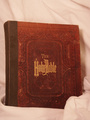
| 06/06/2006 12:51:12 AM | The World's BEST Best Seller!by 777STANComment: CRITIQUE CLUB CRITIQUE
by karmat
Intial response -- I agree totally. Very interesting take on the challenge, and a great example.
Compositionally, while this arrangement works for a lot of "product" type shots, here it kinda feels static. The Bible is obviously the focal point, yet it is centered and the eyes go to the Bible and really have no where else to look. Also, by shooting it straight on, it gives it a really flat appearance. To make it more interesting, perhaps a different angle (the book OR the camera, either one) for shooting, or even have it open to a passage. It looks like there is some nice textures in the cover, so emphasizing them would work well, too.
Technically, the focus seems a touch soft, but not terribly so. I think what probably hurt the most is the muted color tones. I don't know what software you were using, but look to see if it can adjust for white balance. The cloth looks like it is supposed to be white, but looks kinda like a muted pink to me. I also think it needs a bit more contrast as it is all rather flat looking. I do like how the cloth drapes over the corner, but because it is out of focus, it is more distracting than helpful, I think.
Into the minds of the dpc voters -- Books are often considered "static" subjects. As a result, something dramatic has to be occurring to push it over the top. This can be done with composition, technique, lighting, or all three. Because the picture is a bit "flat," there isn't really anythign to reach out and "grab" the viewer and compel him/her to stay with your picture long enough to give it a higher vote.
Overall, I think you have a good idea here. If you ever decided to reshoot this particular shot, I would be interested to see what it would look like if you tried some of the following ideas. (Mind you, they may not help, I'm just trying to give you some ideas for "next time.")
*Use a white silky type of background cloth. This would contrast with the Bibles old cover and add some interest. It would also be easier (I think) to make a pure white out of it.
*Set the book on the angle, so that at least some of the pages are showing. This would help to give the book a better feeling of "dimension," and perhaps the overall shot would not feel so flat.
*Use dramatic lighting. Light from above to be like a spot light. Or from one side or the other to cast some interesting shadows.
*Put the Bible in a contextual setting. Someone reading it, on an alter, a table, etc. This would also help with the storytelling aspect and would make it more interesting so the viewers would look at it longer.
Hope this helps. |  Photographer found comment helpful. Photographer found comment helpful. |
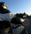
| 06/01/2006 10:10:34 PM | IMotoBikeby seebrownComment: CRITIQUE CLUB CRITIQUE
by karmat
The things we do for a picture!!! :)
Compositionally, I like how the rider fills the left side of the frame. This gives the shot strength and stability, and allows the eyes to have somewhere to "start" when looking at the picture. Also, the arm and leg, while not obvious leading lines, also give good motion through the picture, pulling the eyes up to the mirror where there is a splash of red to "rest" the eyes. Good work. *If* you could have gotten more of the road, it might have been interesting as a facet that would pull the eyes even more through the picture.
Technically, this is well done as well. The exposure is good and the focus is good. Having the background out of focus helps to eliminate distractions. BUT, it is not blurred beyond obscurity, so the context of the shot is perserved. The color seems a little bland to me. There is a lot of blue tones, yet the sun looks like it might be late afternoon. It's difficult to articulate, and maybe it is the bike jacket you have on, but the shot feels "cold" to me.
Let's delve into the minds of the dpc voter. Your score was not a bad one. I suspect that this appealed to those that like to ride, and the angle gave it the interest needed to gain a couple of more seconds of view time. However, since it was a "portrait" challenge, there were probably a lot of voters who wanted to see full face or something. *In my opinion,* you have met the challenge well, and in a creative fashion.
Best to you in future challenges.
karmat | | Photographer found comment helpful. |
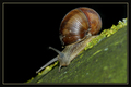
| 05/25/2006 10:13:35 PM | Snail on garden fenceby RUEDISCHMUTZComment: CRITIQUE CLUB CRITIQUE
by karmat
Compositionally, I think this is great. The diagonal really gives it a dynamic feeling and leads the eye through the frame well. The only thing I might suggest is to make it so the snail is crawling up the picture, not sliding down.
Technically, the focus is great here. Also, your choice of dof works because it keeps the foreground from being too distracting from the main subject. To me, it looks like you used a flash, and that makes some of the shadows a bit contrasty OR the solid black background doesn't "feel" right. Maybe if you could have gotten some greenery or something there.
The challenge. I'm sure many voted you down for having something other than a person. This is a great picture, and would score 2 or 3 points higher in a challenge for "Garden Creatures" or "shells" or something like that (another challenge where the connection was more obvious).
Good work though, and best to you in future challegnes.
karmat |
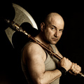
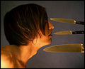
| 05/25/2006 05:13:57 PM | Barbarian by kiwinessComment: Hmmm, a new tool of smite, perhaps??? :) Intimidating shot. | | Photographer found comment helpful. |
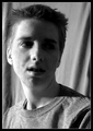
| 05/25/2006 03:26:04 PM | Listenning to myselfby TOYComment: Nice shot -- I like how you have cropped it, and your look just reaches out and grabs the viewer. | | Photographer found comment helpful. |
| 05/24/2006 11:20:28 PM | | | Photographer found comment helpful. |
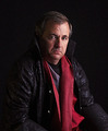
| 05/24/2006 11:16:21 PM | Meby NobodyComment: dude, you look just like an actor whose name escapes me right now. . . .
the red scarf adds a nice touch | | Photographer found comment helpful. |
| 05/22/2006 11:38:05 PM | | | Photographer found comment helpful. |
| 05/20/2006 02:17:20 PM | Splitby justin_hewlettComment: The lighting is pretty cool here. Don't think the filter (?) you've used adds anything though. | | Photographer found comment helpful. |
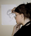
| 05/20/2006 02:06:23 PM | A Portrait Of A Portraitistby KrisbyComment: Interesting take. Two thing bother me -- the shadow under your chin, and your left hand looks a little blue to me. Maybe my monitor, maybe warm it up a bit using a white balance adjustment? | | Photographer found comment helpful. |
|
Showing 5741 - 5750 of ~9205 |
Home -
Challenges -
Community -
League -
Photos -
Cameras -
Lenses -
Learn -
Help -
Terms of Use -
Privacy -
Top ^
DPChallenge, and website content and design, Copyright © 2001-2026 Challenging Technologies, LLC.
All digital photo copyrights belong to the photographers and may not be used without permission.
Current Server Time: 07/27/2026 12:52:49 PM EDT.
|