|
|
|
Showing 5011 - 5020 of ~9205 |
| Image |
Comment |
| 04/27/2007 11:05:40 PM | |  Photographer found comment helpful. Photographer found comment helpful. |
| 04/26/2007 11:23:47 PM | The Danceby cloudsmeComment: CRITIQUE CLUB CRITIQUE
by karmat
Very nice colors and focus. I like how the flowers seem to be "leaning" towards the butterfly. It helps to give the shot some motion and dynamics. The shallow dof really helps the butterfly to stand out, and the detail present is very nice as well.
I agree that cropping on the left would help this image tremendously. Obviously, that wasn't allowed for *this* challenge, but anyother time I think it would really help.
You did well in the challenge. Good work and great capture.
karma | | Photographer found comment helpful. |
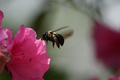
| 04/25/2007 11:48:39 PM | The Pollenatorby Blind_squirrelComment: CRITIQUE CLUB CRITIQUE
by karmat
DANG YOU! I've been trying to shoot one of these little guys for two years. Maybe the bees fly slower in G-ville, SC than they do in Canton, NC. ahahha
You nailed this puppy. Great focus, colors and dof. The lighting is good, and the background is blurred enough to really make the colors of the flower "snap," and the bee stand out.
Compositionally, it is a little off-balanced. Obviously, cropping wasn't allowed, but cropping some off of the top and left would really make this a fascinating shot (but I suspect you probably know that).
Not a lot that I can add, I don't think, other than excellent capture, and with some non-minimal post-processing, you have a real zinger, here, I think.
If I need to further clarify anything, please PM me.
karmat | | Photographer found comment helpful. |
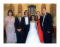
| 04/24/2007 10:30:02 PM | Bed Bugs!by NuzzerComment: CRITIQUE CLUB CRITIQUE
by karmat
Hahahahahahahah. I believe this is an outstandingly (if that is a word) take on the challenge. I didn't vote in this one, but this shot makes me wish I had. :)
I think there are a couple of things you could have done, technically, that would have made this better.
Compositionally, I like the juxtaposition of the bug on the wall and the woman under the covers. That is nice. (And her expression is perfect). However, if feels like there is too much "space" above her head, and it makes the shot feel a bit unbalanced. If it would have been possible to "aim" the camera a bit to the right, it may have helped that feeling just a touch.
Technically, the focus and exposure, etc. are very good. I do find the "shiny-ness" of the little animal a bit distracting. Maybe if you had one that was a bit more "matte" it wouldn't have reflected light quite so badly.
Can't really comment on post-processing, now can I? :)
An overall excellent shot, and while I don't know the rest of the field that well, I can honestly say, I think you were robbed on this one. I guess, probably, because you didn't have a real live bug in it. :(
That's dpc!
If I need to further clarify or explain, please feel free to pm me.
karmat | | Photographer found comment helpful. |
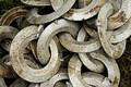
| 04/22/2007 09:24:10 PM | Chain Chain Chainby stanm2Comment: CRITIQUE CLUB CRITIQUE
by karmat
You only received two comments during the challenge, but I believe they nailed the basic issues with your picture.
First, the focus is just a touch off. It almost looks like the original was focused but in resizing it went "off." If that is the situation, I have found that resizing by small increments and sharpening slightly afterwards helps this. It is "close" but that makes it even more noticeable, in some ways.
Secondly, you lack a definite composition. I actually like shots where the subject "fills the frame." What I think makes them effective, that this shot is lacking, is that it helps to be technically perfect. Also, the subject needs to completely fill the frame. In this shot, some of the grass underneath is showing. It may have actually been better to back up a bit and give the shot more of a context.
Overall, this shot doesn't give the viewer anything to have an emotional attachment to. When that is not present, the shot has to be technically almost perfect. I think this shot has a lot of potential.
If I need to further explain or clarify myself, please feel free to pm me.
Karma |
| 04/22/2007 09:09:14 PM | Getting rustyby alexgarciaComment: CRITIQUE CLUB CRITIQUE
by karmat
Compositionally, this is a strong image in that it pulls the eyes diagonally through the image.
Technically, it is also very well done. I'm going to disagree with stdavidson about the sharpening. From where I'm sitting, it does not look oversharpened. Granted, I'm not on the best monitors around, but it just looks nice and crisp to me.
I suspect your score took a hit because it was "just" a picture of a chain. There were several in the challenge (mine included) and I think people wanted more of an emotional impact made with the chain. "Plain" shots did not offer this, though you did get a lot of 6s and up based on your technical merit.
Nice work, though. If I need to further clarify or explain myself, please feel free to contact me.
karma | | Photographer found comment helpful. |
| 04/22/2007 08:55:57 PM | Life in Captivityby acoppolaComment: CRITIQUE CLUB CRITIQUE
by karmat
Compositionally, this is a well balanced shot that feels "complete" because the lion fills much of the frame, yet leaves some context of the area he is in.
Technically, it is also a well done shot. The exposure and focus is good; the shallow depth of field helps to minimize the distractions of a background.
Overall, it is a good shot, that I really can't offer a lot of technicalities to improve. As far as dpc goes, I suspect a lot of people were expecting to see some kind of actual chain or even a strong metaphorical one. The electric wire in the background almost serves as a chain, but then I realized it was not. Also, there isn't really anything dramatic about the shot to make it stand out among the 170 or so others. The lighting is a little flat (I understand that is out of your control) and that doesn't help the "drama" part of it.
I'm wondering if a bw conversion would help add some interest to this shot.
nice work, though, I think the connection to the challenge was just a little too tenuous though.
If I need to further clarify or explain myself, please feel free to contact me.
karma | | Photographer found comment helpful. |
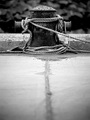
| 04/22/2007 07:47:26 PM | Stuck In a Momentby danielstarrasonComment: CRITIQUE CLUB CRITIQUE
by karmat
Compositionally, this follows the rules and breaks them all at one time. It feels "centered," yet, the picture is divided into thirds at the same time. By placing the subject on the upper third, it gives the shot a lot of "motion" because the eyes start in the lower part and go up into the frame.
Technically, the exposure focus and bw tones are near perfect, I think. This makes a wonderful bw image.
If this challenge was "Rope" or "Things at the Ocean" you probably would have scored much higher. I think the fact that you got 46 votes of 6 or over for a shot that does not meet the challenge speaks very well of the quality of the photograph.
Nice work. If I need to further clarify or explain anything, please let me know.
Karma | | Photographer found comment helpful. |
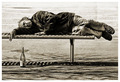
| 04/21/2007 03:36:08 PM | Alcohol & Homelessness: Break The Chain by surfinbirdComment: CRITIQUE CLUB CRITIQUE
by karmat
What can I say that would add to what you've already done? This is a most excellent shot that fit the challenge in a powerful and emotional way. You are correct that it is quite distrubing. Did he ever wake up and see you? (Just being nosy).
I honestly am not sure that I can tell you how to make this better, so I will just tell you what I like about it.
The subject, obviously, has a universal understanding/appeal. Everyone knows about homelessness, but few want to confront it. You have forced us to confront it, whether we wanted to or not. This in itself makes this an "uncomfortable" image, but it needs to be uncomfortable to be effective.
The post processing gives it an edgy look. Color would have made it look to "happy" I think, so the coloring you have chosen is effective.
Initially it looks like a centered composition, until you look at it a bit closer. The man being in the upper third takes away the "static" feeling it would have if it were completely centered. However, in this case, a static feeling might have worked simply because, unless the chain is broken, this guy is going nowhere. :( Also, the bottle helps to anchor the picture, both symbolically and photographically.
I like the vertical outtake, but there the focus seems to fall on the bottle, not the man, and it is not quite as powerful for the "break the chain" message, I think, though others may very well view that differently.
Great work and congrats on the ribbon.
karma | | Photographer found comment helpful. |
| 04/19/2007 11:26:04 PM | Crane Chain for longevityby TlemetryComment: CRITIQUE CLUB CRITIQUE
by karmat
Neat idea for the challenge. Different without being totally way off. Kudos for that.
Compositionally, I like how the crane chain starts in the lower left and goes upwards through the right. That gives the picture a sense of dynamicism and movement. The middle one in is in focus, so it seems that it should be the one that is the "subject" and it is in the very middle of the frame, and while the diagonal is strong, it still feels "centered." While this is not always bad, I think in this shot, because there is nothing else to build context or to look at, it makes it fall just a bit short of completely compelling. If the focus could have been moved "down and to the left" a bit, so that the first bird was in focus, that may have made it feel a bit "stronger.' (Then, you could have had people complaining about the out of focus ones in the back, hahaha).
Technically, this is well done. The focus isn't spot on, and that is generally okay, except for the head of the first bird being out of focus, while the body is not. That becomes very distracting to me, as a viewer. The color was a good choice. The background is okay, it is generally non-distracting, which works in this shot, but the uneveness in the tones in the upper left corner and in the lower right gives it a feeling of vignette-wannabe, which may or may not be intentional. Lastly, around the tail of the middle bird, I can see some kind of funky white. What it *looks* like, though it may not necessarily be, is where you have selected the cranes and brightened them, but not the background. Of course, it may just be my monitor.
Overall, you have a technically, well-done shot that meets the challenge. I think, though, that it lacks that extra *oomph* to get it into the upper 5/lower 6 (or higher) range. I don't think its simplicity hurt it, per se, but I do think that to the average viewer, it was a "oh look, a purple paper crane chain, that's nice. next" kind of moment. Maybe a different, more dramatically lit background, or some kind of environmental context would have made the shot have a bit more impact.
If I need to further clarify or explain myself, please feel free to contact me.
karma | | Photographer found comment helpful. |
|
Showing 5011 - 5020 of ~9205 |
Home -
Challenges -
Community -
League -
Photos -
Cameras -
Lenses -
Learn -
Help -
Terms of Use -
Privacy -
Top ^
DPChallenge, and website content and design, Copyright © 2001-2026 Challenging Technologies, LLC.
All digital photo copyrights belong to the photographers and may not be used without permission.
Current Server Time: 05/12/2026 01:02:23 AM EDT.
|