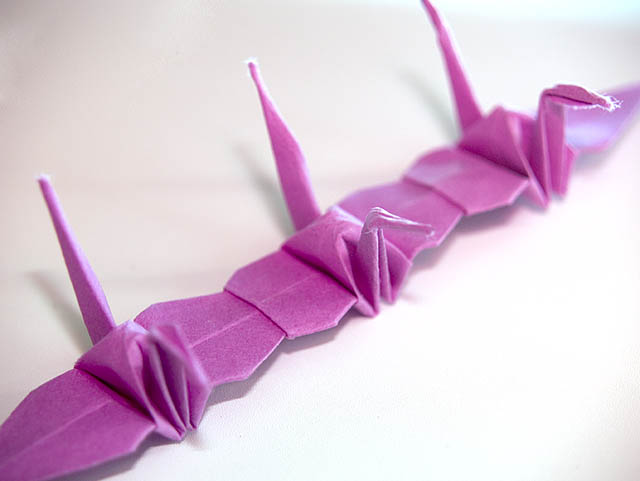
I believe its in Japanese culture that the crane returned every year and they never seen a crane die, so they assumed the bird was immortal. So now the crane is a symbol of immortality. The chain represents long life. I will have to research this to get the story straight.
Statistics
Place: 120 out of 171 Avg (all users): 5.1611 Avg (commenters): 5.5000 Avg (participants): 4.9130 Avg (non-participants): 5.3750 Views since voting: 838 Views during voting: 232 Votes: 149 Comments: 5 Favorites: 0
Neat idea for the challenge. Different without being totally way off. Kudos for that.
Compositionally, I like how the crane chain starts in the lower left and goes upwards through the right. That gives the picture a sense of dynamicism and movement. The middle one in is in focus, so it seems that it should be the one that is the "subject" and it is in the very middle of the frame, and while the diagonal is strong, it still feels "centered." While this is not always bad, I think in this shot, because there is nothing else to build context or to look at, it makes it fall just a bit short of completely compelling. If the focus could have been moved "down and to the left" a bit, so that the first bird was in focus, that may have made it feel a bit "stronger.' (Then, you could have had people complaining about the out of focus ones in the back, hahaha).
Technically, this is well done. The focus isn't spot on, and that is generally okay, except for the head of the first bird being out of focus, while the body is not. That becomes very distracting to me, as a viewer. The color was a good choice. The background is okay, it is generally non-distracting, which works in this shot, but the uneveness in the tones in the upper left corner and in the lower right gives it a feeling of vignette-wannabe, which may or may not be intentional. Lastly, around the tail of the middle bird, I can see some kind of funky white. What it *looks* like, though it may not necessarily be, is where you have selected the cranes and brightened them, but not the background. Of course, it may just be my monitor.
Overall, you have a technically, well-done shot that meets the challenge. I think, though, that it lacks that extra *oomph* to get it into the upper 5/lower 6 (or higher) range. I don't think its simplicity hurt it, per se, but I do think that to the average viewer, it was a "oh look, a purple paper crane chain, that's nice. next" kind of moment. Maybe a different, more dramatically lit background, or some kind of environmental context would have made the shot have a bit more impact.
If I need to further clarify or explain myself, please feel free to contact me.
you know i had intended to leave a comment on this during the challenge but ran out of time. I was going to comment on your ability to make those crane things. I went with my kids to a science center, tried to follow these two pages of directions, and my poor little crane ended up with half a beak. It was a pain! lol So kudos to you for being able to do those things.
I liked the diagonal, i like the color of the cranes. It was great that you thought out of the box. I agree with one of your commenters, something is a little off with the focus. Could be that the head on the one in the lower left created a distraction with it being out of focus. Dunno. Great idea!