|
|
|
Showing 4991 - 5000 of ~9205 |
| Image |
Comment |
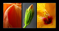
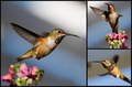
| 05/06/2007 11:33:45 AM | Fleeting Beauty by rinacComment: All three are beautiful shots -- graceful and exquisite. I really like the first one. Great detail and textures. |  Photographer found comment helpful. Photographer found comment helpful. |
| 05/06/2007 11:33:09 AM | | | Photographer found comment helpful. |
| 05/06/2007 11:32:41 AM | |
| 05/06/2007 11:32:14 AM | | | Photographer found comment helpful. |
| 05/06/2007 11:31:35 AM | |
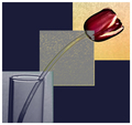
| 05/06/2007 11:30:36 AM | Tulip Triptychby Buckeye_FanComment: The picture of the tulip is nice, I just don't care for the filters or whatever it was that you used. I think it takes away from the "photography" of what looks like it was a nice shot. | | Photographer found comment helpful. |
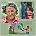
| 05/06/2007 11:29:42 AM | Laundry Dayby HipychikComment: I think you have an awesome subject here, and the shots really tell a story. However, I think the post-processing ruins the effect as it makes her look almost cartoonish, and I find myself looking more at the post-processing and less at the pictures. | | Photographer found comment helpful. |
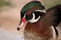
| 05/06/2007 12:13:02 AM | where els to go ?by lolor275Comment: CRITIQUE CLUB CRITIQUE
by karmat
Technically, you have captured some awesome colors here. Also the texture of the feathers is nice.
Also, this is a very common point of view for bird shots, at least of birds like ducks, so I think a low vantage might have made this a bit more interesting.
Compositionally, I think you missed the thirds a bit. The focal point of the shot seems to be the bird's eye. However, the eye is almost dead center of the picture, and even though the body goes through the frame nicely, it still has that static feeling of a centered composition. My suggestion would be to crop some off of the left so that the eye is on the top left third intersection. This composition still would not be great, because it would feel like it was going "out" of the frame, but I think it would be better than it is now.
Also, there is little else here to grab the viewer and make them want to stay and enjoy your shot. Technically, it is pleasing. Subject-wise, it is okay (bird/nature lovers will like, others will likely be ambivalent towards it) and compositionally it feels "off," so most of the voters probably didn't feel inclined to spend a lot of time on it.
If I need to clarify or explain myself further, please do not hesitate to contact me.
Karma
| | Photographer found comment helpful. |
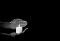
| 05/05/2007 12:41:49 PM | Protectionby sudhiComment: CRITIQUE CLUB CRITIQUE
by karmat
Neat idea.
Compositionally, you have met the challenge well. Also, I really like the use of negative space here. It accentuates the hand and candle well.
Technically, the back hand looks a bit soft, in focus. While this normally wouldn't be a huge deal due to the fact that the candle and lower candle are focused well, it is the first thing noticed, I think in the picture and is illuminated by the candle. I like the shadows, though minimal, and how they help to shape the hand and the area around the candle. The candle seems a bit overexposed in the flame area, and doesn't have any details.
Overall, nicely done and a great idea.
Karma | | Photographer found comment helpful. |
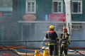
| 05/05/2007 11:58:22 AM | How about that Salad?by MoxyComment: CRITIQUE CLUB CRITIQUE
by karmat
This is an excellent photojournalistic shot. Its vibrant colors and excellent focus really make it *pop.* I also like that you were able to keep the strong colors AND capture some of the smoke. The smoke adds an element of "realness" to the shot and without it, it would just look like some firemen standing around.
Compositionally, you have followed the rule of thirds well. The firemen are in the strong point of the picture, and the machinery in the background help to "lift" the eyes up and through the frame.
The only nitpick I would have is that the fence, or railing seems a bit crooked and makes it feel as if the entire picture is tilted. I think, for the challenge voting crew, though, these kind of shots have to be head and shoulders above everything else, photojournalism just doesn't always seem to score high here. You did well to invoke humor, though it took me a minute to "get it."
Nice work, and best to you in future challenges. If I need to clarify or further explain myself, please feel free to contact me.
Karma |
|
Showing 4991 - 5000 of ~9205 |
Home -
Challenges -
Community -
League -
Photos -
Cameras -
Lenses -
Learn -
Help -
Terms of Use -
Privacy -
Top ^
DPChallenge, and website content and design, Copyright © 2001-2026 Challenging Technologies, LLC.
All digital photo copyrights belong to the photographers and may not be used without permission.
Current Server Time: 05/12/2026 02:03:56 AM EDT.
|