CRITIQUE CLUB CRITIQUE
by karmat
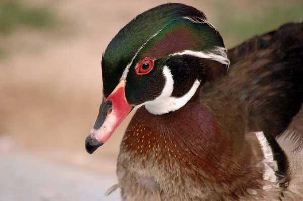
Technically, you have captured some awesome colors here. Also the texture of the feathers is nice.
Also, this is a very common point of view for bird shots, at least of birds like ducks, so I think a low vantage might have made this a bit more interesting.
Compositionally, I think you missed the thirds a bit. The focal point of the shot seems to be the bird's eye. However, the eye is almost dead center of the picture, and even though the body goes through the frame nicely, it still has that static feeling of a centered composition. My suggestion would be to crop some off of the left so that the eye is on the top left third intersection. This composition still would not be great, because it would feel like it was going "out" of the frame, but I think it would be better than it is now.
Also, there is little else here to grab the viewer and make them want to stay and enjoy your shot. Technically, it is pleasing. Subject-wise, it is okay (bird/nature lovers will like, others will likely be ambivalent towards it) and compositionally it feels "off," so most of the voters probably didn't feel inclined to spend a lot of time on it.
If I need to clarify or explain myself further, please do not hesitate to contact me.
Karma
|