|
|
|
Showing 4951 - 4960 of ~9205 |
| Image |
Comment |
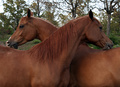
| 05/13/2007 09:05:11 PM | Paternal Brothersby sfmorrisComment: CRITIQUE CLUB CRITIQUE
by karmat
What a great idea for symmetry. These animals are absolutely gorgeous. There is very little I could suggest to improve on this shot. The focus and exposure is great and gives good details on the horses. The shallow dof helps to isolate them from the background, which could be distracting, but because it is blurred, I think it helps to add to the composition by giving it context.
It does seem just a hair dark/flat to me, but I'm thinking it may be my monitor. If not, maybe just a boost of contrast or shadows/highlights, something like that, to give it just a bit more pop.
Great shot, best to you in future challenges.
karma |  Photographer found comment helpful. Photographer found comment helpful. |
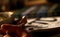
| 05/13/2007 08:47:29 PM | Enclosed Pi²by Robert-LComment: CRITIQUE CLUB CRITIQUE
by karmat
Compositionally, this is a balanced photograph, I think. There is a good "interaction" between the numbers and the compass. I also think that the long, narrow crop works well as well.
I like the high key effect you have gotten here. It adds interest to the shot, and it is also appealing that the numbers are readable, even as they go "out of focus" in the difference.
You had a commendable score and placement, but I suspect some viewers were turned off by the high key effect -- it does look blown out, and some of the detail is gone in the compass.
Good work, and if I need to further clarify or explain myself, please let me know.
Karma | | Photographer found comment helpful. |
| 05/13/2007 08:38:46 PM | Hailfulls.by fourstardaydreemComment: CRITIQUE CLUB CRITIQUE
by karmat
Very interesting shot.
Compositionally, I think you have done well to get a symmetry shot that "looks" like symmetry but isn't exactly symmetrical. You have good details in the hands and hail balls, and the dof works well to isolate it from the background.
The black twig, or whatever, is extremely distracting. I know that it is "natural" but in a black and white shot like this, it presents itself as *the* black point and the eye is drawn to it. In advanced, you could have just cloned it out, but in basic, you would have had to remove it before you shot. Also, I don't know what process you used to convert to bw, but it lacks in tonal contrasts. Instead of being a black and white picture, it is more of a muted gray picture. If you simply convert to greyscale, sometimes it helps to adjust the contrast. If you want to try other methods of conversion, (if you don't know about them) check out the tutorials on dpc.
If I need to further explain myself or clarify what I've said, please feel free to contact me.
Best to you in future challenges.
Karma |
| 05/13/2007 12:48:01 AM | 3.14 O.C.D.by empiresbmComment: CRITIQUE CLUB CRITIQUE
by karmat
Welcome to the world of dpc!
There are a couple of things about this shot that work really well. First, it is a good idea. It gives the impression of a student, stressed from exams and what not, trying to relax by smoking. Also, the focus and detail on the ash at the end of the cigarette is very nice. I also like the shallow depth of field and how the background is tilted ever so slightly. That keeps it from being static, and gives it a bit of a chaotic feeling, which fits in with the rest of the shot.
I think what probably hurt you the most is that it seems a bit dark, and I had to study it for a few seconds to understand what was going on. In a challenge where people are cruising through, this can be almost fatal for the score. A bit more light on the hand and cigarette would help this, I think. Also, if the hand were more "in" the picture, so that it wasn't hanging out of the frame it would feel more complete as well, I believe. I think that would also help tie the two things together.
Nice shot. It tells a story, and has some really good elements to it. I look forward to seeing your future entries. If I need to further explain or clarify myself, please feel free to contact me.
Karma |
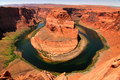
| 05/13/2007 12:32:33 AM | Nature's Omegaby yakatmeComment: CRITIQUE CLUB CRITIQUE
by karmat
Great work at finding a naturally occurring symmetrical picture. Nicely captured.
You have managed to create the feeling of depth here, even though the photograph is "2-dimensional." Even at this small a size, the vastness of this "structure" carries forth and could overwhelm a viewer should they choose to view it for long.
The red is a bit overbearing, I think. While I know that that is the color of this area, it still seems to be a bit on the edge. If you could boost the blues and greens a bit more, and take down the reds *just a touch* I think it would help make it a bit more pleasant for the viewer.
Nevertheless, AWESOME shot and congrats on the top 20.
karma | | Photographer found comment helpful. |
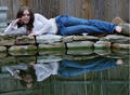
| 05/13/2007 12:26:13 AM | Reflectionsby Shea927Comment: CRITIQUE CLUB CRITIQUE
by karmat
Great idea for a shot! I like how you have managed to divide the frame into thirds instead of halves, and still maintain the symmetry component. That is not always easy or effective.
Technically, the focus is very good, but the lighting seems a bit flat. Since it was overcast, you didn't have to deal with harsh shadows, which is good, but as a result, you don't have any shadows, so there is very little depth into the picture. I think if you could have blurred the back wall, it would have helped. As it is, it almost seems as if everything in the picture is equally focused, and that can detract from the main subject.
For some reason, I really like that she is barefooted. That just gives a sense of calmness and realness to the shot.
Good work, and best to you in future challenges. If I need to clarify or explain myself more, please feel free to contact me.
karma
| | Photographer found comment helpful. |
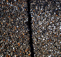
| 05/13/2007 12:04:17 AM | down to every last pebbleby JibComment: CRITIQUE CLUB CRITIQUE
by karmat
Compositionally, you have added a bit of interest to this shot by having it just a touch on the diagonal. Had it been perfectly vertical, I'm afraid the shot would have seemed terribly static.
Technically, the lighting is very harsh in this. While that sets up a nice contrast, it also makes it seem stark and makes a lot of the details mesh in the darkness.
While I'm glad you didn't risk your neck trying to get to the roof, I think a couple of things could have been done differently to make this shot more interesting. As it is right now, the viewer looks at it and says, "okay, it is a shot of some kind of pebbly stuff with a dark line down the middle." There is not a lot else to be interesting or to compel that same voter to do more than give it a cursory glance and move on. I suspect it would have been more effective if you could have made a macro out of it. Most sonys seem to have awesome macro capability, but I'm not sure about yours, or with the 70-200 on it. That said, if it were to show a close up of this, it would give the viewer something that is different or unique.
Also, the line down the middle says "symmetry," but there are voters who are very strict in their definitions, and this may not have flown with them.
If your goal was to enter the challenge, and just shoot to have fun, then you may have accomplished that. If, however, you are wanting to score higher or place higher, always try to look at your pictures from the point of view of a rushed voter and say, "Is there something, anything, that will grab the viewer and make them want to stay with my picture." If not, try to reshoot, find another subject, or check your post-processing to see if anything else can be done. Sometimes something as simple as rotating, a different crop, or mirroring/flipping an image can make it really connect with the viewer.
If I need to further clarify or explain myself, please feel free to contact me. Best to you in future challenges.
karma | | Photographer found comment helpful. |
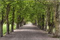
| 05/12/2007 10:28:42 PM | Green lineby LahnetComment: CRITIQUE CLUB CRITIQUE
by karmat
Very nicely done.
I like that you were able to find symmetry existing and that you did not have to set it up. I also think that the trees forming a canopy overhead and then making it appear to be a tunnel at the end is very effective as well. I also commend you for having details in the shadows while not blowing out the highlights. That is a difficult task, indeed, but you have done well here.
The only thing I would suggest would be a bit more contrast. Admittedly, the monitor I am on right now has a tendency to be a bit flat, but it just seems to be missing something to make it "pop." Also, there is a lot of little bitty details in there, and at this resolution, it can start to appear grainy. I have no doubt that a full size version, or even a large print of this would be awesome, but at this small size, it does look a bit grainy.
Nice work, and best to you in future challenges. If I can further clarify or explain myself, please let me know.
karma | | Photographer found comment helpful. |
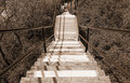
| 05/12/2007 10:22:54 PM | Downstairsby bvyComment: CRITIQUE CLUB CRITIQUE
by karmat
I didn't know they had hills in Pittsburgh!! :)
Excellent use of leading lines/vanishing point to set up the symmetry in this shot. You have also done well at depicting the grade of the steps (I am assuming it is steep), which is not always easy to do. I, like one of your commenters, also feel that something is a bit "off" in the shot. After looking at it, I think it is the shadow of the left handrail setting up the illusion that the left is just a fraction higher than the right. It also makes the shot look a bit off-center, when it really isn't. I suppose to eliminate that you would either have to do a lot of cloning (which wasn't legal in this challenge) or shoot on an overcast day or when the sun was directly overhead. Otherwise, it is to be expected, and nothing to fret over, I don't think.
Technically, this shot is well done. The deep dof lets the viewer see further up into the frame (which is actually down), and the lighting/exposure allows many of the details to show. The coloring you have chosen sets a bit more "mood" than a straight bw would, I think, and I suspect color would be too busy and you wouldn't be able to see the steps and illusion as well.
Best to you in future challenges, and if I need to further clarify or explain myself, please feel free to contact me.
Karma | | Photographer found comment helpful. |
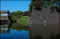
| 05/12/2007 09:58:13 PM | On the way to the Palaceby kolasiComment: CRITIQUE CLUB CRITIQUE
by karmat
Very lovely shot.
Compositionally, having the shot divided in half horizontally makes the shot feel a bit static. I understand for this challenge this was probably necessary, but if you could have framed the shot in such a way to have it divides into thirds instead of halves and still maintained the symmetry, it would have made the shot stronger, I think.
The focus and exposure on this are very nice. You have maintained details throughout the image and the brighter parts are not blown out or distracting. I really like that the two halves are almost equally focused.
Overall, the colors are absolutely stunning in this shot.
Best to you in future challenges, and if I need to further clarify or explain myself, please feel free to contact me.
Karma | | Photographer found comment helpful. |
|
Showing 4951 - 4960 of ~9205 |
Home -
Challenges -
Community -
League -
Photos -
Cameras -
Lenses -
Learn -
Help -
Terms of Use -
Privacy -
Top ^
DPChallenge, and website content and design, Copyright © 2001-2026 Challenging Technologies, LLC.
All digital photo copyrights belong to the photographers and may not be used without permission.
Current Server Time: 05/12/2026 03:08:43 AM EDT.
|