| Author | Thread |
|
|
05/13/2007 08:47:29 PM |
CRITIQUE CLUB CRITIQUE
by karmat
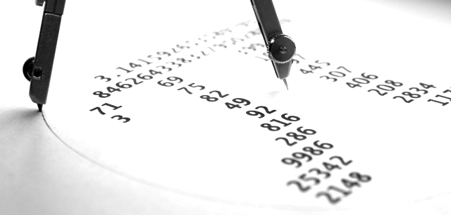
Compositionally, this is a balanced photograph, I think. There is a good "interaction" between the numbers and the compass. I also think that the long, narrow crop works well as well.
I like the high key effect you have gotten here. It adds interest to the shot, and it is also appealing that the numbers are readable, even as they go "out of focus" in the difference.
You had a commendable score and placement, but I suspect some viewers were turned off by the high key effect -- it does look blown out, and some of the detail is gone in the compass.
Good work, and if I need to further clarify or explain myself, please let me know.
Karma |
|
 Photographer found comment helpful. Photographer found comment helpful. |
Comments Made During the Challenge  |
|
|
05/07/2007 04:08:17 PM |
|
Composition and DOF are great. Lighting is just right! |
|
| Photographer found comment helpful. |
|
|
05/04/2007 05:36:56 PM |
|
| Photographer found comment helpful. |
|
|
05/04/2007 10:26:28 AM |
|
Interesting effect. I'm not sure if I like the high contrast, but it is effective. |
|
| Photographer found comment helpful. |
|
|
05/04/2007 07:25:10 AM |
|
Clever, I wish I'd thought of that ;-) |
|
| Photographer found comment helpful. |
|
|
05/04/2007 01:27:06 AM |
|
Clever multiple use of pi in the picture. B&W presentation matches B&W aspect of math. Excellent minimalist inclusion of only the essential images. 8 |
|
| Photographer found comment helpful. |
|
|
05/02/2007 11:38:31 AM |
|
| Photographer found comment helpful. |
|
|
05/02/2007 10:07:06 AM |
|
a little too bright - details around the compass point seem bleached out. Otherwise good |
|
| Photographer found comment helpful. |
Home -
Challenges -
Community -
League -
Photos -
Cameras -
Lenses -
Learn -
Help -
Terms of Use -
Privacy -
Top ^
DPChallenge, and website content and design, Copyright © 2001-2026 Challenging Technologies, LLC.
All digital photo copyrights belong to the photographers and may not be used without permission.
Current Server Time: 06/28/2026 07:36:04 AM EDT.