CRITIQUE CLUB CRITIQUE
by karmat
Very nicely done.
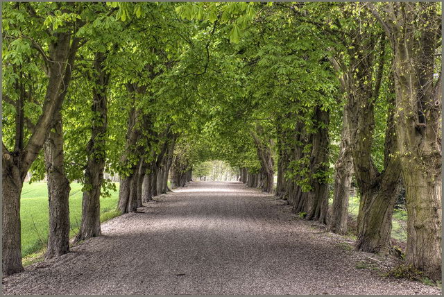
I like that you were able to find symmetry existing and that you did not have to set it up. I also think that the trees forming a canopy overhead and then making it appear to be a tunnel at the end is very effective as well. I also commend you for having details in the shadows while not blowing out the highlights. That is a difficult task, indeed, but you have done well here.
The only thing I would suggest would be a bit more contrast. Admittedly, the monitor I am on right now has a tendency to be a bit flat, but it just seems to be missing something to make it "pop." Also, there is a lot of little bitty details in there, and at this resolution, it can start to appear grainy. I have no doubt that a full size version, or even a large print of this would be awesome, but at this small size, it does look a bit grainy.
Nice work, and best to you in future challenges. If I can further clarify or explain myself, please let me know.
karma |