| Image |
Comment |
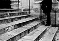
| 04/04/2009 04:38:51 PM |
Timeby e301Comment: I love the high contrast in this and all the questions that it does not answer. |
 Photographer found comment helpful. Photographer found comment helpful. |
| 04/03/2009 11:37:03 AM |
|
| Photographer found comment helpful. |
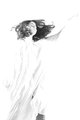
| 03/29/2009 12:40:03 AM |
Let Me Soarby chesireComment: CRITIQUE CLUB CRITIQUE
by karmat
I remember voting on this and thinking it did look "hopeful" but there were just a couple of things that prevented it from being absolutely and totally effective.
Compositionally, to me there is too much space at the top and not enough on the right and/or left. I think a lot of negative space on the top and right would give this an interesting composition.
Technically, I like the high key aspect of it. The first two things that I noticed though, were the lack of any real "blacks" and the jeans showing at the bottom. Using levels, contrast, or dodging/burn, could help you get some contrast into some of the areas, especially around the face/hair where it is a kind of murky grey. If you want to use this crop, you could try to clone part of the robe over the lower part of the leg. It is advanced, so it would have probably been okay in this challenge, and if it isn't for a challenge, you can do anything you want. :) Another option would be to crop it horizontally around her waist.
Overall, a very ethereal feeling picture. The bright white give it an angelic feeling and it is like she is reaching up and out to something just beyond reach or just out of sight. I think you have an awesome idea, and it is definitely different from most senior portraits -- very arty.
Best to you in future challenges.
Karma |
| Photographer found comment helpful. |
| 03/26/2009 01:27:31 PM |
|
| Photographer found comment helpful. |
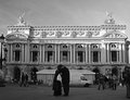
| 03/24/2009 03:47:43 PM |
Candid-The lovers to the Opera Concordeby Rino63Comment: CRITIQUE CLUB CRITIQUE
by karmat
I really liket this shot, and the more I look at it, the more I like it.
It has a very classical feeling to it -- like it is a scene out of a old bw romance movie.
Upon first glance, the van bothered me, but in a sense it adds to the movement and drama of the shot. It gives the shot a bit more context and realism. I also really like the bw. I suspect that this shot in color would be too busy and everything would be battling for the viewer's attention.
The tilt still bothers me a bit. If it is on purpose, so be it, but I do find myself tilting my head to "make it right."
Very well done, and interesting for many subtle reasons.
good work. |
| Photographer found comment helpful. |
| 03/20/2009 03:05:28 PM |
|
| Photographer found comment helpful. |
| 03/20/2009 03:05:11 PM |
|
| 03/20/2009 03:04:41 PM |
|
| Photographer found comment helpful. |
| 03/20/2009 03:04:14 PM |
|
| Photographer found comment helpful. |
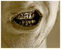
| 03/20/2009 03:03:44 PM |
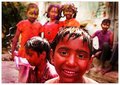
A Colorful Future - Togetherby WeJayComment: the background really adds to the shot here. the kids teeth are pink on my monitor though -- i'm going to assume they are supposed to be like that? |
| Photographer found comment helpful. |
Home -
Challenges -
Community -
League -
Photos -
Cameras -
Lenses -
Learn -
Help -
Terms of Use -
Privacy -
Top ^
DPChallenge, and website content and design, Copyright © 2001-2026 Challenging Technologies, LLC.
All digital photo copyrights belong to the photographers and may not be used without permission.
Current Server Time: 06/17/2026 10:53:32 PM EDT.