|
|
|
Showing 201 - 210 of ~9205 |
| Image |
Comment |
| 08/03/2009 01:17:05 PM | |  Photographer found comment helpful. Photographer found comment helpful. |
| 08/02/2009 11:57:18 PM | | | Photographer found comment helpful. |
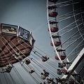
| 08/02/2009 11:54:12 PM | Swings and the Ferris Wheelby KidKilowattComment: this is cool. i like the "old" feel of the colors and i like how it looks like there is going to be a collision between the two rides. awesome shot and processing! this is also one of a handful of shots where I think a grainy/noisy look actually works. |
| 08/02/2009 11:48:21 PM | | | Photographer found comment helpful. |
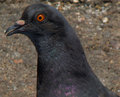
| 07/29/2009 11:11:53 PM | Eye on youby stfleckComment: CRITIQUE CLUB CRITIQUE
Compostionally, I think you have filled the frame nicely. It gives a nice close up view of the bird. This kind of shot would work well for a documentary type purpose, more than art. Not that either is more valuable or "better" than the other, but they are definitely different.
Technically, the focus is just a hair soft and this close that is very obvious. It could have been any number of things, but in looking at your settings, I would suggest a smaller aperture number (f/8 or 11, maybe) and this would allow you to "speed up" your shutter speed by a couple of stops. This may have let the focus be a bit sharper. The dof is good, and the lighting isn't dramatic, but it is nice and even and that helps.
Overall, it is technically an okay photo, but it feels like it just comes up a bit short. There is nothing that really grabs the viewer and draws him in or makes him compelled to stay with this shot, though the bird does look a touch surprised, if that is possible. More context, or using negative space (a personal favorite of mine, whether effective or not is totally up to you >grin<) may have helped add that little bit of interest that would take this shot up the ranks a bit.
Best to you in future challenges.
Karma
PS -- Something that *might* prove to be effective is to look at the third place picture and yours side by side and do a honest self-evaluation about what make that one better than yours. The pose is nearly the same. This distance is very similar, etc. You had the potential with this "pose," but some of the technicals dropped you down, I think. Message edited by author 2009-07-29 23:17:29. | | Photographer found comment helpful. |
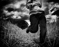
| 07/29/2009 10:47:17 AM | jesse1.jpgby kashiComment: again, i am so sorry. my thoughts and prayers are with you. | | Photographer found comment helpful. |
| 07/28/2009 11:39:26 PM | Make upby Rino63Comment: CRITIQUE CLUB CRITIQUE
by karmat
Compositionally, this is a very interesting image and a creative take on the challenge. The repeating face almost gives a sense of the day after day routine that many women do. The squarish crop makes it feel a touch static, I think.
Technically, I think you have done well at making the skin tones and other colors work, and her eyes are captivating. I think the single drawback, as someone mentioned, was the feeling of a lack of focus. It appears that the eye in the "middle face" is the most focused, but the others aren't quite as much so.
Again, you have met the challenge and met the challenge well. Best to you in future challenges.
Karma | | Photographer found comment helpful. |
| 07/22/2009 10:57:02 PM | Sunshineby dswannComment: CRITIQUE CLUB CRITIQUE
by karmat
Compositionally, I really like this shot. You "fill the frame" but still leave a bit of black in one corner and this seems to balance the shot very well. I also like that you chose to photograph the back of the flower. The only teeny tiny nitpick I would have is that I think the shot would have a bit more dynamics if it were tilted ever so slightly to the right so that the stem was more in the corner. However, please realize that this is probably just a personal bias of mine as I really like tilting shots. :)
Technically, you have nailed the exposure, focus, etc. The lighting really accentuates the details, and the flower really does look like a miniature sun.
Overall, very well done and congrats on your top10!
Karma | | Photographer found comment helpful. |
| 07/07/2009 09:32:36 PM | | | Photographer found comment helpful. |
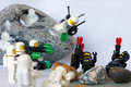
| 06/16/2009 11:32:59 PM | Ambush!by chalesComment: CRITIQUE CLUB CRITIQUE
by karmat
Compositionally, you have a very strong entry, I think. The "subjects" in the shot wrap around from upper left down and through the bottom right, generally. This gives it a sense of balance and movement. The small amount of negative space also pushes the viewer's attention down into the action.
Technically, it is also well done. The exposure allows for good details, and the blurred foreground sets up good depth of field.
So, it is a well done photograph, with little that could be improved upon; however, I have found in the 7+ years at dpc, toys as subjects don't tend to score well, generally (there are some very noted exceptions, but overall. . .). I'm not sure if it is because adults don't connect with toys in general or what, though I suspect it is more a case of having higher expectations -- if you are shooting toys you have control over everything in the shot, therefore it needs to be perfect and/or very dramatic. Don't know if that was the case here, though I suspect it may be.
And like one commenter noticed, the white guys are just too happy to be killing their enemies. :)
Good work, though, and best to you in future challenge.s
Karma | | Photographer found comment helpful. |
|
Showing 201 - 210 of ~9205 |
Home -
Challenges -
Community -
League -
Photos -
Cameras -
Lenses -
Learn -
Help -
Terms of Use -
Privacy -
Top ^
DPChallenge, and website content and design, Copyright © 2001-2026 Challenging Technologies, LLC.
All digital photo copyrights belong to the photographers and may not be used without permission.
Current Server Time: 06/16/2026 08:54:57 PM EDT.
|