|
|
|
Showing 1201 - 1210 of ~9205 |
| Image |
Comment |
| 06/03/2008 09:04:28 PM | |  Photographer found comment helpful. Photographer found comment helpful. |
| 06/03/2008 09:04:06 PM | sixteenby sigrun_thComment: I love, love, love, love the lighting on this. A bit tighter on the right would make it feel a bit more balanced, but it is still an AWESOME portrait. | | Photographer found comment helpful. |
| 06/03/2008 09:03:25 PM | | | Photographer found comment helpful. |
| 06/03/2008 09:03:03 PM | Individually mirroredby pgirish007Comment: Great composition and bw tones. It might seem a bit more balanced if there were a bit more space at the top and not quite as much at the bottom. Also, the border feels a bit thick and heavy. That said, I love the expressions on their faces, and it is a wonderful, wonderful picture. | | Photographer found comment helpful. |
| 06/02/2008 12:48:06 PM | -- Reflection on a Boat Hull --by LydiaComment: I really, really like the abstract nature of this and the simple colors. I thought it was very well done. Even though I have been here at dpc over 6 years, I am astounded at how people want to be hit over the head with pictures. This, to me, is very obviously a boat. Or maybe I'm just out there. Anyway, I thought it was an excellent shot. Best to you in future challenges. | | Photographer found comment helpful. |
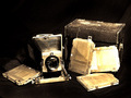
| 06/01/2008 11:51:27 PM | My Grandfather's Cameraby mhlambiComment: CRITIQUE CLUB CRITIQUE
by karmat
Compositionally, I think this is a well done shot. The different elements, in addition to the camera, helps to add balance and interest. I think a lower perspective may have been a bit more dramatic, but it is still well done. Also, a tighter crop may have made it feel a bit less "standard" or less like a camera ad and more like "art." (If that does not make sense, let me know and I will try to articulate it better).
Technically, I like how you made it look and feel old. The processing of the picture really compliments the subject nicely.
Overall, an interesting shot, and it does obviously meet the challenge.
Best to you in future challenges. |
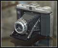
| 06/01/2008 11:46:30 PM | My Very First Cameraby lennolandComment: CRITIQUE CLUB CRITIQUE
by karmat
That is so cool that you still have this. Does it work?
Compositionally, the shot is a bit "centered." This causes it to feel a bit static, and detracts from the interest level a bit, I think. That said, having the camera angled like you do helps, somewhat, as it does give the eye a strong diagonal to follow. It seems a bit tight at the top.
Technically, the lighting is good, as is the focus and exposure, etc. On my monitor, it could use a touch more contrast to make the blacks a bit blacker. Reading your other comments, including mine, I see, it may have been a touch flat (I did not vote on this computer). Boosting the contrast, or playing with curves or levels may help, to some degree.
Overall, you have a good shot, and it obviously meets the challenge. I think, though, that it may have suffered from being just another shot of a camera. I know that is what the challenge called for, and it would make a good ad, but the shots that really grabbed the viewers attention had a bit more context, I think.
Best to you in future challenges,
Karma |
| 05/31/2008 10:14:58 PM | The Antiqueby LadyKComment: CRITIQUE CLUB CRITIQUE
by karmat
Compositionally, I like this shot. The different circular elements set up a nice balance and contrast. Also, I like the tight crop in this.
The lighting on this is really good. It emphasizes the shapes and textures nicely. Also, I like the basic bw on this.
I think if focus had been a bit stronger, at any point in the photograph, the shot itself would have been more effective. While I don't think EVERYTHING needs to be in focus, it would help if something was clearly in focus. It does appear that the far right of the element on the right is more in focus than the rest, but it is difficult to tell.
Nice approach to the challenge, and the lighting in this (again) is really good.
karmat | | Photographer found comment helpful. |
| 05/31/2008 09:50:15 AM | Old Schoolby timfythetooComment: and you, dear "brother," are a smart aleck
(It is a really good picture, though. nice sepia tones) | | Photographer found comment helpful. |
| 05/28/2008 03:31:21 PM | Retiredby kleskiComment: A bit over saturated and it feels like it is tilted to the left. | | Photographer found comment helpful. |
|
Showing 1201 - 1210 of ~9205 |
Home -
Challenges -
Community -
League -
Photos -
Cameras -
Lenses -
Learn -
Help -
Terms of Use -
Privacy -
Top ^
DPChallenge, and website content and design, Copyright © 2001-2026 Challenging Technologies, LLC.
All digital photo copyrights belong to the photographers and may not be used without permission.
Current Server Time: 06/22/2026 07:29:13 AM EDT.
|