|
|
|
Showing 1111 - 1120 of ~9205 |
| Image |
Comment |
| 07/01/2008 03:38:36 PM | Nei hallo!by DufusComment: I like the use of negative space in this, but the focus seems just a shade off. |  Photographer found comment helpful. Photographer found comment helpful. |
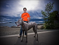
| 07/01/2008 03:38:15 PM | Bigby robaComment: The composition feels a bit centered/static to me. That orange shirt really grabs attention though, and that dog is HUGE! | | Photographer found comment helpful. |
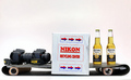
| 07/01/2008 03:35:12 PM | Returnby xianartComment: CRITIQUE CLUB CRITIQUE
by karmat
There are a lot of things right with this shot; things that i like. I like the symmetry of it, the motion implied by the balls in different positions and the coloring of it.
It feels a bit tight, left to right, as far as the crop goes, though. At least to me. If there were a way to make it just a shade wider without getting too many distracting elements, it might help.
I do think it meets the challenge, so you did well there. On the monitor I'm using right now, it feels a tad dark, but I don't remember it being like that when I looked at it initially, earlier, so it "might" be a bit dark, and it may not be. :)
Interesting shot.
Karma | | Photographer found comment helpful. |
| 07/01/2008 03:16:06 PM | | | Photographer found comment helpful. |
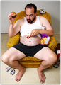
| 06/30/2008 05:41:36 PM | Relaxationby CronMonComment: CRITIQUE CLUB CRITIQUE
by karmat
Compositionally, I like how the different lines at different angle interact with each other. The point from where the hammock is hanging from leads down and into the man nicely. Then, the arms add to this. His left hand is a bit distorted -- it looks really big in proportion to the rest of his body, quite possibly due to the "wideness" of the lens, I would think.
Technically, exposure, focus, color, etc is all pretty good. The sky looks like it has been brightened quite a bit, and the color in it looks a bit off, but everything else is good.
Overall, it made sense to me -- someone who has worked and achieved success can take the time to linger and rest in what looks like a luxurious setting. I guess, though, it may have been a tenuous stretch for some.
Good work, and best to you in future challenges.
Karma |
| 06/30/2008 05:18:46 PM | | | Photographer found comment helpful. |
| 06/25/2008 04:46:58 PM | Real scene: Housewife had never cut a tree before - neighbor property damagedby PelleComment: CRITIQUE CLUB CRITIQUE
by karmat
Compositionally, this feels a bit tight to me, horizontally. I think a bit more on the right, showing more of the tree at the top would help that, and may make it a bit more balanced as well.
Technically, the colors are a bit surreal to me. I suppose had this happened to me, it might feel that way, but for the shot, in this challenge, it is a bit much. The lighting is "uneven," which in and of itself is not a bad thing, but it looks unnatural here. IMO, tonemapping and HDR are like table salt. Used in correct proportions, it can really enhance what is in front of you. If you can actually taste it (or tell it has been used), though, it is too much. Again, this is just my opinion, but I think it is a bit over the top on this one.
Also, the tree going into the window seems to be the actual "crime." When I look at it, it seems a bit soft or devoid of details.
Overall, and interesting shot. For some, it may not have seemed like a "crime" but I suppose, in a way, it does fit.
Best to you in future challenges.
karma |
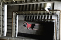
| 06/25/2008 04:25:39 PM | Thursday morningby MikkiMixComment: CRITIQUE CLUB CRITIQUE
by karmat
Welcome to dpc!
Compositionally, this is one of those rare shots where the largely centered composition works well. The stairs lead the eyes down to the body, and the "perp escaping" is a nice touch. I think the only nitpick I could offer is to include some of the staircase/railing closest to you, at the bottom of the frame. That would cause it to completely encircle the victim, and make it feel a bit more complete, I think.
Technically, the grittiness and high contrast really work well together to set the mood in this shot. I like that it is not black and white because that makes the victim that much more obvious.
Overall, good work and I look forward to seeing more of your entries.
Karma | | Photographer found comment helpful. |
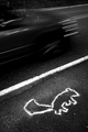
| 06/25/2008 03:55:50 PM | Hit and Runby posthumousComment: CRITIQUE CLUB CRITIQUE
by karmat
Ha. I thought this was absolutely hilarious when I was voting. I did wonder, though, if you outlined a real squirrel. :)
Compositionally, the moving, blurry car really sets the scene and gives good context to the shot. I can help but wondering, though, what passerby-ers had to be thinking.
Technically, I really like the high contrast "grit" of this shot. It is edgy, and almost makes you feel guilty for being amused (almost). The only thing that might improve the shot is to widen the crop a bit. It just feels a bit cramped left to right for me.
k | | Photographer found comment helpful. |
| 06/25/2008 03:47:54 PM | Barefoot and Pregn...by egambleComment: CRITIQUE CLUB CRITIUQUE
by karmat
You have received a lot of feedback on this, as I thought you would. Also, now that I read that it is tomato sauce, it *looks* like tomato sauce. Perhaps if it were in black and white, or almost completley desaturated that might make it look less fake.
Yes, this picture is disturbing. Largely so. But, um, aren't most crime scenes, especially violent ones?
Do I want to look at this picture? Is it pretty? Is it emotionally appealing? Um, no. But, then violent crime isn't.
Is the "blood" excessive? Yes, but, for heaven's sake, she has just "committed" murder and suicide. I don't think that would be really neat and tidy, now would it?
It is a depressing, hopeless, stark, distressing, unreal, smacked in the face kind of picture. The challenge was crime scene, what were people expecting?
The surreal colors, the stark contrast, the gritty focus (all things I would normally comment on to "correct") add to the overall effect of the shot. You may not have scored well, but you didn't score well for all the right reasons.
Karma | | Photographer found comment helpful. |
|
Showing 1111 - 1120 of ~9205 |
Home -
Challenges -
Community -
League -
Photos -
Cameras -
Lenses -
Learn -
Help -
Terms of Use -
Privacy -
Top ^
DPChallenge, and website content and design, Copyright © 2001-2026 Challenging Technologies, LLC.
All digital photo copyrights belong to the photographers and may not be used without permission.
Current Server Time: 06/21/2026 10:07:06 PM EDT.
|