|
|
|
Showing 1001 - 1010 of ~9205 |
| Image |
Comment |
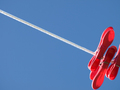
| 07/07/2008 06:14:38 PM | Ohandmeby omikeoComment: I think a wider horizontal would make it feel a little more balanced. Also, the round thing in the middle is a bit distracting. |
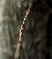
| 07/05/2008 12:18:59 PM | ------- x ------- X ------- x -------by glad2badadComment: CRITIQUE CLUB CRITIQUE
by karmat
Compositionally, this feels just a touch off-balance to me. I think more of a diagonal OR more negative space on the right would make it feel more balanced. Also, having the barb further towards the bottom of the frame would make it feel more stable, I think -- right now it is almost centered and it seems to make it feel static.
Technically, I really like the shallow dof in this. It accentuates the barb and textures nicely. Also, the mottled background gives an interesting almost-smooth contrast to the sharpness of wire. The colors are also really good.
Overall, you have definitely met the challenge. Despite what it probably sounds like, I really like it. It has an almost abstract quality that it intriguing. Good work.
Karma |  Photographer found comment helpful. Photographer found comment helpful. |
| 07/05/2008 12:03:50 PM | Urban Fisherman's Tranquilityby wingyisleedsComment: CRITIQUE CLUB CRITIQUE
by karmat
Compositionally, there is a good balance between the grass and the water. The line, however, looks a bit odd, contextually. My first thought, based on the title, was that it was a fishing pole, but it doesn't look like a fishing pole. It just looks like a stick going across the frame. It may have been helpful if you could have gotten wider and included the tip of the pole -- it would have given a definite starting/stopping point for the line, and given the shot some more context.
Technically, I like the selective focus used. The bw and contrast level is also done very well.
Overall, a nicely done shot. It meets the challenge, but there isn't as much context, I think, to really connect with the voters.
Best to you in future challenges.
Karma | | Photographer found comment helpful. |
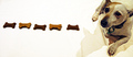
| 07/05/2008 03:34:13 AM | Mine...by SundayMorningsComment: CRITIQUE CLUB CRITIQUE
by karmat
You have a lot of things "right" in this picture, but two thing seriously effected the overall image.
First, the focus issues. Even though you were able to "salvage" it to a degree, the shot still suffers from being out of focus. Due to the processing you have done, the biscuits look "blocky" with not discernible texture remaining in them, and there are artifacts in the "background." His back right paw looks focused, so I am thinking it was just a matter of your camera not focusing where you wanted it to.
The color cast is also distracting. A clean white would have really given this shot some zing. I don't know about your camera, but a lot of them have it so that you can adjust the white balance if you are using flash. It may have also been possible to desaturate the yellows, and gotten the whites a bit white. You could have used levels and desaturated the whites, then "erased" the dog to get him back to his 'natural' colors. Or you could use a mask and do it that way.
The flash is what caused the shadow, and may have been diminished some by bouncing the flash. If using on camera flash, simply take an index card or a piece of white paper and hold it (or fasten it somehow) so that the light from the flash hits the paper and bounces. You get the benefit of the flash, and not as much shadow.
I love the composition in this. It works very well, and if the things addressed above had been "fixed," I have no doubt that you would have score as much as a point and a half higher.
Best to you in future challenges.
Karma |
| 07/05/2008 03:22:41 AM | Starting Lineby hotpastaComment: CRITIQUE CLUB CRITIQUE
by karmat
Very, very well done. The composition is strong, and like one of your commenters mentioned, there is a nice juxtaposition between stillness and motion. That can be done, but it often comes across as being contrived. It just looks nice in this one. I think you did well in making the stripe a different color. Had it been left bluish, it may not have been as obviously a "single line" as I could see people considering this shot to have two main lines -- the one that is now green, and the one that is largely horizontal.
Technically, it is very well done with regards to color (now we can add hotpasta blue to our drAchoo greens -- grin), exposure, and all that other stuff.
Again, a very nice shot.
karma | | Photographer found comment helpful. |
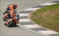
| 07/05/2008 03:15:49 AM | Racing Lineby McJamweaselComment: CRITIQUE CLUB CRITIQUE
by karmat
Compositionally, I think there is a good balance between the riders on the left and the infield on the right. This sets the shot up to be strong, compositionally. I do think, however, that having the riders further down in the frame, with a bit more space towards the top would make it even stronger, and give a better feeling of the movement of the bikes.
Technically, the focus and details are good. Also, oranges stand out nicely from the asphalt and green grass. It seem that contrast and/or saturation could be bumped up *a little,* to give the photo a bit more dimension -- it feels a bit flat.
Overall, nice work, and I think you met the challenge well. I also think it is interesting that the color schemes are so similar. At first glance, I thought perhaps they were all teammates.
Best to you in future challenges.
Karma | | Photographer found comment helpful. |
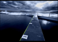
| 07/04/2008 07:43:54 PM | Wash Day Bluesby LittleArkComment: CRITIQUE CLUB CRITIQUE
by karmat
Compositionally, I really like this, and the way you have used the negative space. The line draws your eyes down and through the frame to the pins. The only suggestion for composition I would have is if a bit more of the far right clip was included, OR if you had cropped it on the bottom so that it was "overflowing" two sides of the shot.
Technically, the colors are very good here and the exposure is good. I'm impressed that you can still see the texture of the string. That said, a bit more contrast or levels adjustment to make it just a shade darker, might make the pins a bit bolder, and therefore make the shot a bit stronger.
Overall, you have met the challenge well.
Karma |
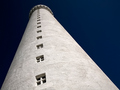
| 07/04/2008 07:26:47 PM | Line of windowsby BrinComment: CRITIQUE CLUB CRITIQUE
by karmat
Compositionally I really like how you have done this. I would imagine the more typical way to photograph it would be to try for a perfectly symmetrical shot. As it is a bit off center, and not symmetrical, it causes the viewer to take a second look, and this is good. It is also good that you have kept the balanced feeling of the composition.
Technically, you have done very well. The sky is a deep, rich blue, and yet the structure is not blown out and details/textures are still visible.
Overall, very well done. You have met the challenge in a way that is technically well done and visually pleasing to the eye.
Karma
| | Photographer found comment helpful. |
| 07/02/2008 03:46:22 PM | | | Photographer found comment helpful. |
| 07/02/2008 03:23:26 PM | | | Photographer found comment helpful. |
|
Showing 1001 - 1010 of ~9205 |
Home -
Challenges -
Community -
League -
Photos -
Cameras -
Lenses -
Learn -
Help -
Terms of Use -
Privacy -
Top ^
DPChallenge, and website content and design, Copyright © 2001-2026 Challenging Technologies, LLC.
All digital photo copyrights belong to the photographers and may not be used without permission.
Current Server Time: 06/21/2026 06:21:08 PM EDT.
|