|
|
|
Showing 991 - 1000 of ~9205 |
| Image |
Comment |
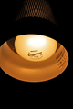
| 07/09/2008 03:37:40 PM | The Lamp Above My Bedby EssAreDubyaComment: CRITITQUE CLUB CRITIQUE
by karmat
Compositionally, I like the vertical crop overall. I think it is a little tight on the lefthand side, but other than that, it seems to work. I am wondering if it wouldn't be slightly strong if the lamp was more on an angle -- it might give the shot more of a diagonal "flow."
Technically, you have done an excellent drop at controlling the light on this. It is not blown out, yet there are some details still visible. The "darkness" works well as negative space.
You DID meet the challenge, and it IS technically well done. What I think it lacks though, is a "connection" to the viewer. Without that, it just kinda feels like "ho hum -- another light bulb shot." Perhaps a bit more context for the shot would have helped.
Best to you in future challenges.
Karma |
| 07/09/2008 12:18:00 PM | Searching for an Ideaby zackdezonComment: CRITIQUE CLUB CRITIQUE
by karmat
Compositionally, I do like how you have filled the frame with the subject. I think, though, as someone else mentioned, it might have been better to do a profile shot. Without the ears, (which can only be seen with scrolling on some monitors), it is not immediately obvious that this is a head. Also, it is too tight at the top. It almost feels like the bulb is hanging on the top of the frame, or is attached to something that you don't want to be seen.
Technically, I like how the bulb is sharp focused, and the orange really make you pay attention to this shot. There is some orange haloing around the head, kinda like an aura, that takes away from the overall effect, but otherwise it works pretty well.
Burning a "glow" on the bulb would have definitely gotten you dq'ed as it would be adding an element that is not present in the original. THAT SAID, it is your picture, so outside of dpc, edit to you heart's content -- I think it would be a neat effect. Especially if the glow contrasted with the background.
Best to you in future challenges.
Karma |  Photographer found comment helpful. Photographer found comment helpful. |
| 07/08/2008 10:08:00 PM | Envious EyEsby heavyjComment: CRITIQUE CLUB CRITIQUE
by karmat
Compositionally, I think this shot would benefit from a slightly different crop. If there were more space on the right for her to "look" into, and less empty space on the left. I think this would give the shot more of a balanced feeling.
Technically, it is a good capture. There is some noise visible in the darker areas, and overall this hurts your clarity, etc.
Overall, it is a good portrait. Without the title, frankly, I would be lost as to which "sin" is was representing. This may have hurt with other voters. It is a good candid, and would probably make a good bw as well.
Karma
| | Photographer found comment helpful. |
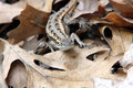
| 07/08/2008 09:21:58 PM | lizard-should-have-done-IMG.jpgby bergiekatComment: Yea, definitely better, but looking at it is like looking at one of those pictures that if you stare at it long enough, another picture will appear. It makes my eyes feel like they are crossing.
It does look like he is laughing at you though! | | Photographer found comment helpful. |
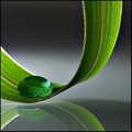
| 07/08/2008 05:03:32 PM | Curves by IreneMComment: Looks very irene-ish. Nice colors and tones in this one. The composition is nice as well. | | Photographer found comment helpful. |
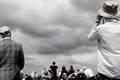
| 07/08/2008 08:28:59 AM | Sightingby spencerwoodComment: And the other was from me. Like I said, I just really like it, and can't tell you why. :) | | Photographer found comment helpful. |
| 07/07/2008 06:19:00 PM | | | Photographer found comment helpful. |
| 07/07/2008 06:18:31 PM | | | Photographer found comment helpful. |
| 07/07/2008 06:18:13 PM | |
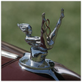
| 07/07/2008 06:17:36 PM | '47 Ford Sportsman V8by VenomComment: The "V8" part of the ornament is hilarious. Is that the original? If so, that was pretty risque for '47. Technically, it is a fairly well done shot, but seems a bit flat and static. Maybe boosting contrast or playing with the composition would add to the interest, a bit. | | Photographer found comment helpful. |
|
Showing 991 - 1000 of ~9205 |
Home -
Challenges -
Community -
League -
Photos -
Cameras -
Lenses -
Learn -
Help -
Terms of Use -
Privacy -
Top ^
DPChallenge, and website content and design, Copyright © 2001-2026 Challenging Technologies, LLC.
All digital photo copyrights belong to the photographers and may not be used without permission.
Current Server Time: 06/21/2026 01:34:07 PM EDT.
|