This sudden challenge totally derailed my plans for the night, so it had better do well :P
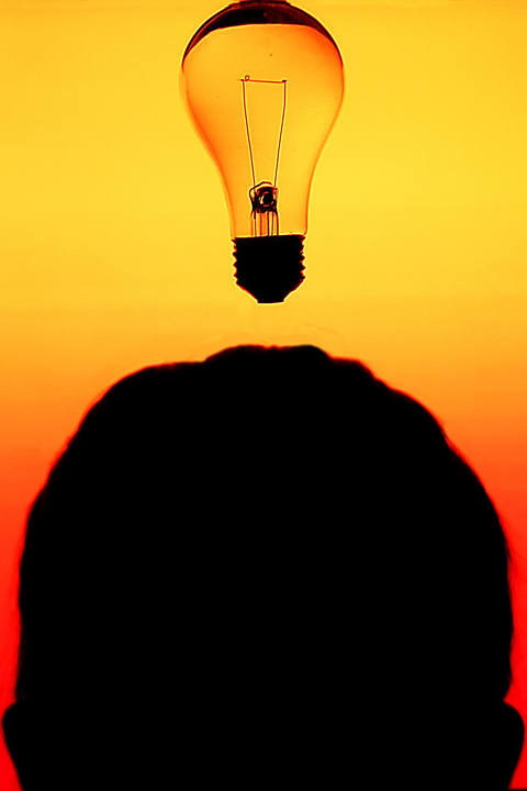
The style in which I shot this was a tribute (perhaps a little tongue-in-cheek) to all the "shot in front of a monitor" shots I see on the front page of DPC. Maybe if I emulate their style I can get higher scores. I feel like such a sell-out.
Though I'm sure there'll be a million "light bulb over head" shots.
Crop, curves, clone out black thread from which bulb dangled, clone out some excessive red fringe on left side of bulb. Wanted to burn the outside of the bulb to create a 'glow' effect, but was afraid that might be against the rules, so I played it safe. Those commenting after the challenge, what do you think?
Statistics
Place: 71 out of 112 Avg (all users): 5.3333 Avg (commenters): 5.6000 Avg (participants): 5.0455 Avg (non-participants): 5.4639 Views since voting: 1005 Views during voting: 262 Votes: 141 Comments: 7 Favorites: 0
Compositionally, I do like how you have filled the frame with the subject. I think, though, as someone else mentioned, it might have been better to do a profile shot. Without the ears, (which can only be seen with scrolling on some monitors), it is not immediately obvious that this is a head. Also, it is too tight at the top. It almost feels like the bulb is hanging on the top of the frame, or is attached to something that you don't want to be seen.
Technically, I like how the bulb is sharp focused, and the orange really make you pay attention to this shot. There is some orange haloing around the head, kinda like an aura, that takes away from the overall effect, but otherwise it works pretty well.
Burning a "glow" on the bulb would have definitely gotten you dq'ed as it would be adding an element that is not present in the original. THAT SAID, it is your picture, so outside of dpc, edit to you heart's content -- I think it would be a neat effect. Especially if the glow contrasted with the background.
Personally I think if the shilhouette were of the profile of the face instead, the might have made the concept clearer. Also the cropping is a bit tight on the top; the lightbulb is almost cut off. Otherwise this is good image. I like the colors!
Could have been a major contender if you could have figured out how to show the entire bulb. Was the head closer to the camera than the bulb? Or did you use a fairly wide aperture? The head is OOF. No vote, I'm in this one.





 Add photograph to your favorites
 Add photographer to your favorites

 Photographer found comment helpful.


