| Image |
Comment |
| 06/02/2009 08:16:13 AM |
|
 Photographer found comment helpful. Photographer found comment helpful. |
| 05/25/2009 05:12:42 PM |
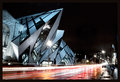
Architectural Inspirationby FrankRobinsonComment: Thanks for your thoughts - Perhaps a little more could have gone from the right, I was aiming for those magic thirds but hey ho!
Fair comment on the lamp posts but given that this was a basic editing challenge there was not much I could do about them!
Thanks for commenting. :o) |
| 05/08/2009 12:59:18 PM |
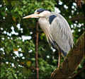
Featherby CitadelComment: This is also a great example of a picture which gets better the more you look at it, which doesn't work so well on a DP Challenge where most voters will give it about 30 seconds... more contrast to make the components stand out will help grab that fleeting attention.
Alternatively, photograph it for you and accept the score which is definitely more purist! For myself, I would be curious to see this picture with the feather diagonally bottom left to top right in almost a square crop processed much as you have, although with maybe a touch more contrast. How did you do the BW conversion? |
| Photographer found comment helpful. |
| 05/08/2009 09:33:09 AM |
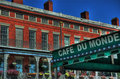
Cafe Du Monde - A New Orleans traditionby SEGComment: A lot of this will be down to taste, but for me the benefit of HDR is the chance to expose more of the picture correctly, while maintaining the look of a photo. I have seen HDRI used very effectively to produce a slightly 'cartoon' image as you have here but it leaves me a little cold.
I would also recommend processing to avoid the halos around the chimney (a common sign of excessive use of the shadow/highlight tool as well I have found) and the slightly over saturated colours.
To me it actually doesn't look that crisp - the lines are sharp but thick, which I often also find a problem when I am trying HDR and my photos are not exactly in line (from manual rather than remote shutter normally!)
As to why it didn't score well, I just don't think it is to DPC taste. If you look at the front page, the photos tend to be sunsets/landscapes or action shots of this and that. Do one of those and you can get away with all sorts of technical failures (mentioning no names on a recent challenge!) |
| Photographer found comment helpful. |
| 02/09/2009 01:39:34 PM |
The Watcherby FrankRobinsonComment: Couple of comments on a lack of greyness. Hmmm. I guess it is all about point of view - my subject is grey which is what the challenge called for. Oh well.
Many thanks for the more interesting comments like Wendyd's :o) |
| 02/08/2009 07:39:56 AM |
|
| 02/07/2009 08:41:09 AM |
devilby jjmonkey1993Comment: You really want to make this as big as possible within the 640px limit as I feel you are losing out on what could be a great shot. |
| Photographer found comment helpful. |
| 02/06/2009 11:45:36 AM |
End of beautyby Rino63Comment: Fun idea but a bit too blown out. Perhaps it would have worked better with a coloured flower? |
| Photographer found comment helpful. |
| 02/06/2009 11:44:39 AM |
|
| Photographer found comment helpful. |
| 02/06/2009 11:44:05 AM |
|
| Photographer found comment helpful. |
Home -
Challenges -
Community -
League -
Photos -
Cameras -
Lenses -
Learn -
Help -
Terms of Use -
Privacy -
Top ^
DPChallenge, and website content and design, Copyright © 2001-2026 Challenging Technologies, LLC.
All digital photo copyrights belong to the photographers and may not be used without permission.
Current Server Time: 06/10/2026 11:01:12 PM EDT.