| Author | Thread |
|
|
05/08/2009 04:33:56 PM |
Greetings from the Critique Club!
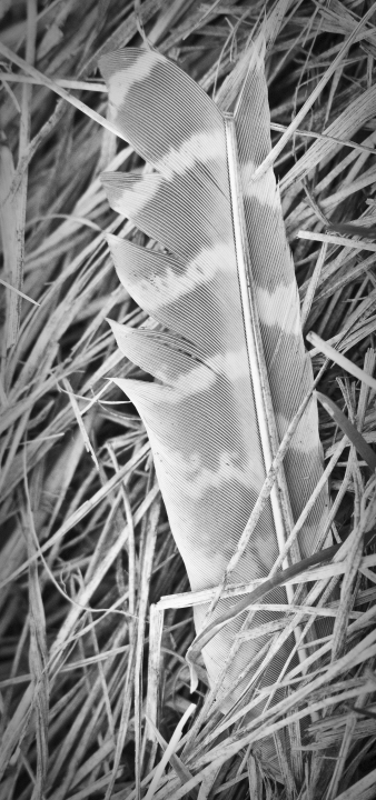
Initial impression: lovely study in textures and lines, though lacking a bit in visual impact. Long portrait orientation is an interesting choice.
Technical: As has been noted, composition could be a little stronger; here it looks shot from directly overhead, which makes for a tougher shot. Dof works well with background oof, but that straw 2/3 the way down does slow down the flow of the feather tremendously.
Artistic: Don't know if b/w was the best way to go here, tends to make it a little washy.
FWIW: I would've carefully plucked away the topmost blades of grass/straw, that would leave feather undisturbed, to show off whole length of feather and banding to advantage. Probably would have rotated camera to give it more of a diagonal/leading lines thing. And would have left it in colour, or gone b/w and really whacked the levels and curves sliders around to emphasize the feather.
Overall not a bad shot, just needs a little more tweaking. Don't be afraid to move obstructions out of your way if it'll help you get a better shot. Keep up the good work!
Feel free to PM me with any questions,
Susan |
|
 Photographer found comment helpful. Photographer found comment helpful. |
|
|
05/08/2009 02:06:16 PM |
|
Not sure if anyone else mentioned it, but the odd dimensions of the photo could also contribute to a low score. |
|
| Photographer found comment helpful. |
|
|
05/08/2009 12:59:18 PM |
This is also a great example of a picture which gets better the more you look at it, which doesn't work so well on a DP Challenge where most voters will give it about 30 seconds... more contrast to make the components stand out will help grab that fleeting attention.
Alternatively, photograph it for you and accept the score which is definitely more purist! For myself, I would be curious to see this picture with the feather diagonally bottom left to top right in almost a square crop processed much as you have, although with maybe a touch more contrast. How did you do the BW conversion? |
|
| Photographer found comment helpful. |
|
|
05/08/2009 02:46:03 AM |
|
It lacks contrast, all to "samey" ( if there is such a word , I would have tried a colour filter or colour balance adjustment before B&W conversion and darken the grass to frame the feather (unless of course the feather was green which i doubt ) |
|
| Photographer found comment helpful. |
|
|
05/08/2009 02:18:01 AM |
|
It's the straw which ruins the picture I think. As you said in your details, the feather has great texture and fantastic stripes. But the straw does considerably distract from it. It's the strongest in the bottom right corner because it is in the foreground and drags the eye away from the feather. Of course, like the other commenters said before me, you could diminish this effect with post-processing. But unless you are a photoshop god, it stays a weak composition. |
|
| Photographer found comment helpful. |
|
|
05/08/2009 01:34:37 AM |
in response to your forum post: i think that the black and white really diminishes the viewer's ability to separate the feather from the grass which leads to a combination of two clashing textures that just makes the picture seem very busy. its like wearing a leopard print shirt with spotted pants to me. i also agree with JDubsgirl that tight vertical crop is displeasing in this kid of photo it feels like it was only cropped in this manner in order to be able to fit the whole feather in the frame as if you were documenting it for scientific analysis rather than trying to construct a more abstract piece of natural art. i love the texture and the sharpness really bring it out great but i dont feel any movement due to the confining crop and i feel like the emotion/feeling brought about by the subject and the texture has been diminished by taking it out of context and sort of just showing it solely as its physical manifestation rather than having some sort of feeling behind it. i feel like a single feather in a patch of grass brings a feeling of being lost or left behind. lonely. and in this case the texture would act to enhance its difference from its surroundings putting it in an even more isolate state but the composition doesnt reflect any of that or any other sort of feeling for that matter. i hope that my very long winded and circuitous answer was helpful in some way shape or form. on the other hand it could be completely worthless seeing as its 1:30 AM haha
-Max |
|
| Photographer found comment helpful. |
|
|
05/08/2009 12:58:47 AM |
|
It didn't come up for me in voting, or I would tell you what I gave it. My impression is a lack of something that keeps the feather from standing out against the background. Could possibly be the heavy patterns of both the feather and the background, or maybe contrast also plays a part. They are different, but maybe not different enough. What does it look like in color? |
|
| Photographer found comment helpful. |
|
|
05/08/2009 12:48:57 AM |
I think  JDubsgirl pretty much hit the nail on the head. For me, the B&W conversion is really lacking. It is full of very mid-tone grey and very little real black or white, making, as Juliet says in her comment, the feather blend in with the background. Both comments made about the composition are also very valid. I think it needs more space around the subject, as it feels pretty cramped. JDubsgirl pretty much hit the nail on the head. For me, the B&W conversion is really lacking. It is full of very mid-tone grey and very little real black or white, making, as Juliet says in her comment, the feather blend in with the background. Both comments made about the composition are also very valid. I think it needs more space around the subject, as it feels pretty cramped. |
|
| Photographer found comment helpful. |
|
|
05/08/2009 12:37:18 AM |
|
crop is a it tight, contrast in the feather could be more enhanced, maybe a bit of dodging/burning. and thats about it. maybe some curves and levels work could have helped |
|
| Photographer found comment helpful. |
Comments Made During the Challenge  |
|
|
05/06/2009 12:37:00 AM |
|
I like this shot, I like the lines that you have that draw the eye. Personally I think the feather needs to be tilted just a tad as it is nearly a straight line, it would draw your eye all the way across the page. The BW also is maybe hurting it a little too. I would have gone a little more dramatic in the BW just so the feather stands out as right now, it is blending into the background. I really like the highlight on the piece of straw that you have on the left hand side, it draws the eye. Btu I do not think that it is enough to make it stand out from the crowd. It is sharp, clean and crisp, all the details really stand out. |
|
| Photographer found comment helpful. |
|
|
05/03/2009 06:14:06 PM |
|
Minimalist imagery is always appreciated. A solid image that is crisp, sharp and properly framed and composed - a technical success in every way. From an artistic standpoint, it has significant impact being rich with excellant detail. A perfect demonstration of the power of properly controlled light and focus. Well done. |
|
| Photographer found comment helpful. |
Home -
Challenges -
Community -
League -
Photos -
Cameras -
Lenses -
Learn -
Help -
Terms of Use -
Privacy -
Top ^
DPChallenge, and website content and design, Copyright © 2001-2026 Challenging Technologies, LLC.
All digital photo copyrights belong to the photographers and may not be used without permission.
Current Server Time: 07/16/2026 03:07:48 PM EDT.