| Image |
Comment |
| 04/05/2004 12:07:48 AM |
Chaotic Reflectionby russiComment: This is a great photo. I don't like the way you have used the title to wedge it into the challenge though.. I would have given it a 10 otherwise :) |
 Photographer found comment helpful. Photographer found comment helpful. |
| 04/04/2004 11:14:02 PM |
Air Force Magazineby orussellComment: Greetings from the Critique Club...
Hi Orussell...
This image has suffered a bit in quality, maybe from the 100% crop. I'm not sure.
These planes are massive and that offers some amount of interest in this photo. I can't really offer much critique on this one. Subjectively, the image is OK. There just isn't much about it that really grabs my attention.
John Setzler
|
| Photographer found comment helpful. |
| 04/04/2004 10:29:28 PM |
Antique Review (special sewing issue)by LouisonComment: Greetings from the Critique Club...
Hi Louison...
I enjoy 'antiques', especially in photos. The sepia toning you chose works nicely here.
This particular composition has some opportunities. This one looks rather 'linear'. Maybe some amount of 'chaos' in the order of the items in the photo would create a strong image as well. A higher camera angle would also possibly work well here. Maybe raising the camera up a few inches and turning it counter-clockwise would upset the horizontal composition enough to make something else interesting :)
Keep up the good work...
John Setzler
|
| Photographer found comment helpful. |
| 04/04/2004 09:26:41 PM |
Horticultureby vtruanComment: Greetings from the Critique Club :)
Hi Vtruan...
This is a nicely executed black and white. The choice for black and white really brings out the texture and shape in this subject. I think most of the comments you have received here about sum it up though.. For a 'Horticulture' magazine cover, I struggle with the concept of black and white. For a fine art magazine of some sort, this shot works nicely :) Some of the absolute best flower photos I have ever seen have been done in black and white. I think you simply introduced an opportunity for critique with the combination of the photo and the title.
Keep up the great work :)
John Setzler
|
| Photographer found comment helpful. |
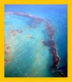
| 04/04/2004 12:28:12 AM |
National Geographicby bjallenComment: Greetings from the Critique Club...
Hi Bjallen...
This photo has potential, but I believe the exposure through the airplane window really had some issues. The photo just appears to be 'hazy' overall and it probably came from the window on the plane. I think the division between the blue and green in this photo could be much stronger, and I'm not sure if post processing would correct it efficiently or not, but it's possible.
Beyond that, I think Cuba would be a beautiful place to visit... I would love to go there someday myself. I think I will probalby see that happen at some point in my lifetime :)
John Setzler
|
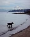
| 04/04/2004 12:19:26 AM |
Northwest Travelby timj351Comment: Greetings from the Critique Club...
Hi Tim :)
You are such a fortunate photographer to live in the pacific northwest. I envy that :) If you have a couch for lease sometime, I'll have to come visit and get you to take me to some of these beautiful places :)
I love the theme of this photo. It's a nice integration of raw nature and urban encroachment... lol.. does that make sense? My 'fluff factor' isn't working so well after the night out...
Obviously, I don't know what is visible off to the right in this frame, but if this shoreline was visible, I think that curve would offer some nice fluidity for the eye. The dog is perfectly positioned in this composition though.
Here's a thought from my one track mind for ya.... You know I like black and whites. I think one of the reasons I produce so many of them is because when I feel that the color is not adding to the composition, I usually remove it. There are some instances where it works either way, but most don't. I'm wondering if this particular photo would make a nice contrasty b/w with a little editing. Maybe you could also discuss this idea with me. I would love to hear your side of that as an artist.
Keep up the good work :)
John Setzler
|
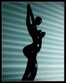
| 04/02/2004 04:24:42 PM |
Art Magazineby terjeComment: Greetings from the Critique Club...
Hi Terje :)
I love it when I get a great image to critique from the critique club queue. This photo is underrated for sure. The problem here is that I can't really offer you any 'critique' because I wouldn't change anything about this image. Everything you have presented here simply works well as is. Maybe I can comment on some of the comments you have already received...
Beagleboy - "A bit dark, but nice concept."
I'm not sure what he means by this, but dark is the theme of the image, IMO. I think you have a perfect mixture of light and dark. The subject itself is dark, and the subtle light and shadow in the background accents that nicely.
jpochard - "I like the potential here. I'm not sure how...but I'd like to see better lighting on the figure."
It appears to me that the subject is black. No amount of light is going to change that or bring out any more detail. The subject seems 'smooth' textured and adding light won't do anything but cast unwanted shadows on your background. "brett2004" made a comment about different lighting as well. His comment mentions casting shadows on the subject, which seems quite impossible since it's black. He also mentioned the centered composition, which seems to work fine for me here as well. It's a simple preference in a photo like this, but it works in this case. Moving off center wouldn't really change a lot.
The rest of the comments you have don't seem to be complaining.
Excellent work... going on my favorites list...
John Setzler
|
| Photographer found comment helpful. |
| 04/01/2004 10:55:11 PM |
Easy Home Cookingby KonadorComment: Greetings from the Critique Club...
Hi Ben :)
I think this is a good execution. You have a strong theme of shape and texture working here. The composition in the lower right of '3' is also strong. Odd numbers usually work better :) The opposing diagonals also strengthen the composition without overpowering the focal point in the image.
This also looks like a great composition for magazine cover with plenty of room for a title and supporting text. The overall simplicity of this image also lends itself well to a magazine cover. I'm not experienced in this type of work but this seems like it would make a good cover simply because the image itself is strong and doesn't overpower the other information that may be on the cover with it...
Excellent work as usual :)
John Setzler
|
| Photographer found comment helpful. |
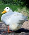
| 04/01/2004 04:44:41 PM |
WaterFowlby faidoiComment: Greetings from the Critique Club...
Hi Fadoi...
Good rule of thumb: If you ask for an in depth critique, you should be willing to include your own comments with your photo when you submit it. Does this photo not have any meaning or interest to you personally? If not, it's not worth asking for an in depth critique. You have to care about it before you should ask someone else to do the same :)
This particular composition feels too tight. Filling the frame has its merits, but effectively 'padding' your subject does as well. The spotty sunlight is working against you in this photo. The subject's environment is also not creating a lot of separation between it and the subject.
I spend quite a bit of time photographing ducks and geese at my local park. Sometimes I just have to follow them around (or let them follow me around) until the light and conditions allow some nice photos....
Keep up the good work...
John Setzler
|
| Photographer found comment helpful. |
| 04/01/2004 04:39:07 PM |
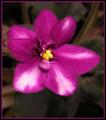
The Growing Edgeby ColeyComment: Greetings from the Critique Club...
Hi Coley...
Good rule of thumb: If you ask for an in depth critique, you should be willing to include your own comments with your photo when you submit it. Does this photo not have any meaning or interest to you personally? If not, it's not worth asking for an in depth critique. You have to care about it before you should ask someone else to do the same :)
This flower has a nice texture to it. I can see the tiny hairs on the petals. The composition here is rather static though. It's not composed in such a way as to highlight those finer details and give any depth to the subject. This particular composition also creates some amount of distraction from contrasts in the background.
The center of this flower seems to be the main point of interest overall. Maybe a very close shot of just that portion of the flower would present a stronger image. You could spend some time focusing on the elements that give a subject strength rather than the subject as a whole....
Keep up the good work.
John Setzler
|
Home -
Challenges -
Community -
League -
Photos -
Cameras -
Lenses -
Learn -
Help -
Terms of Use -
Privacy -
Top ^
DPChallenge, and website content and design, Copyright © 2001-2026 Challenging Technologies, LLC.
All digital photo copyrights belong to the photographers and may not be used without permission.
Current Server Time: 06/15/2026 03:57:58 AM EDT.