| Image |
Comment |
| 04/08/2004 02:19:02 PM |
Bath Timeby jmleliiComment: Greetings from the Critique Club...
Hi Outofreachx...
Ducks are fun to work with :) I can't really offer you much on this composition. It feels slightly overexposed to me. The partial ducks don't seem to work well for me. Maybe focusing on a single duck or the entire group would enhance the presentation.
John Setzler
|
 Photographer found comment helpful. Photographer found comment helpful. |
| 04/08/2004 02:17:04 PM |
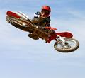
The Jump Shotby TerryGeeComment: Greetings from the Critique Club...
Hi Terry :)
This shot finished rather well in the challenge. I can't really add much to the comments you have received other than maybe a compositional change. As I play with this image on the screen, it seems that cutting off the right half of the image makes a tighter view of the subject area of the shot. Panning motion is quite difficult to 'compose' in most cases. The image just feels stronger overall to me when I remove the right half...
Excellent work :)
John Setzler
|
| 04/08/2004 02:13:58 PM |
Zooming Verdigo....by DrakeComment: Greetings from the Critique Club...
Hi Drake...
Some subjects seem to work better for zoom bursts than others. This one has some potential probably. I'm by no means an expert on this technique because I just tried it for the first time recently. Here is my example shot:
//www.pbase.com/image/27263843
As you can see, there is room for refinement. I haven't had time to experiment more with the technique yet, but this shot was created by creating a tight composition with the zoom, and then zooming OUT from the open shutter. I tried several variations as I was working this subject, and I discovered that this technique worked best for me. I also zoomed out at a speed that left me a small amount of time at the end of the exposure to 'lock' in the subject with some clarity. Camera shake is always an issue on these...
John Setzler
|
| Photographer found comment helpful. |
| 04/08/2004 02:09:47 PM |
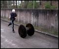
My Son In Motionby MonaComment: Greetings from the Critique Club...
Hi Mona...
I think the comments you received throughout the challenge sum up the resulting score on the photo pretty concicely. I won't reiterate those...
Other than that, the image doesn't seem to create any special interest for me. Does he walk on the spool? That could also create some interesting images :) When I was young, one of my neighbors had some really large wooden spools in his back yard that we used to walk on. Some of them were 6 feet tall and quite entertaining :)
John Setzler
|
| Photographer found comment helpful. |
| 04/08/2004 01:31:28 PM |
Leaving the barby egillibsenComment: Greetings from the Critique Club...
My initial comment on this photo sums up my opinion pretty well. I think this photo could be a lot stronger with a little less blur. Based on your exposure settings, there probably isn't much room for adjustment though. It appears that you used your maximum aperture size. It may have been possible to use ISO 200 to get a 1/2 second shutter speed instead of 1 second.
John Setzler
|
| Photographer found comment helpful. |
| 04/08/2004 01:14:51 AM |
|
| Photographer found comment helpful. |
| 04/08/2004 12:03:27 AM |
|
| Photographer found comment helpful. |
| 04/07/2004 05:02:26 PM |
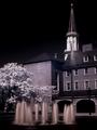
Courthouse Fountain - Alexandriaby BAMartinComment: Greetings from the Critique Club...
Hi Barbara...
I do enjoy infrared images. This one lights up nicely with strong contrast. The only element that looks odd to me is the color of the fountain. The hue in that area doesn't seem to match the overall feel of the rest of the scene...
Keep up the good work :)
John Setzler
|
| Photographer found comment helpful. |
| 04/07/2004 04:52:00 PM |
SHARK ! ! !by joleneyng1Comment: Greetings from the Critique Club..
Hi Joleneyng1...
I really hate to see that this photo scored so poorly. I gave the photo a 10 because of the blur and the sense of pure fear that the image creates for me. It was easy for me to determine what I was looking at as soon as I saw it. I think it's a great shot... nice abstract... excellent work... thanks for sharing it :)
I gave this photo a 7.
Keep up the good work :) Message edited by author 2004-04-07 16:52:26. |
| 04/07/2004 02:21:20 PM |
Intimidated Lionby unknowndeathComment: Greetings from the Critique Club...
Hi Unknowndeath...
I enjoyed this photo as a stand-alone image. I can't offer you much of a critique since you have not explained your intent in the photographer's comments. |
Home -
Challenges -
Community -
League -
Photos -
Cameras -
Lenses -
Learn -
Help -
Terms of Use -
Privacy -
Top ^
DPChallenge, and website content and design, Copyright © 2001-2026 Challenging Technologies, LLC.
All digital photo copyrights belong to the photographers and may not be used without permission.
Current Server Time: 06/14/2026 09:33:07 PM EDT.