| Image |
Comment |
| 08/08/2004 11:01:04 AM |
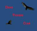
The Dead Pickers Clubby Dim7Comment: Greetings from the Critique Club...
This is a nice capture of the turkey vultures. I have a difficult time evaluating challenge photos of this nature, because the photo itself is not the only element that determines how strong the entire presentation is. The text is the other part being judged, along with what it actually says. With my limited knowledge of graphic design, I would agree that the text in this image is a bit 'loud'. I'm not sure how to suggest much improvement with this idea and theme.
John Setzler
|
| 08/08/2004 01:33:52 AM |
|
 Photographer found comment helpful. Photographer found comment helpful. |
| 08/06/2004 03:02:50 AM |
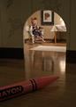
Home Sweet Holeby scalvertComment: This is exceptional :) This is one of the few photos I have seen lately that leaves me with questions about how it was done.... GREAT work :) = 10 |
| Photographer found comment helpful. |
| 08/04/2004 01:36:22 PM |
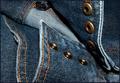
Stud fastenersby trainComment: Greetings from the Critique Club :)
Hi Train...
This is a good example of everyday objects. Blue jeans are quite commonplace and most people are familiar with them. The texture and detail here are also somewhat interesting, but the point of focus seems a bit off. The fasteners/snaps here probably should be in nice sharp focus. In an image like this one, I can't see any particular reason for everything not to be sharp. Compositionally, there is an ajustment you could have made that would possibly create more visual appeal. The label that is showing in the back of the pants is not really adding anything to the image, but the break in the curve on the bottom left is a bit uncomfortable. Changing the camera angle slightly would have included this entire curve and probably removed the label. The additional 'flow' in the image with that curve being complete would be nice :)
John Setzler
|
| 08/02/2004 01:15:15 AM |
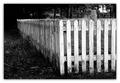
Blues Reliefby pcodyComment: Excellent idea here... nice color contrast. The composition may be improved some by giving a little subject breathing room around the bottom and bottom right edges... |
| Photographer found comment helpful. |
| 08/02/2004 12:37:31 AM |
Rootsby TommyMoe21Comment: This is really nice :) The clipping of the bottom curve here feels a little uncomfortable though.. it seems to break the rhythm of the image.... |
| Photographer found comment helpful. |
| 08/02/2004 12:08:19 AM |
|
| 08/01/2004 05:57:37 PM |
|
| Photographer found comment helpful. |
| 07/31/2004 08:33:15 PM |
|
| Photographer found comment helpful. |
| 07/30/2004 05:32:49 PM |
|
| Photographer found comment helpful. |
Home -
Challenges -
Community -
League -
Photos -
Cameras -
Lenses -
Learn -
Help -
Terms of Use -
Privacy -
Top ^
DPChallenge, and website content and design, Copyright © 2001-2026 Challenging Technologies, LLC.
All digital photo copyrights belong to the photographers and may not be used without permission.
Current Server Time: 06/14/2026 05:15:15 AM EDT.