| Image |
Comment |
| 08/12/2004 03:46:24 PM |
What Safety Zone?by ImagineerComment: Greetings from the Critique Club...
This is a great action capture but I think it simply didn't scream BLUE to anyone. I can't really imagine any way to improve this photo without actually setting it up. There are lots of different compositional options for something like this, but once again, that would require setting it up :) Because of that, there is not really a lot of room for 'critique' outside the context of the challenge, which has already been covered.
Keep up the good work :)
|
 Photographer found comment helpful. Photographer found comment helpful. |
| 08/11/2004 06:48:11 PM |
Breath Of Fireby jmsetzlerComment: Originally posted by BradP:
Hmm..... seems we have something in common besides our goods looks!
:) |
Good looks are all that matters anyway ;) |
| 08/10/2004 04:52:02 PM |
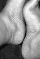
Sby KaveyComment: This is a challenging composition. I definitely understand the theme and your intent with this photo, but something is causing me to struggle with it. It may possibly be the exclusion of the toes on the right foot. Something just doesn't 'flow' and I can't really put my finger on exactly what it is. It may simply be that the S is not strong enough to successfully create the flow. Another possible modification to increase the strength of the curves here would have been to let them create a little stronger diagonal in the frame by rotating the camera slightly counter clockwise for the photo. I can't really 'recreate' this image a different way in my mind without actually trying it :)
|
| Photographer found comment helpful. |
| 08/10/2004 04:10:21 PM |
Signby dyriComment: Greetings from the Critique Club...
Hi Dyri...
This is a challenging photo to 'critique'. I can certainly see how it meets the challenge for you. It's probalby a road sign that you pass every day... something simple... something without frills.
The image doesn't hold any special interest for me as a viewer. I can't look at this and be inspired by the composition, photographic technique, or the subject. Even though it meets the challenge, there needs to be something photographically interesting about the image as well for higher placements most likely.
Cheers and good luck in the future :)
John Setzler
|
| 08/09/2004 01:23:38 AM |
"POP !" a macro illusion by graphicfunkComment: Greetings...
This is a beautiful execution... I gave this photo a 10 and was actually surprised to see it in the top 3... congrats :)
I listened to a discussion once about a technique for this type of photo where the bottom of the bottle is removed... the bottle is mounted and water is poured in from the open bottom of the bottle... is this similar to a technique you may have used for this? |
| Photographer found comment helpful. |
| 08/09/2004 12:19:09 AM |
Feet on the beachby pumaComment: This is an example, IMO, of where selective desaturation does not work. Selective desaturation is generally used to put a viewer's focus on part of the image... usually the subject of the image. Is the board/wood in this photo where you want your viewer to focus? |
| 08/09/2004 12:07:27 AM |
Feet and Inchesby ClubJuggleComment: This is certainly a creative interpretation of this challenge :) I hope it can survive the vote... great shot :) |
| Photographer found comment helpful. |
| 08/08/2004 11:50:46 PM |
|
| Photographer found comment helpful. |
| 08/08/2004 11:19:19 PM |
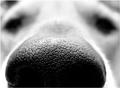
Sniff ..Sniffby CamComment: This is phenomenally good work :) Pet photos like this one hold nice 'universal' appeal and it goes way beyond the mundane... great concept and execution :) = 10 |
| Photographer found comment helpful. |
| 08/08/2004 08:14:41 PM |
On the Edgeby smokeditorComment: Beautiful work. This is my favorite photo in this challenge. The lighting is excellent... it could possibly stand a tad more depth of field... = 10 |
| Photographer found comment helpful. |
Home -
Challenges -
Community -
League -
Photos -
Cameras -
Lenses -
Learn -
Help -
Terms of Use -
Privacy -
Top ^
DPChallenge, and website content and design, Copyright © 2001-2026 Challenging Technologies, LLC.
All digital photo copyrights belong to the photographers and may not be used without permission.
Current Server Time: 06/14/2026 05:15:22 AM EDT.