| Image |
Comment |
| 05/27/2002 07:41:00 PM |
|
 Photographer found comment helpful. Photographer found comment helpful. |
| 05/27/2002 09:26:00 AM |
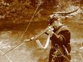
ahhhhh.....by kimComment: She's cute! I would like to see it without her head cropped across the top of the frame :) |
| 05/28/2002 05:03:00 AM |
|
| 05/27/2002 12:30:00 AM |
|
| 05/27/2002 12:33:00 AM |
|
| 05/27/2002 12:19:00 AM |
the wisdom of morpheusby jonathansComment: I don't see any interpretation of a PEOPLE theme with this photo... Maybe this would have worked as an advertisement challenge.... |
| 05/27/2002 10:01:00 AM |
|
| 05/28/2002 09:39:00 AM |
|
| 05/28/2002 04:59:00 AM |
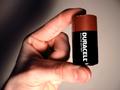
nigthmareby roni81Comment: Nice shot! I would like this one even more without the bottle :) |
| 05/22/2002 03:02:00 PM |
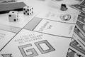
D.P. Monopolyby dlhComment: I like monopoly and I like it even better in color.. Did you intentionally fade the printout on this photo? The 'community chest' cards behind the dice are actually bothering me just a bit because of the sharp dark contrrast that they introduce into the fading background. Bringing the GO into a little sharper focus could be an improvement as well.... good layout and nice effort on this photo... |
Home -
Challenges -
Community -
League -
Photos -
Cameras -
Lenses -
Learn -
Help -
Terms of Use -
Privacy -
Top ^
DPChallenge, and website content and design, Copyright © 2001-2026 Challenging Technologies, LLC.
All digital photo copyrights belong to the photographers and may not be used without permission.
Current Server Time: 06/14/2026 04:36:59 PM EDT.