| Image |
Comment |
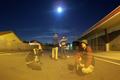
| 07/04/2002 12:24:00 PM |
<Moon Shadows>by willsy66Comment: excellent! I love this one... The only improvement i could suggest woudl be a little white balance to remove some of the tungsten glow of the lights... I think the moonlight would mix better with the rest of the image if the light glow was not as yellow... good shot! = 8 - jmsetzler |
 Photographer found comment helpful. Photographer found comment helpful. |
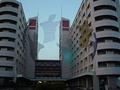
| 07/06/2002 11:16:00 AM |
See Throughby aelithComment: I love the way the bifocal lens creates the distortion over the text. excellent composition and lighting in this photo... great work! = 10 - jmsetzler |
| Photographer found comment helpful. |
| 07/03/2002 11:00:00 PM |
Dancing Ghostby phillipComment: This is really cool :) I wonder how this was done... is this an art piece at this building or something? great shot! = 8 - jmsetzler |
| 07/01/2002 12:31:00 PM |
|
| 07/02/2002 12:27:00 PM |
One's Not Enoughby bobgaitherComment: The concept on this photo is excellent. In my personal preference, I don't care for single subject photos where the subject is bullseye centered in the frame. The focus is a little too soft in this photo as well... = 5 - jmsetzler |
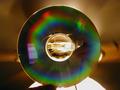
| 07/01/2002 12:29:00 PM |
Ceiling Fan Behind CD-Rby kbargerComment: This is a unique entry this week but.... without the title, I would have no clue as to what i'm looking at with the exception of the CD. The title is explaining this photo to the viewer. Photos should really stand on their own, as stated in the rules of the site. = 4 - jmsetzler |
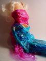
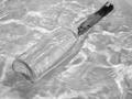
| 07/05/2002 12:35:00 AM |
Vesselby csbComment: I like this transparency... I think it works nicely but I am wondering if there would have been a way to offer some more contrast. I'm also wondering why you chose black and white? Good work :) = 8 - jmsetzler |
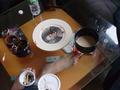
| 07/02/2002 12:24:00 PM |
naturmortby leshiyComment: This looks like my own coffee table :) = 6 - jmsetzler |
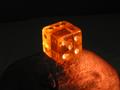
| 07/05/2002 12:34:00 AM |
Sphereby arippsComment: This is lovely :) I love the color of the items inside this sphere. the lighting is also very nice. In my own opinion, I would have rather seen this on a solid dark background. I think the contrasting background in this image doesn't appeal to me as much as it would in a different environment... Good shot though :) = 8 - jmsetzler |
| 07/01/2002 11:19:00 PM |
HOPEby amnonComment: Nicely done :) I wonder what this shot would have looked like with a narrow depth of field to blur out the rest of the stamps? = 7 - jmsetzler |
Home -
Challenges -
Community -
League -
Photos -
Cameras -
Lenses -
Learn -
Help -
Terms of Use -
Privacy -
Top ^
DPChallenge, and website content and design, Copyright © 2001-2026 Challenging Technologies, LLC.
All digital photo copyrights belong to the photographers and may not be used without permission.
Current Server Time: 06/20/2026 03:16:23 AM EDT.