| Image |
Comment |
| 07/26/2002 10:45:00 AM |
dognoseby foot stepsComment: INteresting texture but the dog nose lacks focus. There are a few things that could improve this. I think that raising the camera up off the floor a bit and shooting at a more downward angle would improve the depth of field focus issue here. I don' tknow what camera was used on this shot, but some cameras dont work as well at close range as others. If this is the case, you need to back up from the subject a little as well... = 6 - jmsetzler |
| 07/28/2002 05:05:00 PM |
Peakabooby chariotComment: I like the vertical orientation and the 'peekaboo' concept on this photo. The texture is also quite nice... The empty space in this photo really emphasizes the 'peekaboo' concept quite nicely... the only critique I have is that the lighting around the bear's eyes may be a tad weak... good shot :) = 7 - jmsetzler |
| 07/28/2002 04:01:00 PM |
papasan junctionby mnewmanComment: excellent photo... I love the black and white here... good texture as well :) = 8 - jmsetzler |
| 07/23/2002 09:58:00 AM |
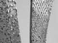
crude metalby BeeGeeComment: interesting texture but the shallow focus on the left doesn't work for me... = 5 - jmsetzler |
| 07/28/2002 05:17:00 PM |
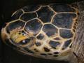
Turtle's headby prkembyComment: this is interesting texture.. this photo accomplishes the task of the challenge nicely but the overall impact of the image doesn't grab my attention. = 6 - jmsetzler |
| 07/26/2002 05:11:00 PM |
|
| 07/23/2002 07:40:00 PM |
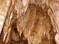
Skin so Softby kathleenmComment: Interesting lighting on this photo... the visual impact is not grabbing my attention though... = 6 - jmsetzler |
| 07/25/2002 07:27:00 PM |
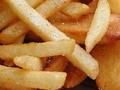
Crispy Crunchyby NitenComment: this is a neat texture photo.. it makes me hungry :) The detail on this one is good... it would look good on a french fry carton at a fast food restaurant :) = 7 - jmsetzler |
 Photographer found comment helpful. Photographer found comment helpful. |
| 07/23/2002 07:03:00 PM |
|
| 07/24/2002 11:36:00 AM |
acrylic on canvasby tommccabeComment: This is nice work. I like the texture of the surface and the color in this image... good shot :) = 9 - jmsetzler |
Home -
Challenges -
Community -
League -
Photos -
Cameras -
Lenses -
Learn -
Help -
Terms of Use -
Privacy -
Top ^
DPChallenge, and website content and design, Copyright © 2001-2026 Challenging Technologies, LLC.
All digital photo copyrights belong to the photographers and may not be used without permission.
Current Server Time: 06/22/2026 05:47:01 AM EDT.