| Image |
Comment |
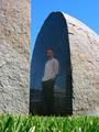
| 11/04/2004 01:05:29 AM |
00011110 v2 by MousieComment: This is the inspiring photograph that I saw when I joined this site that made me decide to try to use my camera creatively. I saw this photo the first day I joined DPChallenge and realized that a camera is more than a tool for populating a family album. Anyone who uses a camera for creative purposes probably has some similar 'root' in the art, and this one is mine.
John Setzler
|
| 11/03/2004 10:41:34 PM |
October colorsby Dim7Comment: This photo does not work for me at all. I understand your intent with the color based on your title, but the tree trunk in the center of this frame is just creating a huge 'block' of the view in this scene. It appears that you wanted this small waterfall to be a part of the composition. If that is true, I would have given it more attention in the composition. |
 Photographer found comment helpful. Photographer found comment helpful. |
| 11/03/2004 10:39:48 PM |
Michelleby lagavulinComment: This is a very well done simple portrait. The light is nice and even. I think her eyes really set this photo in motion for me... great shot.. = 10 |
| Photographer found comment helpful. |
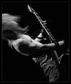
| 11/03/2004 01:51:43 PM |
Heavy Metalby tyt2000Comment: This is a great shot... very intense. You have successfully relayed the power that is a part of heavy metal music. This also makes a great black and white... great shot :) = 10 |
| Photographer found comment helpful. |
| 11/02/2004 06:20:04 PM |
|
| Photographer found comment helpful. |
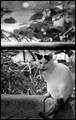
| 11/01/2004 01:29:33 AM |
Peace and Preyby RudyC310Comment: This is scary. This is a very unique looking cat, but what is so odd about it is that it looks almost exactly like my cat. "Potter" is solid white with black ears and a black tail just like this one. Send me a PM after the challenge sometime and I'll share some photos with you :) |
| 11/01/2004 12:44:23 AM |
Serene Reflectionby whatdewucComment: This is a gorgeous scene. I would really like this image much more if u crop out the bottom 25% of it. When you compose a landscape where the horizon is splitting the horizontal center of the frame, you really need to have equal amounts of interest on both sides of the horizon. The interest in this image is concentrated in the center horizontal portion of the frame. This image also appears to be suffering from some jpg artifacting, probalby from too much compression during the save process. It could also come from enlarging a smaller section of the photo... not sure in this case. |
| Photographer found comment helpful. |
| 10/31/2004 10:00:46 PM |
Relaxationby KekiinaniComment: Greetings from the Critique Club...
Hi Kekiinani...
I think most of the primary issues with this photo have been covered in the comments you have already received. The contrast does feel very weak in this image for the type of shot it is. It almost looks like it has been 'lightened' with the brightness tool in software. The other issue that probalby hurt this photo is that there is still light in the sky. Based on the comments I have read in this challenge, a lot of voters expected a 'night shot' to be done well after sundown rather than at dusk where there is still detail visible in the sky....
John Setzler
|
| Photographer found comment helpful. |
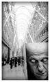
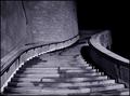
| 10/29/2004 01:27:38 PM |
Spiralby labudsComment: Greetings from the Critique Club...
Hi Labuda :)
This is a nice nighttime architectural photo. It hits on a lot of things that I particularly like in any given photo, such as shapes and texture. It is also nicely composed and 'inviting' to the viewer to walk right into the scene.
One other alternative that could possibly work well here would be a lower angle shot, where the camera is closer to the ground. This often seems to work well by creating a 'larger than life' feel to your subject...
Keep up the good work :)
John Setzler
|
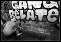
| 10/27/2004 12:18:10 PM |
Truantby jmsetzlerComment: Here is the color version of this photo:
//www.pbase.com/jmsetzler/image/35177598
I expected the comments about wanting to see it in color. Graffiti does make your mind think about color. To me, the color in this image was not particularly interesting and the image did make a nice contrasty black and white. Since we were bound by the silly basic editing rules, I could not remove the lens flare in this photo.
Saintnicholas_25: I got the impression you believe this photo was contrived from your comment. The 'try hardey' comment made me think that and the fact that you believe that a teenager would not wear clothes like this... The comment I posted with the color version explains the scene better than I did in my comment here. It's not contrived. The kid was actually painting the wall. I just happend to stumble upon the event while it was taking place, so I asked him if me minded me making some photos. He was delighted at the thought of it, especially since what he was doing is not illegal. You are right in the fact that it doesn't relate to school. I wedged this photo into the challenge with the title. I do, however, believe that it fits within the greater shceme of adolescence and the overall process of education. It's just not a 'slap in the face' interpretation of the challenge topic. It requires that the voters think outside the box and look at the bigger picture. I am fully aware that this method of challenge photo does not score well :) |
Home -
Challenges -
Community -
League -
Photos -
Cameras -
Lenses -
Learn -
Help -
Terms of Use -
Privacy -
Top ^
DPChallenge, and website content and design, Copyright © 2001-2026 Challenging Technologies, LLC.
All digital photo copyrights belong to the photographers and may not be used without permission.
Current Server Time: 06/12/2026 07:26:39 AM EDT.