| Author | Thread |
|
|
06/10/2014 08:14:51 PM |
|
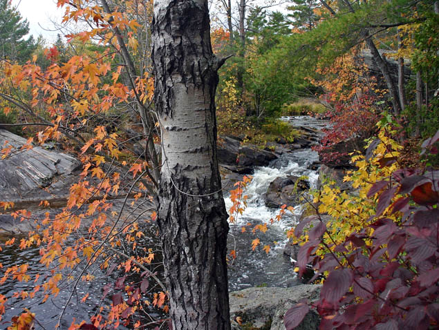
nope, tree is the main focus...not the falls... |
|
|
|
11/15/2004 12:00:53 AM |
Hello from the Critique Club
Initial Thoughts
My first thoughts were that this was a pretty cluttered shot, with the subject I wanted to see blocked by foreground objects.
Compostion / Content
The composition is hurt by the foreground here. The stream itself is a nice subject, surrounded by fall colors, but unfortunately, the tree in the way only detracts. Another perspective, maybe from being almost in the stream shooting upstream, would have made for a nicer comp. Again, in content, just a little too much in the photograph, especially in the foreground.
Background
The background is almost *too* green for a photograph of "October Colors", and I feel that it should have included more of the coloring that you show in the foreground.
Camera Work - Technical
You do have a really crisp focus here, with a good DOF. The exposure might be a little dark. Bumping the shutter speed to 1/250 or even 1/125 might have helped that aspect. Metering in different areas as an experiment might have helped as well.
Digital Processing
You didn't give the details for your post processing, but I think a little brightness/contrast and levels work would have helped here, in order to brighten up the over all shot.
Fits the Challenge
Being a Free Study, it obviously fits the challenge.
My Opinion on the Photo
It's a nice shot of nature, but the foreground elements to me are distracting, and would have made much better *backgound* elements. The stream would have been a much stronger subject, and playing around with perspectives and angles can do wonders. Good luck in the future. |
|
Comments Made During the Challenge  |
|
|
11/07/2004 07:59:44 PM |
|
A bit too busy, but from the look of it you had many options for a great subject... Just need to narrow it down to *one* and work to bring it to attention rather than having many things compteing for it. |
|
 Photographer found comment helpful. Photographer found comment helpful. |
|
|
11/07/2004 12:53:52 AM |
|
Nice image and lovely colours I think if you had cropped it so that the tree was more to the left it would put more emphasis on the river I like this |
|
| Photographer found comment helpful. |
|
|
11/05/2004 10:46:05 PM |
|
IMO the tree is too centered. Great focus and exposure. 6 |
|
| Photographer found comment helpful. |
|
|
11/05/2004 08:55:17 PM |
|
My eyes are finding it hard to rest on just one place. There's a strong vertical line (tree) running through the middle of the photo, and no real subject. The first thing I look at is the tree trunk, but there really is no interest there. Maybe if you could get a shot looking up the river or something, you would have a stronger focal point and might add interest to the photo. The colors are nice. Maybe play with the saturation a bit to see if you can boost the color even more! |
|
| Photographer found comment helpful. |
|
|
11/04/2004 02:56:20 PM |
Could have done with some (more) usm to make it nice and crisp.
Another thing that you could have done is this (little trick)
Open up the photo in Photoshop press: ctrl alt ~ (three keys at one time)
It will select the lightness, then goto image->adjustments->Brightness/contrast and "up" the contrast around 40% then goto select -> Deselect and look at you picture again.
It gives the picture some more color without making everything oversaturated and making it a bit more believable...
Still a nice picture, good luck.
|
|
| Photographer found comment helpful. |
|
|
11/04/2004 04:50:07 AM |
|
I think it is a good idea to have the tree in the foreground to creat depth but it is too much 'smack in the middle' and looks like it just 'got in the way' of the photograph.. If you moved it to the left perhaps, that might be helpful... put it on the 1/3 line on the left, or a little more over. |
|
| Photographer found comment helpful. |
|
|
11/03/2004 10:41:34 PM |
|
This photo does not work for me at all. I understand your intent with the color based on your title, but the tree trunk in the center of this frame is just creating a huge 'block' of the view in this scene. It appears that you wanted this small waterfall to be a part of the composition. If that is true, I would have given it more attention in the composition. |
|
| Photographer found comment helpful. |
|
|
11/03/2004 08:22:04 PM |
|
Is the tree the "subject"? With it dead center, it makes you wonder - even though it is perhaps the least interesting object in the picture. Perhaps changing your view point (re-framing the shot) to move the tree over to the 1/3rd line would help. A long exposure would have made the water interesting. |
|
| Photographer found comment helpful. |
|
|
11/02/2004 07:50:35 PM |
|
The composition is interestingly done, the colors are gorgeous. A very peaceful appearing scene. :) |
|
| Photographer found comment helpful. |
|
|
11/02/2004 06:27:06 PM |
|
Great colors, But the tree right in the middle seems distracting to me. Maybe if it had been on the left thirds line? |
|
| Photographer found comment helpful. |
|
|
11/02/2004 03:16:07 PM |
|
the tree in the middle of the shot messes the nice stream up. |
|
| Photographer found comment helpful. |
|
|
11/02/2004 08:58:31 AM |
|
Nice photo, I think it would have been a stronger image if you had left the tree out and focused on the stream. |
|
| Photographer found comment helpful. |
|
|
11/02/2004 03:23:13 AM |
|
I feel like the tree just clobbered my view. It's like stepping out onto a pristine balcony with an awesome oceanview *but* there's a telephone pole right in front of ya. I'm definitely not feeling the composition here though the colors are rather lovely. 5. |
|
| Photographer found comment helpful. |
|
|
11/01/2004 01:09:05 AM |
|
Good colors and sharpness but IMHO the busy foreground is competing with the busy background. With this composition, the eye is drawn to the stream, which is in a critical position compositionally, and has the brightest colors (next to the sky). Yet it's mostly obscured. The lovely colors in the foreground don't get attention because the eye is still drawn to the stream. |
|
| Photographer found comment helpful. |
|
|
11/01/2004 12:46:06 AM |
|
Beautiful colors but the tree is too dominant. Got a chainshaw? |
|
| Photographer found comment helpful. |
Home -
Challenges -
Community -
League -
Photos -
Cameras -
Lenses -
Learn -
Help -
Terms of Use -
Privacy -
Top ^
DPChallenge, and website content and design, Copyright © 2001-2026 Challenging Technologies, LLC.
All digital photo copyrights belong to the photographers and may not be used without permission.
Current Server Time: 07/16/2026 04:03:28 PM EDT.