| Image |
Comment |
| 09/21/2002 12:32:00 PM |
Walking the Levee at Sunsetby mjcecilComment: beautiful silhouette :) I love the photos this week where the subject is the negative space... good idea :) Compositionally, I would like this photo better if the walker was on the left side of the frame rather than the right. I don't know if that was possible in this photo or not however.... When you have a subject that is 'moving' in the frame, it is usually a good idea to leave space in front of the subject so that the motion has room to 'continue' in the frame... great shot :) = 8 - jmsetzler |
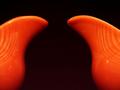
| 09/20/2002 09:19:00 AM |
A New Bell Curveby just-marriedComment: Very nice... I love the way the symmetry works in this photo... Some images do vey nicely when they are symmetrical and this is a great example of that. The color also works very well against the dark background. Nice! Meets Challenge: 10 Technical Merit: 8 Artistic Merit: 8 Creative Merit: 10 WOW Factor: 8 Score: 9 - JMSetzler |
 Photographer found comment helpful. Photographer found comment helpful. |
| 09/16/2002 01:38:00 AM |
the best playground bar noneby MagsCoyoteComment: I'm having trouble deciding what is the negative space here... if it is the bars, they are competing with the subject for attention... - jmsetzler |
| 09/19/2002 12:18:00 PM |
|
| Photographer found comment helpful. |
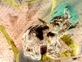
| 09/16/2002 10:03:00 AM |
Elephantaisiaby photodoggComment: I'm not sure if I understand the negative space in this photo. Everything in this photo seems to be competing with the elephant for the attention of my eye. I would love to hear what your thoughts are on the negative space here... :) - jmsetzler |
| 09/18/2002 10:15:00 AM |
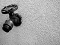
Tapped Outby ShiiizzzamComment: I like the 'tapped out' theme in this photo. That lone drip of water hanging on to the fawcet is a really neat element of the photo. i wish there had been some great way to accent that more, as I feel it will go unnoticed. The positioning of the fawcet in the frame and the angle also add to the 'tapped out' theme... it's like a person turning his head to the side in disgust or exhaustion... good shot :) = 10 - jmsetzler |
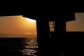
| 09/19/2002 02:03:00 PM |
Dumbarton Landingby lennierComment: Very nice photo... I love the photos were the subject is the negative space and this one is excellent too :) I would like to have seen the bridge columns to the right just a little more... don' t know of that was possible or not though... Meets Challenge: 10 Technical Merit: 8 Artistic Merit: 7 Creative Merit: 8 WOW Factor: 8 Score: 8 - JMSetzler |
| 09/20/2002 09:46:00 AM |
Bachelorby ClubJuggleComment: I wish my fridge was that clean... I think mine is has several different cultures thriving within it's walls :) The concept here is a good one... The perspective doesn't excite me excessively. I see two beer bottles in an empty fridge. I need some more excitement in this view somehow... If i was doing this shot, I possibly would have popped the cap on one bottle, turned it over and let it spill into the bottom of the fridge... it wouldn't have been particularly fun to clean up, but it would have created some more excitement :) - jmsetzler |
| Photographer found comment helpful. |
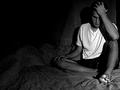
| 11/25/2002 04:11:00 PM |
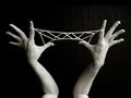
Jacob's Ladderby hypoStillerComment: This is a great shot.... Composition: I think the composition here is excellent... I like the addition of the 'elbow' to the frame... The balance of this composition is perfect. The contrasts between the hands, string, and the dark background, along with the lines and patternd created here are quite teasing to my eye. I believe that the 'angles' in this shot also strengthen the overall composition. Your choice of angle and including the 'elbows' in this shot seems to have disturbed some of the voters in this challenge... hmm... dunno why to be quite honest. I think the 'strangeness' of the photo angle and the view of the arms creates something special in this image. In short, this is one of those photos that I 'enjoy' looking at. During this particular challenge, I came back to this photo quite a few times. Technical: I think the exposure here is good. I think it could probably be better. The ISO 400 grain in this shot doesn't really bother me, but i'm wondering subconsciously if the shot could have been even stronger without the grain. Black and white was a good choice on this shot IMO. I believe that any color here would distract from the lines and shapes that dominate this image. Today is the first time I have looked on this image on my laptop at work. I can see your background. This particular aspect seems to bite me quite frequently. Some computers and monitors are cranked up so high on brightness and contrast that this can become a problem. One of the things I do to check this on my own images is to test them by cranking mine all the way up also. I don't do this test in photoshop. I do it in internet explorer. The two programs do not display images the same way. I believe that a slight level adjustment would correct this issue. I did NOT see it on my monitor at home when I originally judged the image. I doubt very seriously that it would have changed my score anyway. In my opinion, 10 means VERY GOOD. The site description of the scoring doesn't say an image has to be perfect to get a 10 :) Challenge: I think you did a great job accomplishing the challenge topic here. The dark background simply and beautifully isolates your subject. I can't say much more about that at all... Kudos on a very interesting and entertaining shot... keep up the good work :) John Setzler |
| 09/23/2002 06:14:00 AM |
|
Home -
Challenges -
Community -
League -
Photos -
Cameras -
Lenses -
Learn -
Help -
Terms of Use -
Privacy -
Top ^
DPChallenge, and website content and design, Copyright © 2001-2026 Challenging Technologies, LLC.
All digital photo copyrights belong to the photographers and may not be used without permission.
Current Server Time: 06/24/2026 11:43:15 PM EDT.