| Image |
Comment |
| 12/17/2002 06:00:37 AM |
|
| 12/17/2002 05:59:53 AM |
Prairie Sunset by SonifoComment: beautiful.. I love the color and contrast in this image... great work :) = 10 - setzler |
 Photographer found comment helpful. Photographer found comment helpful. |
| 12/17/2002 05:59:17 AM |
|
| 12/17/2002 05:32:05 AM |
A Splash of Colorby RackatComment: congrats on a great photo and a great score :) i wonder where that nasty single vote of 1 came from... ugh... Keep up the great work :)
|
| 12/16/2002 09:22:34 PM |
Christmas Appleby DougPazComment: Greetings from the Critique Club :)
Hi Doug :)
I hate that I got this photo this week because I like it... It looks like I was your only 10 of the week though :( I don't quite understand that at all. I think this was an excellent idea. I think you simply got 'nitpicked' to death. Where there is an opportunity, it seems like the voter will take it... the score is decent though...
Great shot :)
John Setzler
|
| Photographer found comment helpful. |
| 12/16/2002 09:16:46 PM |
Vaelen Confronts Darknessby HBunchComment: Greetings from the Critique Club :)
Heather, this is an excellent photo. Like I said in my original comment, I could see this on a game box or on a CD cover for sure :) I think the composition of the swords on the artwork background is excellent. Unfortunately, I can't really make any suggestions for improvement on this photo since I really like it the way it is. I read through your comments and I don't really understand where most of them are coming from. I couldn't think of a better way to light the swords or change anything about the composition. I suppose the 'artwork' factor may be at play, but it's an integral part of this image for sure...
Keep up the good work :)
John Setzler
|
| Photographer found comment helpful. |
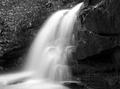
| 12/16/2002 09:01:50 PM |
Continuous Flowby darbComment: Greetings from the Critique Club :)
I love waterfall shots and they are quite fun to do. You have done well with this one too. Your exposure here is right on the money. You did not over expose the water. There is still enough detail in it to see the water nicely. As I look at your camera settings for this shot, I can see that you are definitely in tune with what needs to be done on a shot like this. I generally use Aperture priority to get a longer shutter speed on shots like this rather than shutter priority.
I have a friend that does waterfall shots professionally.... You can see some of his stuff at //www.kevinadamsphoto.com if you are interested. He speaks at our camera club about once per year and he has two waterfall photo books out now.
The only 'risk' I see in this waterfall shot is the choice of black and white. Most viewers are going to beg for color on a shot like this.
Keep up the good work :)
John Setzler
|
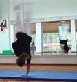
| 12/16/2002 08:50:40 PM |
GYMby amonteforteComment: Greetings from the Critique Club :)
This photo does an excellent job on capturing motion. The mirror is an excellent touch in this photo as well. I am at a bit of a loss on exactly how to provide a detailed critique on this image. I don't really see anything wrong with it. I scored this photo a 7 when I voted last week. Going higher than that would have probably required some higher level of 'artistic' merit in the image. This is one of those photos where I would need to 'know' the girl in order to really go high score with it.
Keep up the good work :)
John Setzler
|
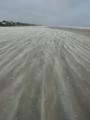
| 12/16/2002 01:06:17 PM |
Sand Flow: Strom Coming in Creating a Sand Mistby CreativeDotComComment: Greetings from the Critique Club :)
I think you have a nice subject here for a photo... the swirling sand in the wind makes a good motion idea. As I view this image, I can feel the sand on my feet and hear the wind and the ocean sounds :) Photos that instil that type of feeling are good photos :)
I agree with one of your comments about the image being a bit 'flat' as far as color and contrast are concerned. I don't know if there was really a good way to punch that up a notch or not. The beach and the sky seem to come together as one color. Maybe a perspective where the sand is blowing at a diagonal to the upper right of the frame would allow you to bring some more housing into the image for some contrast breaks? not sure...
keep up the good work :)
John Setzler
|
| 12/16/2002 12:38:28 PM |
Tight Raceby jimmyn4Comment: Greetings from the Critique Club :)
This is an interesting shot.. I think you probably could have created a better sense of motion by focusing on just one of the boats. Motion is definitely evident in this shot, regardless :)
I believe that the image could use some additional contrast somehow. There is not enough overall color variation for this photo to really punch out and punch hard. I also believe that the horizon in this particular image is a little too close to center in the frame... I think that lowering the horizon would make a stronger image in this particular case.
I read through your comments... Most of them don't really give you much insight as to how the photographer felt about the photo. I believe that this happens when the image impact is lower than they appreciate.
There is nothing wrong with your horizon line either. I need to investigate that comment maybe :) Maybe hbunch is measuring pixels :) It must have bothered her since she mentioned it three times in her comment...
Keep up the good work :)
John Setzler
|
| Photographer found comment helpful. |
Home -
Challenges -
Community -
League -
Photos -
Cameras -
Lenses -
Learn -
Help -
Terms of Use -
Privacy -
Top ^
DPChallenge, and website content and design, Copyright © 2001-2026 Challenging Technologies, LLC.
All digital photo copyrights belong to the photographers and may not be used without permission.
Current Server Time: 07/16/2026 02:24:00 PM EDT.