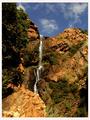
DPChallenge: A Digital Photography Contest You are not logged in. (log in or register
 
Browse Settings
Currently viewing:
Memberjmsetzler

Show comments:

Per page:

Order:

Comments:


Comments Made by jmsetzler
Pages:   ... [446] [447] [448] [449] [450] [451] [452] ... [809]
Showing 4481 - 4490 of ~8082
Image Comment
The Fog Rolls in at Dusk
01/20/2003 04:53:01 PM
The Fog Rolls in at Dusk
by sjgleah

Comment:
Greetings from the Critique Club :)

Hi SJG :)

The 'fog' in this scene is definitely a nice element of the photo. I also like the silhouetted trees framing the right side of the image. What I don't like about this image is the flat color tone. Looking at the camera settings here, it looks to be deliberately underexposed, which created this effect. I"m not sure why... maybe that was necessary to highlight the fog clouds that you reference in the title.

The only suggestion I could maybe offer to improve this shot would be to slow down the shutter and let some more exposure brighten things up a bit :)

Keep up the good work :)

John Setzler
Waterfall
01/20/2003 12:03:43 PM
Waterfall
by sulamk

Comment:
Greetings from the Critique Club :)

Hi Sulamk! I received your email and I feel lucky to have gotten your photo to critique. This will be an example of the types of critiques we are looking for in the Critique Club...

I love a waterfall. I enjoy photographing them myself and here are a few examples of some I have done in the past:

//www.pbase.com/image/5520374
//www.pbase.com/image/5555604
//www.pbase.com/image/8563364

I think you did a great job of capturing this particular waterall in the context of the 'landscape' challenge. Your vista in this particular shot covers the waterfall and plenty of surrounding land as well :)

One of the things about this image that I particularly like is the color contrasts. The blue sky / red rocks / greenery work very well together in this image. The waterfall itself is just a nice single element that makes this image stand out. I believe that all great landscape shots, contrary to the finishing order in the challenge this week, need some single 'strong' element for the viewer's eye to come to rest on. Your waterfall profides that to me in this image.

As for a possible improvement on this image...

I'm looking at your camera settings. My personal preference on waterfall photos, as shown in my examples, is 'soft' water created by a slower shutter speed with the camera. There is a simple trick to getting this. Your aperture was set to F4.5 and a shutter speed of 1/160". Without knowing any better, I would assume that this was a 'point and shoot' shot taken with the default camera settings.

If you had chosed aperture priority and setup with a smaller aperture (larger F number), your shutter speed would have slowed down some which would have created 'softer' water in this shot. You can also get even longer shutter speeds in a situation like this by using a polarizer or a neutral density filter on your camera.

For more information about shutter and aperture priority photo modes, take a look at my tutorial on DPC at:

Controlling Your Exposure

This tutorial explains how aperture and shutter priority affect your images...

Keep up the good work and I will be in touch with some links for you on critiques very soon :)

John Setzler
Photographer found comment helpful.
Frozen Forest
01/20/2003 01:02:24 AM
Frozen Forest
by karmat

Comment:
Greetings from the Critique Club :)

Hi Karma :)

The 'landscape' scope of this shot is fairly narrow, but, IMO, that is OK. I did a fairly narrow landscape myself for this challenge.

There are a couple of things that bother me slightly about this particular image. First of all, it looks under exposed. It's sorta 'flat' on the color and tone ranges. I can see that it is a 4" exposure so this must have been shot in deep shade or at dusk. In a situation like this, I normally use a larger aperture... somewhere around F2.8 or F3.5 on this one would have worked nicely :) The image has an overall 'blue' cast to it. I'm not sure how your white balance was set, but an adjustment in this would have fixed that right up with the 707. Thirdly, the camera is tilted to the right. In a scene like this, the icecicles should hang vertically. The slant of the icecicles gives that one away pretty quickly :)

Keep up the good work :)

John Setzler
"Break the Blue" - Dime Store Prophets
01/19/2003 01:58:03 AM
"Break the Blue" - Dime Store Prophets
by brandonarbini

Comment:
Greetings from the Critique Club :)

Brandon,

I think this is a great shot. I'm not familiar with the song, but I think the image fits the title quite well :) I really like the shallow depth of field presented here. I'm a sucker for strong contrasts. The tonal range of this image is also very impressive. It's one of those images that I would like to reach out and touch. The sharpness of the broken glass shards are part of what makes this a high impact image for me. I can't really make any suggestions for improvement for you on this image, and I'm not sure why it did not score higher than it did. I haven't read your comments on this image yet, but I will go do that. The only thing I can imagine that would have cost points on this photo is the shallow depth of field. That single aspect is what makes this photo so strong in my opinion. Some people like to see everyting in focus, whether it makes a stronger image or not.

Keep up the great work :)

John Setzler

** After reviewing your comments on this image, I definitely have NO idea why it didn't score better. There is no indication of why it wasn't better received... your comments seem to support this image... go figger....


Message edited by author 2003-01-19 02:00:31.
Photographer found comment helpful.
The wall (Pink Floyd)
01/19/2003 01:19:49 AM
The wall (Pink Floyd)
by Parentx

Comment:
Greetings from the Critique Club :)

Pink Floyd... one of my favorite groups of all time... "The Wall" represents a lot of things in the movie and on the 'album' as well. It primarily seems to represent oppression, in my opinion. The graffiti on your wall represents the uprising against the oppression in a very strong way... The black and red against the white paint can make a good representation of death and the 'dying'...

I think my only misunderstanding in this image is the red brickwork at the top of your image. I don't see where it 'fits' in the theme. If this was my photo, I would have expolred the possiblities of cropping that part out maybe...

I normally do not like photographs that don't show 'depth', but this is one exception to that. Since I'm familiar with the song, I can definitely see lots of other 'dimension' in this photo.

I can't really offer you any technical critique on this photo because I can't see how it could be technically any better...

Keep up the good work :)

John Setzler
Tie Me Kangaroo Down - Rolf Harris
01/17/2003 11:28:46 AM
Tie Me Kangaroo Down - Rolf Harris
by Martin

Comment:
Greetings from the Critique Club :)

Hi Martin...

This photo ties with your song title nicely. There is no doubt in my mind that I'm looking at a kangaroo :)

My first impression of this photo is that it lacks punch. There is not much here that really grabs my attention. I think the image could be a bit stronger with a few minor compositional changes.

See the large horizontal root just below the kangaroo's feet? Take a piece of paper and cover up the part of this image from that root to the bottom and then look at your image again. This minor crop change creates two improvements for me in this photo.

1 - it removes the uninteresting foreground. There is noting in that area of the photograph that adds impact to your image.

2 - it re-positions the kangraoo to a more desireable location in the frame (on a 'third' intersection).

In the current presentation, the kangaroo and the tree end a little too close to to the center of the frame to suit my taste.

A third improvement to this image may be to add a little extra sharpness with software. The image seems to be just a bit soft, but I think a sharpen filter in photoshop would fix that right up...

Keep up the good work :)

John Setzler
Photographer found comment helpful.
Dusky Pink
01/17/2003 10:57:04 AM
Dusky Pink
by Erastis

Comment:
The image quality on this one has suffered for some reason. I'm not sure what the source of that is... it lacks sharpness... - setzler
Too late to photograph this landscape
01/17/2003 10:55:54 AM
Too late to photograph this landscape
by Lustre

Comment:
You have a 'landscape' photo here for sure, but there isn't much of a subject or particular single element here that makes this photo interesting. A great landscape shot needs to have some element or group of elements that attracts the viewer :) - setzler
Photographer found comment helpful.
Storms a Coming
01/17/2003 09:32:49 AM
Storms a Coming
by kevinswope

Comment:
This landscape lacks a strong element to really catch the viewer's eye. The bare tree on the lower left of the frame could posibly have made a nice subject for this shot as well.. maybe focus a little closer on it for a strong black and white shot :) - setzler
Photographer found comment helpful.
Reflection
01/15/2003 11:51:33 PM
Reflection
by Hotshot132

Comment:
This is a lovely photo.. I really like the warm color tones and how they contrast with the theme of the cold ice... great shot :) - setzler
Photographer found comment helpful.
Pages:   ... [446] [447] [448] [449] [450] [451] [452] ... [809]
Showing 4481 - 4490 of ~8082


Home - Challenges - Community - League - Photos - Cameras - Lenses - Learn - Help - Terms of Use - Privacy - Top ^
DPChallenge, and website content and design, Copyright © 2001-2026 Challenging Technologies, LLC.
All digital photo copyrights belong to the photographers and may not be used without permission.
Current Server Time: 05/08/2026 03:53:45 PM EDT.