| Image |
Comment |
| 01/28/2003 10:18:09 PM |
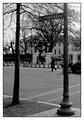
Square competition gone to my head.by SharQComment: This is a great photo... one of my favorites this week for sure... the composition is really intriguing. I don't particularly care for the title though... I would love to see a strong title to go along with this strong photo :) = 10 - setzler |
 Photographer found comment helpful. Photographer found comment helpful. |
| 01/28/2003 04:22:58 PM |
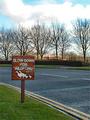
Slow Down For Wildfowlby vestanpanceComment: Greetings from the Critique Club :)
Hi Tim :)
I think you have a compositionally excellent photo here. There is nothing at all that I think could improve the angle. Obviously, as you mentioned in your comment, some fowl would have been nice! I'm sure it would have been very impractical to wait around for that to happen as well. Maybe catching an automobile in the frame would have created some more impact as well :)
The color in the foreground seems a tad flat but the exposure of the clouds is excellent. It's not easy to catch that detail and you have done well with it :) I believe that a slightly larger aperture.. maybe F5.6, and a slightly slower shutter speed... maybe 1/250 or 1/125 could have improved the overall color saturation in this image.
The concept of a 'leading line' is playing a small role in this image as well.. the yellow road line is leading the viewer's eye right to your sign... that is a nice touch!
Keep up the good work :)
John Setzler
|
| 01/26/2003 04:09:02 PM |
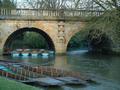
Magdalen Bridge, Oxford, UKby chrismbhouseComment: Greetings from the Critique Club :)
I think this is a nice scene for a photograph. The bridge definitely adds a very nice element to the photo. I think architecture integrates nicely with certain landscapes :)
There are a couple places where this photo could use come improvement overall. 1 - The top of the bridge would be nicer if it was lined up parallel with the top of the frame. It is slightly sloping to one side. The 'horizon line' in any landscape should be horizontal in the frame unless you have chosen an extreme angle for effect. 2 - The colors are a bit 'flat'. I think that a little saturation adjustment in software would fix this right up for sure!
This photo could also possibly use a little extra sharpness maybe... I bet that if you used software to increase the color saturation just a little and increase the overall sharpness, you would have a much more powerful photo :)
Keep up the great work :) This is an excellent first submission. I look forward to seeing more of your work in the future :)
John Setzler
|
| 01/24/2003 02:38:46 PM |
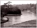
Pains Hill Cobhamby redfigComment: Greetings from the Critique Club :)
Hi Redfig...
Is this water frozen? It has that appearance and I can't really tell. I particularly like the tree in the upper left corner of the frame. The dark shapes that it provides make it stand out nicely in this image. I also appreciate the 'foreground' in this image. I have seen several landscape photos recently that make me think I'm standing in the water as I view it... I think this foreground in your shot gives the viewer a nice solid entry path into your landscape.
The pinkish color toning seems a bit strange. I think that it possibly removes some contrast from the overall image. I also believe the photo is a bit 'soft' and could possibly use a quick pass of the sharpen filter to make the details stand out a little more...
Keep up the good work :)
John Setzler
|
| Photographer found comment helpful. |
| 01/24/2003 01:03:27 PM |
Trying to butter me up?by catpixelComment: This photograph has a 'strange' quality to it but the color doesn't work well for me... I'm not sure if this is intentional or not... - setzler
|
| Photographer found comment helpful. |
| 01/24/2003 10:35:32 AM |
Meteoraby emitComment: Greetings from the Critique Club :)
This photo offers an excellent 'surreal' mood with the shallow tonal range and the contrasts of the rocks and the fog. To be quite honest, I don't think I would change a thing about it... I really like it just the way you have presented it here. For a 'critique club' comment on this work, I am at a loss.
Like I said, I think the shallow tonal range in this image is what gives this photo its great character...
Keep up the good work!
John Setzler
|
| 01/24/2003 10:30:02 AM |
Plowed Overby connieComment: This is a great shot.. the strong diagonal combined with the black and white here really looks nice! Kudos.. = 10 - setzler |
| 01/24/2003 10:29:14 AM |
|
| 01/24/2003 08:49:25 AM |
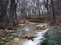
Serenityby David EyComment: Greetings from the Critique Club :)
Hi David...
This is an excellent scene for a landscape photo. I particularly like waterfall shots, so this one does nicely :) My personal preference on waterfalls is 'soft water'. I'm not sure if you like that or not, but it probably could have been achieved in this shot with a smaller aperture. The smaller aperture would have created a longer shutter speed for this shot :) That's just preference though and I'm not sure if that was what you were looking for or not.
Compositionally, my opinion of this shot is that it needs some 'foreground' possibly. As I view this scene, it makes me think i'm standing in the water :)
This image also makes me believe that it would be stronger in black and white than in color also. The 'color' in this image is rather flat, therefore, it could make a stronger contrasting black and white image possibly...
Keep up the good work :)
John Setzler
|
| Photographer found comment helpful. |
| 01/23/2003 12:38:59 PM |
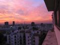
Where I use to Chillby takethatComment: Greetings from the Critique Club :)
I love the color in this shot. I like cityscapes as well. Compositionally, I think this photo could use a slight rotation to the right, which would straighten up the building edge and level the horizon at the same time :) I am slightly at a loss for words on a critique for this photo. Subjectively, I'm not overly inspired by what I see. The color is the key in this photo. the color of the sky and clouds is what creates the interest primarily rather than the landscape itself. I don't know how it could be done without a little longer exposure, but some more visible detail in the buildings would be nice also :)
Keep up the good work :)
John Setzler
|
Home -
Challenges -
Community -
League -
Photos -
Cameras -
Lenses -
Learn -
Help -
Terms of Use -
Privacy -
Top ^
DPChallenge, and website content and design, Copyright © 2001-2026 Challenging Technologies, LLC.
All digital photo copyrights belong to the photographers and may not be used without permission.
Current Server Time: 07/18/2026 02:41:02 AM EDT.