| Image |
Comment |
| 01/31/2003 09:25:35 AM |
2 Squaredby boyte1Comment: very simple and elegant design... the background color really makes this shot work well = 10 - setzler |
 Photographer found comment helpful. Photographer found comment helpful. |
| 01/31/2003 09:09:50 AM |
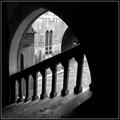
Skylightby KonadorComment: I love the simplicity of this shot... the lighting is excellent and the exposure is still showing the details in the dark areas of the shot... great work :) = 10 - setzler |
| Photographer found comment helpful. |
| 01/31/2003 09:08:55 AM |
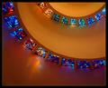
Helical Illumination by crabappl3Comment: great shot.. I love the 'curve' presented here and the yellow lighting tint works very well against the stained glass.. great work :) = 10 - setzler |
| Photographer found comment helpful. |
| 01/31/2003 09:08:08 AM |
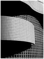
Wall of Windowsby NatashaComment: This is a beautiful architecture shot.. I love the patterns and 'texture' displayed on this one.. black and white accents that very nicely.. .= 10 - setzler |
| Photographer found comment helpful. |
| 01/31/2003 09:07:22 AM |
|
| 01/31/2003 08:25:18 AM |
lollipopby miss parkerComment: Greetings from the Critique Club :)
Hi Miss Parker :)
I see some occasional signs like this in my own community. They are usually wrapped up like this when they are new and not actually in use yet. The city road crew usually does this to alert the drivers that there is a new sign coming and to make people aware of it before it actually comes into use.
I like your choice of a shallow depth of field on this photo in order to help isloate your subject against the background. I only see one comment in your comments that suggests more depth of field, and I heartily diasgree with that.
To improve the overall impact of this photo, I believe that showing a little more of the sign post would have been a good idea. Your "lollipop" concept may be slightly weakened by not having more of the 'stick' visible :)
The 717 is a great camera... Keep up the good work!
John Setzler
|
| Photographer found comment helpful. |
| 01/30/2003 09:38:58 AM |
Village Next Leftby kevinswopeComment: Greetings from the Critique Club :)
Hi Joshua...
I'm not really sure why this image didn't score better than it did. Technically, I don't see much wrong with it. I think there may be a couple areas where some improvement could be helpful though.
1 - This image could be slightly sharper to bring out some of the details in the scene. One pass with the photoshop sharpen filter could do the trick nicely on this one.
2 - The lighting is a little harsh. The detail in the trees coupled with the light/dark in the image could be making this image a little on the 'busy' side for the viewer. This particular scene could possibly be better photographed at a different time of day or when the sky is overcast. This would help remove some of the sharp lighting contrast and possily help your viewer focus more attention on the indian structures in your image :)
I really like the way the 'pathway' leads the viewer into this scene. When I shoot scenes like this, I always try to get low to the ground with the camera also. It makes that 'path' a much more dominant part of the image...
Keep up the good work :)
John Setzler
|
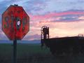
| 01/29/2003 05:08:22 PM |
Drew's Stop Sign Revisited by autoolComment: Greetings from the Critique Club :)
Hi autool :)
Congrats on a great finish with this photo... I think you have a very strong composition here. You are right about the railcar in this shot. I believe that it definitely adds perspective to the entire composition. It would be a little boring without it IMO. I also think the extreme left composition of the stop sign works very well here also..
"Waiting" for the right shot is always fun :) Especially with a sunset... the color and composition of it is constantly changing and you knever know what you will end up with. I have often shot 30-40 frames of the same composition in a sunset in order to have a good selection to choose from when I'm finished.
I don't know if there is much room for improvement on this image. The only thing I would have possibly tried with this setting would have been to underexpose a few shots. (I think you reversed your aperture and shutter in the settings here) I would have tried the same composition at 1/20, 1/40, and 1/80 with the flash also. Each stop down would have darkened the sky (and the foreground) a bit more, but it could have punched up the color in the stopsign with the flash as well... I think the only complaint I have with this shot is that there is not enough contrast between the color of the stopsign and the sky to really make it stand out as much.
The bullet holes in the stop sigh are great! I actually looked for some signs with these holes in them but I did not find any around here... There used to be plenty of them but I suppose my community has gotten away from the 'fun with firearms' lately :)
Keep up the great work :)
John Setzler
|
| Photographer found comment helpful. |
| 01/29/2003 04:55:15 PM |
Duck Crossingby Wheeler1992Comment: Greetings from the Critique Club :)
Hi Wheeler :)
This photo has a strong 'cute' element to it. Your message comes across very well and the challenge is met :)
Photographically, the photo may be a bit weak. There are three specific elements here that I believe could use some improvement.
1 - The exposure is not as strong as it could be. It appears that you are shooting into the sun. This being the case, you have a little washout in the color on your sign and at the top of the building behind it. You did not post your camera settings so I can't make any suggestions on a different exposure route for you.
2 - Compositionally, your camera is tilted which causes the sign to be tilted in this photo. I'm not sure if that was intentional or not, but it doesn't really add anything to the photo.
3 - Your sign is dead centered in the frame. The surrounding buildingd don't really strengthen your photo, so maybe a tigter crop just including the 'duck' and the sign would improve the overall impact of this shot ....
Keep up the good efforts :)
John Setzler
|
| Photographer found comment helpful. |
| 01/28/2003 10:18:57 PM |
Distorted Squaresby MaYzComment: phenomenal abstract work.. the black and white works beautifully here... = 10 - setzler |
| Photographer found comment helpful. |
Home -
Challenges -
Community -
League -
Photos -
Cameras -
Lenses -
Learn -
Help -
Terms of Use -
Privacy -
Top ^
DPChallenge, and website content and design, Copyright © 2001-2026 Challenging Technologies, LLC.
All digital photo copyrights belong to the photographers and may not be used without permission.
Current Server Time: 07/18/2026 02:41:31 AM EDT.